Can a Slidedoc Ever be a Presentation?

In scientific presentations, pre-made slides are a bane and a boon at the same time. Some journals offer all the figures from publications as slides, but it’s usually as a single unalterable image, which make the slide often unsuited for presentation. In this article Dr Oliver Hauss highlights the dangers of assuming your audience will have the time, inclination or even patience to persevere with such a presentation. Is there a better way?
Understanding the differences between use for personal reference and use for presentation
Need to present the latest study on your product? That’s easy! The publisher even provides pre-made slides for the figures! Just drop them into PowerPoint and you’re set to go! You’re asked to present the pertinent results presented at a recent conference? No problem! There’s a website offering whole slide kits on conference proceedings that you can use! Life is easy!
Except…. It isn’t.
The result, all too often, is speakers bombarding the audience with an information overload, garnering blank stares trying to make sense of the projection image while the speaker’s words fall on deaf ears, the audience’s attention being completely tied up by the visual input. With glazed eyes and spinning heads, the presentation may well lead to a “wow”-effect – but probably not the one aimed for.
The fundamental problem is the question of what actual purpose the slides are going to be used for. If I use slides of conference proceedings for my personal reference, just between me and my monitor screen, then things work which might not work if I try to present the very same slide to an audience of 50, let alone 200 people.
Alone at my computer, I am the master of my time and I decide how long I look at a certain slide. If it takes me ten minutes to understand what’s going on, then I can spend ten minutes on that slide. In a presentation, it is unlikely that the speaker will present a slide that long. Any information that I have not processed by then is lost to me. And since I likely focused on the slide, some things the speaker mentioned are likely to have been lost as well.
But on the other hand, in a presentation, I do have the speaker who can give me additional information. In a downloadable slide set, any necessary explanations need to be included either in the slides themselves or in the notes.
Therefore, a distinction needs to be made between “slide documents”, which work on their own, and presentation slides, meant to work in conjunction with an oral presentation. The same applies for figures transferred one-to-one from publications.
For a presentation, a few points need to be addressed:
- If the speaker does not speak about all the data presented, then there is the question as to whether the additional data is necessary to present at all within that presentation. The more information on a slide, the longer the attention of the audience will linger on the slide, which leaves, at best, divided attention for the speaker.
- And then there is the issue of text size: at my computer, I can zoom as much as I want if I have trouble reading, but in a presentation, I need to keep the people in the back row in mind.
- Lastly, there is the issue of labelling. Sometimes, people use vertical or angled labelling. On a printout, I can turn the page to facilitate reading. On my computer, I can ask the PDF reader to turn the page. In a presentation, I might have 150 people tilting their head in order to be able to decipher the labels.
Slide documents and presentation slides are two very different things using the same file format, and it is dangerous to simply transfer them as-is from one medium and one purpose to another. They each have their advantages and disadvantages which influence what works and what doesn’t in terms of usability.
Distilling the relevant information out of a slide
Let us look at one example from a recently published slide kit on cancer treatment (used with permission – all slides courtesy of www.clinicaloptions.com – who DO offer editable slides!):
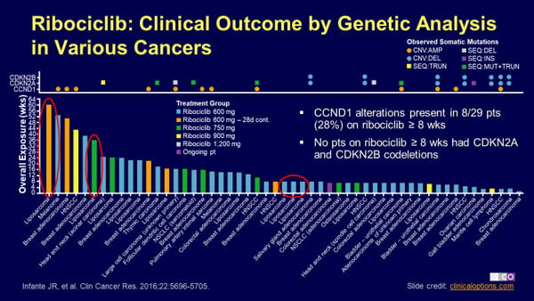
How long would it take you, if someone were to project that as part of a presentation, to take up all the information on here? Quite probably longer than they will present the slide! That is, if you can read the text at all. There’s an overload of data here: we’re shown the results of an analysis of a host of different cancer cases, treated with a certain drug in a variety of different dosages, over different durations.
It also shows which mutations arose in those cases over the course of the treatment and specifically points out in text what mutations were and were not observed after drug treatment ≥ 8 weeks. Even an expert will take a deep breath being submitted to so much content.
So, for a presentation, I’d first “declutter” the slide. It is not necessary to label every segment of the Y-axis – a few points, such as 20, 40, 60, should suffice. The explanatory text in the center right should go. If, as it points out, the key point is the difference in mutations beyond 8 weeks exposure and the different dosage regimes are not talked about, then the bars can all be done in the same color and the corresponding legend removed.
Likewise, it’s unlikely that the host of different cancer types will be analyzed in detail. The entire lower part legend could then be removed, generating a lot more real estate, allowing the upper part of the diagram to be stretched out . The textbox on the right can be removed and replaced by oral pointers by the speaker.
In return, a marker for the 8 weeks mark can be introduced via animation when the speaker references that point. The five cases specially marked in red can then simply be done in a distinct color, rendering the marking far more noticeable than before.
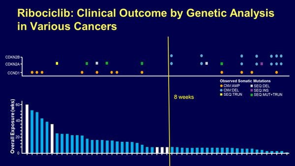
Alternatively, if only those five cases are to be talked about, the full slide can be relegated to an “as needed” reference. The speaker could mention how many patients were tested, noting some of the cancer types involved, but presenting only the pared-down slide.
If there is audience interest in more details, they can be voiced during the Q&A and the full slide then be shown. Instead, the slide could be pared down to just those five cases. The next step then is to turn the graphs around to allow for horizontal labeling. Ironically, in the original publication, the entire graph IS turned 90°, improving readability a lot.
This is evidently not possible with the full graph in a presentation due to the landscape orientation of a slide vs. portrait orientation of a publication, but focusing on a subset of data points would allow reinstating that orientation of the visualization.
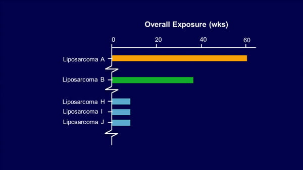
You will note that in the following example, I also added “A, B…” to the cancer type label to illustrate some cases of the same type were left out in the visualization and increased the font size to improve readability further.
Making unavoidably complex diagrams more digestible
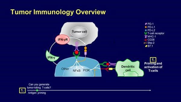
Let me illustrate some of my points with a sequence of two slides from a different slideset (Fighting a Smarter War on Colon Cancer: Immune Therapy in GI Cancers). In this case, we’re dealing with the added challenge that the slides are supposed to demonstrate the interaction between a host of molecular players in the reaction of the immune system to the presence of cancer cells – some degree of complexity here will be unavoidable if we want to look at the whole picture:
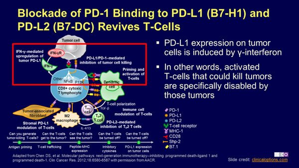
This first slide is followed by a magnified excerpt in the next slide:
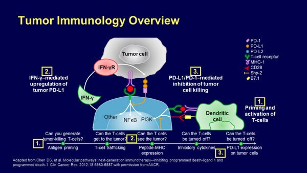
Once again, the fact that this is a downloadable slideset necessitates explanation that in a presentation would be best left to the speaker. So for the first slide, the text box on the right can be removed for a presentation. I’d likewise eliminate the timeline underneath the visualization, since it is explored in-depth in the next slide.
The “real estate” gained can be used to magnify the cellular complex and put it at the center of the slide. I would then introduce some of the details via animations as the speaker talks about them, gradually increasing the complexity of the slide, e.g. like this:
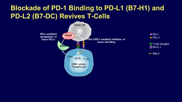
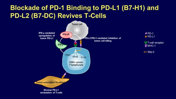
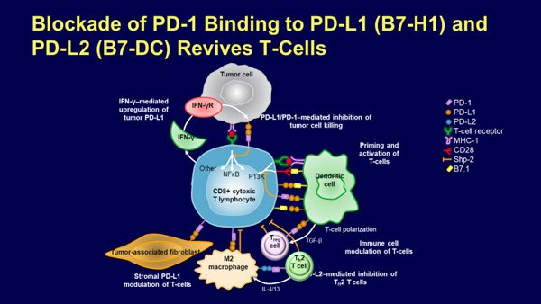
Using newer versions of PowerPoint, the transition to the next slide could then be done with the morph transition, giving a zoom-in view that keeps it evident what is going on. The different stages of the timeline I would then introduce not just through numbering, but also through text appearing bit by bit as I talk about them. Therefore, the slide in the kit represents the end state whereas we would start out with something like this:
We gradually add to the complexity until we reach the full result. This is still not ideal in my eyes, but keeps the additional information the audience has to digest, at any one point, manageable.
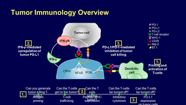
Note that a lot of these slides are now much less self-explanatory – but that is perfectly ok for a presentation slide, which relies on the speaker to give it meaning and context. You will also note that I removed the full references for the figures. While it is, of course, proper academic conduct to provide them, they are usually barely legible from a few rows back and more properly provided in the form of a handout, freeing slide “real estate” for more useful information.
Can I have slides with that?
The author of several general highly acclaimed presentation books, Nancy Duarte, coined the rule that a presentation slide should be understandable within but three seconds. For scientific slides, that will not always be achievable, since we’re dealing with highly complex concepts. But the amount of information displayed or added at any one time should still be as easily digestible as possible (while still making sense). This avoids prolonged periods during which the audience is trying to figure out the slide.
This is the challenge in using slides both for reference and for presentation. But the same is obviously also true vice versa – a good presentation slide should not be usable directly as a slide document for reference. “Can I have your slides?” is not something that should regularly be a fruitful question. After all, if the slides are fully self-explanatory, what was the purpose of having a speaker go through them in the first place? Like simply using slides out of publications or slide kits, it’s all too convenient to simply print out our slides and hand them to someone for reference.
But convenience comes at a price – and in this case, that price may well be overloading our audience with information and jeopardizing the actual goal we are there for to begin with – getting a specific point across.
Oliver Hauss
Latest posts by Oliver Hauss (see all)
- Scientific Presentations – It’s All About the Data… or Is It? - 25th September 2019
- Reasons Why You Shouldn’t Just Cut and Paste - 13th March 2018
- Can a Slidedoc Ever be a Presentation? - 12th September 2017
- Should You Use Storytelling in Scientific Presentations? - 15th June 2017


