6 Design Ideas for a Killer Presentation

[This article contains affiliate links. For more information, see our disclosures here.]
At some point in our lives, we all have to make a speech or present something to an audience.
To present something comfortably and confidently requires plenty of preparation. That means rehearsing your dialogue, practising your nonverbals, knowing your subject matter inside and out, and having solid visuals to guide your audience along.
However, while skilled presenters ace the speaking part and know their stuff, most hit a wall when it comes to presentation-slide design. In fact, audience engagement and slide design are cited as the biggest hurdles for presenters today.
But not everyone’s an expert at designing presentation slides, whether that’s because of lacking the right tools, the technical skills involved, or just an eye for design. So how do you get around this?
Well, you’d be surprised how easy it is now to create professional-looking content, whether it’s for social media, your blog post or an upcoming presentation. There are plenty of easy-to-use tools that can make you look like a pro designer, even if you’re a complete beginner.
So don’t settle for less, present with the utmost confidence! With just a handful of presentation design ideas, you can easily create unique slide decks that are engaging and captivating.
6 Presentation Design Ideas
In this article I’ll cover 6 presentation design tips, along with a few examples of each, to help you crush your next presentation.
1) Choose a template
The easiest and quickest way to start designing your presentation slides is to use templates. Whether you’re using Google Slides, Prezi or Venngage presentation maker, it’s much easier to edit a template instead of starting from scratch.
With the right design tools you can choose from a variety of template styles, and you won’t need to worry about design consistency.
As well, great templates will have all the elements and features you need, in order to create something attractive and engaging of your own. They should inspire your creativity and help you generate your own ideas.
You might see template bundles online that you can download for free or purchase in order to customize. However, most times you’ll need a tool like Adobe Photoshop to access and edit them. And you’ll actually need some degree of technical design skill.
Using an online tool that provides templates is much more convenient. Most online tools are intended for beginners and non-designers, making it much easier to customize the designs.
2) Alternate slide layouts
Ever drive long distances at night on the highway? All you see is the same thing over and over – highway signs, billboards, lights, lights and more lights.
What happens? You start dozing off.
This applies to presentations too. For longer presentations, you’re asking your audience for extended periods of focus and attention. An easy hack for keeping people tuned is to alternate between slide layouts for your presentation.
Here’s a presentation template that lets you do just that:
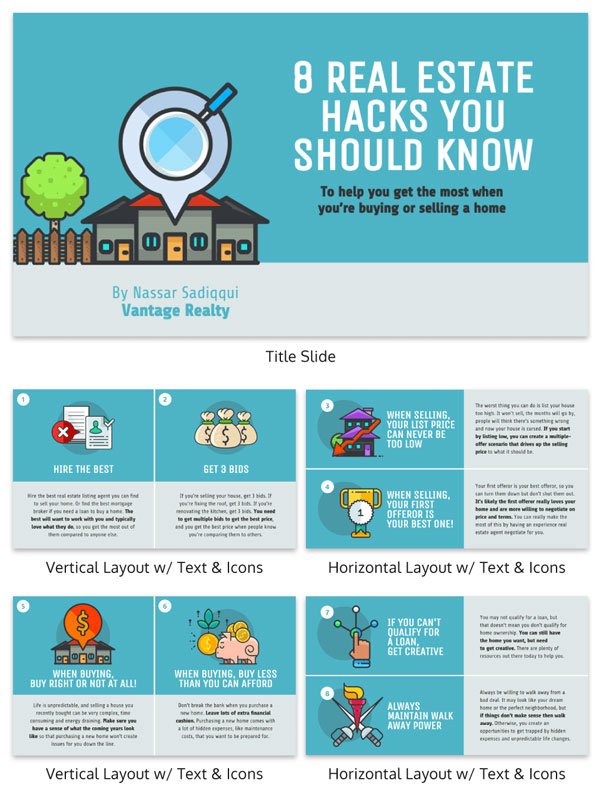
The slight changes in layout break up the monotony of your presentation. It shows your audience that new information is being presented, grabbing their attention all over again. I would recommend using at least 3 slide variations to keep it engaging.
3) Be minimalist
Often times, less is more. You don’t want an overly crowded presentation, since too much information can overwhelm your audience. Or they just won’t identify the core message behind each slide.
With a simple design you’re forced to keep your words per slide to a minimum. Here’s an excellent example from Mark Schaefer:
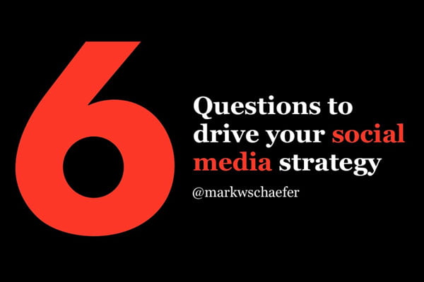
Focus on the core message of your presentation. Apply a color palette that’s simple and plain. You’ll also notice the individual slides are stripped to their essentials. Each one has a single impactful statement that holds the audience’s attention. Take a look below:
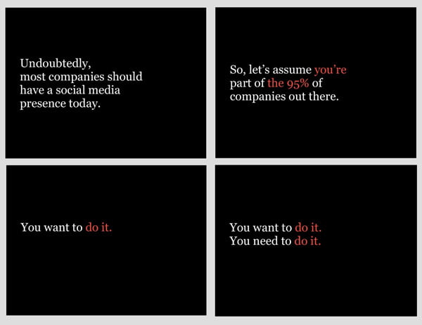
You may end up with a lot more slides this way (this presentation has 84!), but you’ll keep your audience hooked by getting the most impact from simple, resonating statements. One expert encourages saying as few words as possible, letting your audience really absorb your message.
4) Use icons
When crafting a presentation, you want a design touch that pulls everything together. Icons do exactly that. To present complex ideas, list out information and share facts, use unique icons for each section. Pairing an icon to each idea helps your content stick.
Below, is a presentation deck template that uses icons effectively. Take a look:
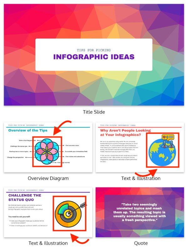
In the body of the presentation, a single icon is paired with a central idea on each slide. This is effective for two reasons. It keeps you on track as the presenter by associating a theme with each icon. And since visuals aid information retention, your audience will recall your content for a longer period of time.
5) Use one dataset per slide
Data, charts and diagrams demonstrate patterns and trends instantly. They’re great visual tools.
But you don’t want to overwhelm your audience with data. Multiple charts, graphs and data sets on a single slide works against you.
Instead, dedicate one slide for each graph or chart for every set of data. This isn’t just easier on your audience, in terms of absorbing information, but it lets each set of data make the maximum impact.
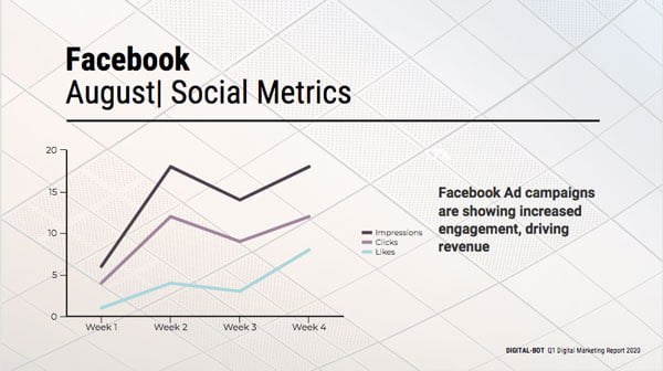
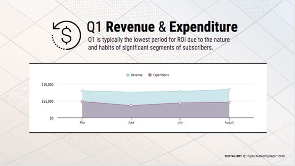
Don’t think of your charts as colorful distractions for your audience. They are storytelling devices that help you present data in a full and meaningful way!
6) Get creative
It’s fun to try new things and stray from the standard, professional-looking approach for presentations.
When you get creative, it captures your audience’s attention right away because it’s new. No one has seen something quite like your presentation before. A creative approach is also an opportunity to relate to your audience.
Here’s a presentation deck by Hubspot that jumps out at you from the very first slide:

The caption in all caps is unconventional and unexpected, which is why it grabs your attention instantly. Don’t be overly formal, try a creative, conversational approach instead. You can also keep things interesting by doing the unexpected.
A lot more can always be said about presentation slide design. However, for a few easy-to-implement tricks, these 6 design ideas will take you far.
Let me know if you’ve found any other design tricks to be really effective, or any resources and tools you’ve found to be helpful.
Jeilan Devanesan
Latest posts by Jeilan Devanesan (see all)
- Powerful Presentation Formats You Didn’t Know About (But Should!) - 19th November 2019
- 6 Design Ideas for a Killer Presentation - 4th September 2018


