Powerful Presentation Formats You Didn’t Know About (But Should!)

We live in a world of public speakers who are so good at presenting information, they’re famous for it.
There’s something about their style and delivery that just gets us to listen. As public speakers, they’re skilled and well-practised. They don’t stammer, mutter or use filler words but are loud, clear and confident.
That’s one part of what makes them so good. The other part of what makes them exceptional presenters are their effective presentation formats. How an idea is packaged and presented, along with the visuals that are used to present it establish a presentation’s format. The number of slides, the types of slides, the design of the slides, and how frequently the slides change are part of the format.
The best speakers structure their presentations in ways that help them deliver their key points clearly, and keep their audience attentive and engaged throughout.
That’s why I decided to share some of the most popular (and not so popular) presentation formats that people use today, with you. I’ll also share presentation styles from a few well-known speakers and influencers who haven’t coined their presentation format, but are worth drawing inspiration from.
These presentation formats can help you with talks at conferences, delivering keynotes, hosting webinars and way more. They’ll help you with developing your personal brand and become an even more engaging speaker.
1) Guy Kawasaki’s pitch deck and the 10-20-30 Rule
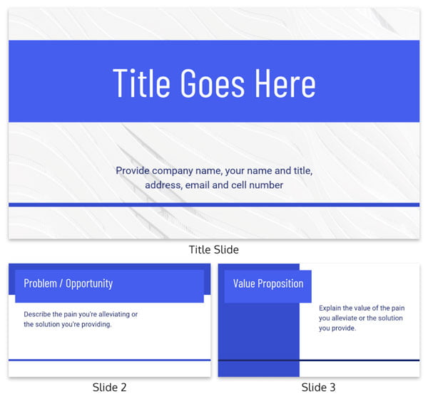
Guy Kawasaki Pitch Deck Template
The Guy Kawasaki pitch deck is part of Kawasaki’s pitching format called the 10-20-30 Rule. It’s a simple guide for making your pitch to investors punchy and to the point.
Guy Kawasaki knows a thing or two about pitching to investors. He started multiple companies himself, including a venture capital firm – Garage Technology Ventures. Over the years, Garage Technology Ventures has invested in recognizable names like Pandora and Tripwire.
That’s one reason why his ideal pitch deck is so popular. He has decades of experience pitching and has listened to plenty of pitches. He knows what the good ones have, and what the bad ones lack.
Another reason Guy Kawasaki’s pitch deck is so well-liked is it’s simplicity. The pitch deck is just ten slides, and that’s the first rule in his 10-20-30 Rule. The second rule is to not speak for more than 20 minutes. And rule three is to only use fonts no smaller than 30 points.
Guy Kawasaki’s 10-20-30 Rule
- Use only 10 slides (no more than 15)
- Only talk for 20 minutes
- Use nothing smaller than 30 point font
With such a simple set of rules to follow, it helps entrepreneurs laser-focus on their business idea, along with the facts and figures that matter. In the entrepreneurship space, having that sort of structure goes a long way.
Now coming back to the actual pitch deck, what goes on the ten slides? Only the most fundamental pieces of information.
- Title Slide
- Problem/Opportunity
- Value Proposition
- Underlying Magic
- Business Model
- Go-To-Market Plan
- Competitive Analysis
- Management Team
- Financial Projections and Key Metrics
- Current Status, Accomplishments, Timeline and Use of Funds
- Thank you Slide
You can bookmark this redesigned Guy Kawasaki Pitch Deck Template from Venngage. It’s previewed above and follows his exact format (and includes example slides to help you out).
2) The Pecha Kucha presentation format
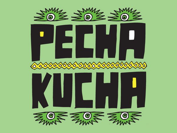
The PechaKucha presentation format was inspired by two Tokyo-based architects, Astrid Klein and Mark Dytham, back in 2003. In an attempt to streamline architectural design presentations, they decided on a format that emphasizes visuals and minimizes text and talking.
What they introduced was a presentation consisting of twenty slides, that are only shown for 20 seconds each, and so a presentation that lasts exactly six minutes and forty seconds. Always.
The concept quickly caught fire and spread throughout Tokyo, then Japan, then the world! Now it’s a hugely popular presentation style that hundreds of thousands of people give (and attend) every year through countless cities.
It has also moved beyond the business and professional setting. PechaKucha presentations also include people talking about their passions, interests, ideas and more. This article shows some great examples of PechaKucha presentations and where you can find a PechaKucha event near you.
The benefits of the PechaKucha presentation format
One basic sales fundamental is knowing your audience well, which is what inspired the PechaKucha format.
The two architects, based out of Japan, wanted to give more meaningful presentations to their clients. That meant highly visual slides that made more of an impact, with concise language that carried more weight. They also wanted to make the best use of their client’s time, rather than have them sit through a boring presentation for an hour.
The PechaKucha presentation helps you accomplish three things as the presenter:
- They become really great speakers who know their topic very well.
- Their slides are visually engaging, memorable and relevant.
- They don’t waste their audience’s time and energy with long presentations.
How does the Pecha Kucha presentation format help me as a presenter?
Using the PechaKucha format means you need a very clear understanding of what you want to communicate. This means searching your thoughts, practising your talk many times, and editing your talking points until your left with exactly what you need.
The visuals also play a huge part. They have to work with your talk, you can’t go back to them, and you don’t have much time to explain each one of them in great detail. That means designing visuals or choosing images that capture and hold your audience’s attention.
What you’re left with is a six-minutes-and-forty-seconds-long presentation that your audience will be grateful for.
Whether you’re presenting a new concept, a learning topic for your team or a brief keynote, making a pitch, or explaining something, the PechaKucha presentation is an effective mode of delivery. Granted, you can’t expect to present on anything and everything using this format. But in client meetings, meetings with your team, talks at networking events, the PechaKucha presentation style is a great choice.
3) Lessig Method presentation style
Lawrence Lessig is the pioneer behind the ‘Lessig Method’ presentation format. Unlike Guy Kawasaki’s pitch deck and the PechaKucha format, there are no slide limitations. The formatting is minimalist in design, but slide count is thrown out the window.
What you have instead is an emphasis on visuals and your key points. The slides are meant to synchronize with your talk, so that specific key terms appear as you’re actually saying them.
The Lessig Method helps to reinforce your message and establish pacing, keeping up the energy of your presentation and your audience tuned in. It helps minimize the opposite situation that many speakers experience, lingering on one slide too long, with the audience’s attention dropping off.
You can check out an example of Lessig himself using the Lessig method during his Ted Talk:
Note the simplicity of the images that Lessig uses in his Ted Talk, too. They are unadorned, high-quality, impressionable images that stick. It grabs the audience’s full attention. It also lessens the load on ‘designing’ a presentation.
4) Takahashi Style Presentation
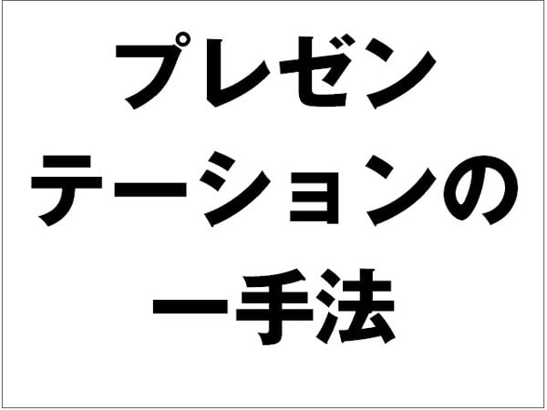
Masayoshi Takahashi, a programmer in the early 2000s, had to give a presentation at Ruby Conference. Whether it was a matter of preference or just a statement, Takahashi chose not to use tools like PowerPoint. Instead, he developed a plain-text presentation deck that only had large, bold text on all of them. The text was similar to Japanese newspaper headlines. Each slide would emphasize a point, reinforcing his message and the key takeaways for the audience.
You can check out the original slide deck below:
This approach gets compared to the Lessig method often, but the key difference here is pacing. As I mentioned before, the Lessig Method is fast-paced and dynamic. It emphasizes keywords and also maintains the energetic cadence of your presentation. Whereas, the Takahashi method emphasizes each point through huge, bold text that jumps out at the audience. In a sense it’s ‘visually loud’ and hits your message home with a slightly different approach.
Influential Thought Leaders and their Presentation Styles
1) Seth Godin – Marketer, Author, and Entrepreneur

Seth Godin is a well recognized thought leader in the space of marketing, business and technology. He has authored numerous books, owned businesses, and is a top-tier marketer and writer.
As an exceptional speaker, he also has a presentation style that’s worth emulating.
Horrifyingly boring, text-heavy PowerPoint presentation decks were taking over offices and conferences. After years of seeing lousy PowerPoint presentations, Godin decided to do things his own way.
Slides should be visual. On his blog, Seth Godin famously states, “[…] make slides that reinforce your words, not repeat them”
That pretty much sums up his approach to presentation slide design. Only you can deliver your message, there’s no way around that. You can see what I mean by just checking out his Ted Talk:
Within a few minutes, you’ll see the images are vibrant, bold and simple. They are great examples that don’t require any design skills. Instead his visuals amplify his message, making it easy to remember what it was all about. They really carry each of his points.
I don’t think his approach disagrees with the Lessig or Takahashi methods (which make heavy use of text), but is a response to the misuse of text you find even in presentations today.
2) Ann Handley – Keynote business speaker, writer, marketer
Ann Handley is a best-selling author, the Chief Content Officer at MarketingProfs, and co-founder of Clickz (amongst other things). She is a talented communicator and a great speaker, too.
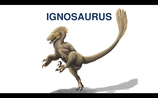
I really like her slide deck for her Slay the Ignosaurus talk she gave in San Francisco last year. You can see her whole presentation deck on her blog.
Two things make her presentation slides strong and impressionable.
- The introduction of a novel creature, i.e., Ignosaurus
- The recurring slides of the Ignosaurus
The Ignosaurus is a unique symbol for a problem Handley wants to address. It also sets the tone for the entire presentation.
The deck’s most effective quality is that it loops back to the Ignosaurus every few slides. This allows Handley to keep bringing the focus back to the problem she’s unpacking for us. As she introduces new concepts and ideas, she ties them back to the main problem. This establishes a strong connection between the issue and the solution she provides.
3)Leila Janah – Founder and CEO of Samasource and LXMI

Leila Janah is a remarkable entrepreneur, founding organizations that align with her personal values, Sama and LXMI.
Sama is a non-profit platform that assists AI teams in deploying machine learning more effectively and reliably. LXMI is a wellness brand that focuses on using natural ingredients, with transparent and responsible production and sourcing practices.
Both organizations emphasize empowering visible minorities, particularly women, to succeed in their fields. She brings together the technology and business sphere with social responsibility and the opportunity to do good.
As someone who is passionate, inspired by her own personal values, and all about representation for the disenfranchised, Leila is excellent at giving talks that resonate on an emotional level.
In 2015, at a Business for Social Responsibility (BSR) presentation, Janah spoke about the concept of ‘impact sourcing’ and its ability to resolve poverty.
Janah immediately connects her audience to something real and tangible, a person, Ken. She goes on to tell us the story about his life, his challenges, his aspirations, and how impact sourcing lifts people like Ken up.
She presents us with someone real, and connects her ideas to real work that has had a positive impact on his life. She doesn’t focus on the hundreds of people Sama has helped or present a number of impressive figures.
She focuses on one person and guides us through his experiences and the very direct way Sama helped improve the quality of his life. Sometimes the very simple and human story can make an impression that broader stories can’t.
Choosing the presentation format that works for you
Choosing the right presentation format really boils down to what you’re presenting and what your message is all about. It also comes down to what suits you best.
Remember, as a presenter your personality and how you like to communicate, should shine through as well. That has to be balanced with keeping your audience’s attention.
People want to listen to you, but you need to make it easy for them. Using a presentation format that helps you crystalize your message, but also holds your audience’s attention is invaluable. There are different, less popular presentation formats out there, but have, in many ways, been inspired by the ones I shared in this post.
And of course, there are thousands of impressive and compelling public speakers and presenters out there. I can’t get to them all, so I have shared with you three that really stuck out to me.
What are some presentation formats that you’ve found worked for you? It can be presentation formats that you came up with! Or maybe you’ve got a favorite presenter I should know about. Share your thoughts with me in the comments below.
Jeilan Devanesan
Latest posts by Jeilan Devanesan (see all)
- Powerful Presentation Formats You Didn’t Know About (But Should!) - 19th November 2019
- 6 Design Ideas for a Killer Presentation - 4th September 2018


