Master the Slide Master

You don’t need to be a professional to be able to take advantage of some of the time-saving tricks PowerPoint has to offer. I might be a self-proclaimed PowerPoint wizard, but anyone can master the really easy ways to speed up your presentation-creation time. It’s simply a case of learning how to create and use a PowerPoint template effectively.
Too many people struggle trying to make their slides look cohesive by manually going into each and every slide to change things like the fonts or backgrounds. The problem with doing these kinds of things manually on a slide-by-slide basis is that there’s no guarantee you will get everything consistent. It’s far too easy to mix up a font size in a title somewhere, or to have your alignment off-center on your footer.
Instead, it’s much simpler to build these features into the slides themselves, so you don’t have to start from scratch with each new slide you create. By putting in the effort to lay out your slides up front (in many cases, less than an hour of effort is required), you save yourself tons of time and money down the line.
So, what’s the magic trick to create a super useful PowerPoint template? Well, it’s all located in an area called Slide Master, which you can access through the View tab. Once you’ve clicked that, you’re all set! I’ll show you some easy tips below to help you create your own template.
1) Setting Up Colors & Fonts
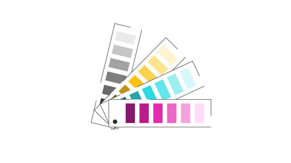
The first thing you should think about with your template is setting up your custom color palette and fonts for the presentation. This ensures that, for each slide you create, there will be set colors that you can choose from; and that each new text box you create will use the same font.
You may think changing fonts or colors in your presentation is easy enough without using the Slide Master, but in reality it’s pretty much impossible to keep everything consistent. And, if your colors and fonts are inconsistent, your presentation starts to look sloppy. Using a consistent look and feel throughout all your slides will make them look much more professional and the results are worth the effort, trust me.
Custom Colors
In the Slide Master go to Colors and Customize Colors and select the range of colors you want to use throughout your slides.
This can be your brand colors or a range of cohesive colors that will look nice when placed together on a slide. You also have the option to use the default color palettes offered by PowerPoint if you don’t want to create your own.
Custom Fonts
In the Slide Master go to Fonts and Customize Fonts to set the default fonts for your presentation.
There’s also an option to choose from some preexisting fonts, if any of those work with your specifications.
Default text boxes
You’ll also need to set default text boxes, so that if you insert text somewhere it will be formatted correctly. This is done outside the Slide Master. On any slide, create a text box and type some text in the correct font and size. Left click so that the text box outline becomes solid, then, right click and select Set as Default Text Box. By doing this, you’ll ensure any text box you create will use the right font, size and color.
Typography can play such an important role in your presentation. Check out this article for more tips on how to use text effectively.
2) Setting Up Shapes

Shapes are great as text placeholders (much better than using bullet points!), or to use to divide up the space on a slide. However, if you want all your shapes in your presentation to be white with a blue outline of a certain thickness, it can take ages to do this manually and you might forget some along the way. And, as with everything, if your shapes are formatted inconsistently, your slides will begin to look like a design nightmare. To ensure consistency, you can set up shapes to be created with specified text and design formatting.
Default shapes
Like setting the default text box, this is done outside the Slide Master. Start by inserting a shape, for example, a rectangle. Then, choose the color, outline style, text alignment and any additional formatting you’d like. Once you’re happy with the way your shape looks, left click if necessary to ensure the shape box has a solid outline and then right click and Set as Default Shape. Now, every rectangle you create will use this formatting.
If you’d like to transfer this formatting to another shape that’s not a rectangle, click your rectangle and press CTRL>SHIFT>C and click your other shape and press CTRL>SHIFT>V to paste the formatting. Once you’ve done this, you can set that shape as a default shape as well and repeat the process to cover all the different shapes you’re likely to use.
3) Setting Up Layouts

The last thing we are going to look at is slide layouts. A lot of less-experienced PowerPoint users may stick to the built-in PowerPoint design templates – which are okay-ish – but if you’d like to make your slides look more modern and unique, or if you have logos and background images you’d like to use throughout your slides, you don’t need to be an expert to accomplish this. PowerPoint makes this whole process fairly simple, and as usual, it’s done using the handy Slide Master.
Custom layouts
Setting up layouts for your slides typically means creating, at minimum, a standard title slide, a section divider, a content slide and a conclusion slide.
If you open up the Slide Master, you can see that PowerPoint sets a lot of this up for you already, but if you’d like to start from scratch you can also right click in the space around the default layouts and Insert Layout to create a new slide template.
One tip that will make your life much simpler is to delete any layouts you don’t think you will use in your presentation, as this helps streamline the layout selection tab when you’re building slides. To do this, just right click and select Delete Layout on any layouts you know you won’t want. For the layouts you do want, insert the images and backgrounds you’d like to use and adjust the text sizes, alignment, footers and margins.
Slide hierarchy
It’s important to note that the Slide Master uses a hierarchy of sorts, so if you change anything in the first slide of the series (which is larger than the rest) it will also be changed on the following layouts. This is useful to remember when adding background images, watermarks or logos that you want to appear on every layout. You only need to edit the one slide.
Placeholders
If you know you want an image or text in the same place on every slide, you can add an image or text placeholder in the Slide Master by going to Insert Placeholder and selecting what type of placeholder you want. That way, every time you use that slide in your deck the content will be added in the right place.
Footers
And lastly, for footers, make sure you select Insert Footer outside of the Slide Master, otherwise even if your master slide shows a footer, it won’t show up on your slides. Click Insert>Header & Footer>Include on Slide>Apply.
Conclusion
The changes you make in Slide Master will be reflected on any slides you create using those layouts. Ultimately this will save a lot of time compared to applying all these elements to each individual slide.
While working with PowerPoint can feel overwhelming at first glance, I think it’s safe to say that these tips can be followed by users with any level of PowerPoint familiarity and they will definitely speed up your slide creation. If you’re interested in learning more about creating and using slide templates, consider checking out our free on-demand video content about creating and using slide templates.
If you liked this, you might also like
Why You Need to Invest in Creating Professional PowerPoint Templates
A Recipe for an Efficient Corporate PowerPoint Template
The Wondrous World of Colour in Presentations
The 3 Legs of the Better Presentation Stool
Amy Post
Latest posts by Amy Post (see all)
- A Quick Guide to More Effective Animations - 28th February 2019
- Master the Slide Master - 20th March 2018
- 5 Ways to Make Your Presentation More Visual and Effective - 6th April 2017


