From Cave to Code: Visual Language Through The Years

Emma Bannister is the designer and Entrepreneur behind the amazing Presentation Studio. She’s also a founder of Presentation-Guru.com and here she introduces her thinking on how great visuals can add emphasis, impact and interest to a great speech. It’s one of our ‘10 Pillars of Public Speaking‘ that we think should be required reading for every presentation designer, speaker and coach if they want to shine in this industry.
We know presentations filled with endless bullet points don’t engage the audience; graphics improve assimilation and recall of information. But it’s not as simple as slapping some images on a slide. In fact erroneous images can make you memorable for all the wrong reasons.
I recently attended a conference where a leading retailer was presenting. Default colours and company logo adorned each slide, along with bullet points and more bullet points. Yawn.
Then, to my horror, most of the slides contained ‘dog’ photos (for no apparent reason). That’s all I remember. No visuals supported the message or the information (and I will avoid using the company as a supplier from now on).
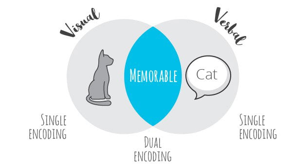
A successful presentation is more than just finding the “right” visuals – it incorporates both visual and verbal triggers – because people differ in the way they receive information.
Recent research has found individuals who identify themselves as “visual learners” when reading words, activate their visual cortex. In other words, they convert the word into an image in their brain. Conversely, people who identified themselves as verbal learners, convert pictorial information into linguistic representations.
What if the decision maker at your presentation is a visual learner? But they’ll be conferring with their key colleague who’s influenced linguistically? The integration of both visual and verbal is essential.
The Evolution of Communication
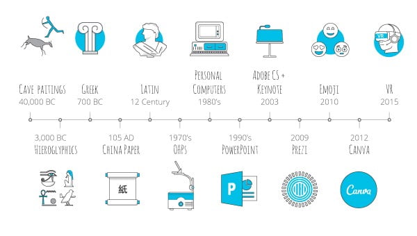
Whilst the physical forms of delivery have evolved from ‘cave to code,’ what have we learned about visual communication?
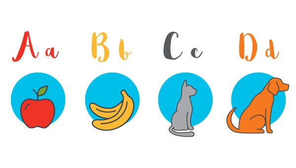
Images are instantly understood
For Example:
From a young age, we are taught to associate words with images or objects
A picture speaks a thousand words
The term ‘A picture speaks a thousand words’ has been traced back to Fred R. Barnard who, on 8 December 1921, wrote an article in the advertising trade journal ‘Printers’ Ink’, about the use of images in advertisements.
In that edition, Barnard posted an ad, “One Look is Worth A Thousand Words.” Although his original message was to do with advertising, his fundamental idea has been utilized by great presenters ever since.
The science behind visual communication
Vision is our primary sense. About 70% of all the sensory receptors in the body are in the eyes. Three days after hearing a piece of information we recall about 10 per cent – if we add a visual, recall rises to 65 per cent.
A supporting image on a slide does more than aid recall; it facilitates the brains ability to understand its meaning – what social scientists term “sensemaking”. Visual stimulation is intrinsic to our sensemaking ability – 40% of our sensory receptors are involved in processing visual information to make sense of what we’re seeing.
Why is vision paramount to sensemaking? It’s how we’ve always apprehended major threats, food supplies and reproductive opportunity.
So what works?
If I say ‘cat’ and show a picture of a cat it is significantly more memorable. But only if the cat picture is relevant to the subject matter!
Before & After Visual examples
Text / bullet points
Pet ownership statistics
- Dogs are the most common pet, with 39% of households owning a dog. There are estimated to be 4.2 million pet dogs in Australia; 19 dogs for every 100 people.
- Cats are the second most common pet, with 29% of households owning a cat. There are estimated to be 3.3 million pet cats in Australia; 15 cats for every 100 people.
- The number of birds is estimated to be 4.8 million.
Data charts
When using data charts ensure the graph you select makes it as easy as possible to understand the data you’re providing.
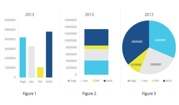
These 3 graphs have the same data, yet Figure 1 represents the differing values of the pet population more clearly. Figure 2 requires you to study the image to differentiate and then mentally calculate the values. Figure 3 requires you to match up the legend – not an ideal option, thus pie charts work best when you are showing an obvious percentage split.
Key Insight
When representing information, only use what is relevant to your message and audience. The data charts above are only useful if your audience is interested in the pet population for all animals. If your intention is to share the ‘cat population’ you confuse your audience with additional information.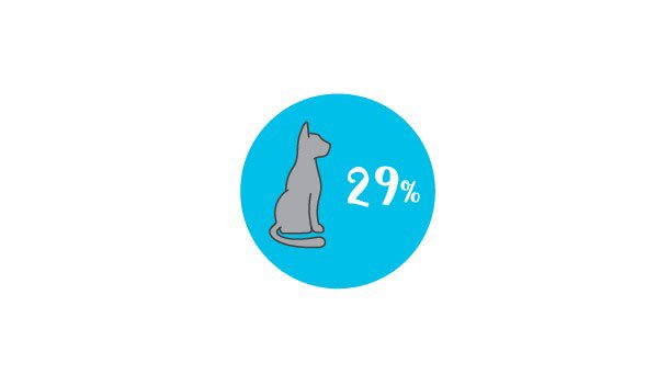
A designer knows he has achieved perfection not when there is nothing left to add, but when there is nothing left to take away. – Antoine de Saint-Exupery
Regardless of the software; Powerpoint, Canva or Prezi the rules remain the same; use simple visual content that supports your presentation.
Today it is easy to become lost in content. Many online and print publications use visual aids to attract readers to their news. Social media platforms give detailed advice to businesses for how best to capture their audiences by combining visual images and words. How many times do you flip through social media feeds or the pages of a magazine, only stopping on an image that catches your attention?
In the fight for attention presenters need to return to basics: provide people with effective shortcuts to help them process the information, otherwise, it will be lost in the mass of information they’re already trying to store.
Application
The aim of presenting is not to speak ‘to your presentation’, rather speak from it – to your audience. You’ll see impressive results if you have the confidence to verbally communicate with your audience, with visual prompts and limited text supporting you from behind.
Visual presentation tools like Prezi allow people to harness the power of images and graphics to create a non-linear presentation that is a more effective way of structuring a compelling narrative, whilst keeping the audience engaged. You can take your audience on a visual journey, keeping them focused on your content, and improving their overall comprehension and recall. But it can be overdone – by using visual elements like motion and zooming for no reason other than it is fun.
Planning is everything. So spend time thinking about the message you’re trying to convey – then see it from the audience’s point of view. Ask yourself, ‘If I had not spent hours learning and practicing this, would I know what I was talking about?’ If not, could you express some of your ideas visually?
Warning: avoid succumbing to presentation cliché: company growth does not need to be represented as a small seedling… in some dirt… in a random person’s hands. Does that really represent what you’re trying to convey?
Likewise, don’t fall into the trap of simply adding visual effects for the sake of it. Thought needs to be given to every element of the presentation to make sure each part is contributing in some way to the overall objective.
Ultimately, there is truth behind the phrase, ‘A picture speaks a thousand words’ – and it’s proven by science! When you are planning your next presentation, remember images and graphics are powerful tools to tell a story, evoke an emotion or even represent something beyond words. But don’t forget, it’s a presentation – express your key points verbally and reach your entire audience.
Emma Bannister
Latest posts by Emma Bannister (see all)
- How to Foster a Culture of Creativity in Your Team - 15th November 2018
- Why It’s Important to Do Your Homework Before You Present Overseas - 21st August 2018
- Hostility in the Presentation Design Industry - 10th July 2018
- What is Visual Tone in your Presentation? - 15th May 2018
- Why It Pays to Invest in a Professional Presentation - 17th April 2018


