What is Visual Tone in your Presentation?
What is Visual Tone in your presentation and, more to the point, why do you need it? This is an article for all of us who have no background or formal training in design, yet still find ourselves having to design a presentation whose message stands out from the crowd. Read on for some simple fixes that will ensure your presentation garners greater respect and that your message does not get lost in the confusion.
Have you ever watched a movie where the actors keep changing characters? Didn’t think so, because it would be totally confusing! It’s the same when it comes to designing your presentation.
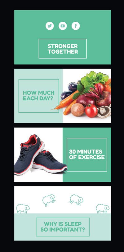
You need to create an overall look and feel, or a theme, that sets the tone for what is to come and gives your audience something to follow. That means developing a cohesive style across your presentation – using a family of colours, font and images that all work together.
To do this, you need to consider how these 3 elements all work together:
- Colour
- Typography
- Layout
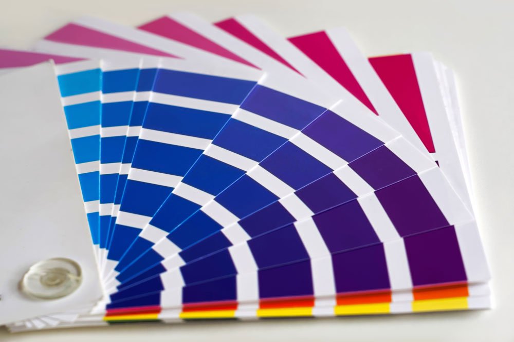
Colour
An excellent presentation isn’t all about using hot fonts and cool colours; your audience won’t appreciate it if they can’t read it. Colour choice can make or break a design. Sure, aesthetics, layout and being ‘on-brand’ are important, but this is not necessarily about using your favourite colours. You need to come at it from the viewpoint of your audience.
Your slides are there to support your audience and help them understand. That means they are helping to clarify your message.
Research shows using colour in business documents has proven benefits: it captures attention, influences our feelings and perception, establishes mood and enhances communication. In fact, colour can increase brand recognition and memory of a message by up to 80%.
Just be careful with your colour choices. While they might look great on your high-resolution laptop it’s important to test on the projector you are going to deliver your presentation. Not all projectors display like your computer screen.
Contrast
Contrasting colours draw attention to your main points and help your audience focus on relevant information. Use two, or no more than three, colours for headings and accents.

High contrast colours taken from an image, then reversed for text, create balance.

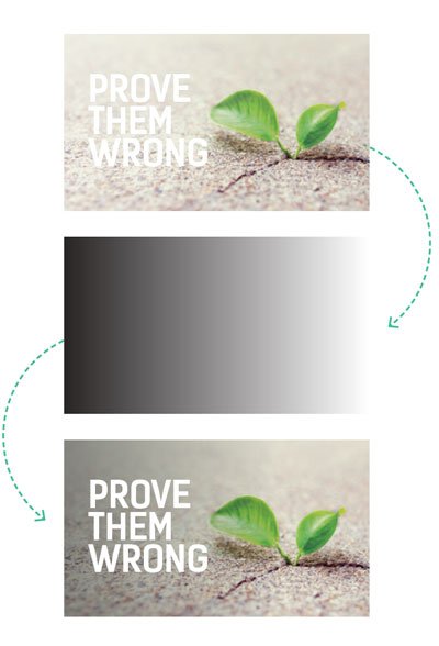
Gradients
If you’re adding text on top of an image, a simple technique is to add a subtle gradient overlay colour block to make it easier to read.
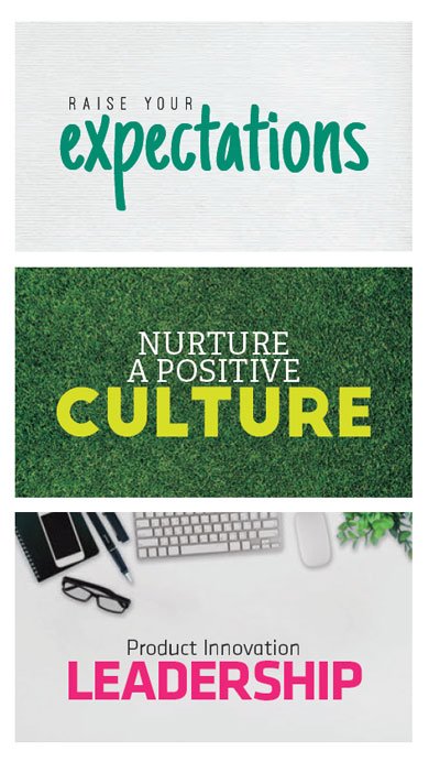
Typography
Typography concerns the design and use of various typefaces or fonts in a way that helps to better visually communicate words. There are thousands of different typefaces. Within each of these are many different styles; they can be fatter, thinner, shorter or taller etc. we call these ‘font families’.
The wrong font choice can be a disaster for your presentation. Your words have to be legible, so your typography must fit with the overall tone and theme, which in turn then has to deliver on your overall objective. Quite a responsibility!
Opposites attract
As with colours, choosing fonts that are too similar (no contrast) serves no purpose. Remember, your eyes need to focus on the important information first and if everything is the same that is hard.
Use up to two contrasting typefaces throughout your presentation.
Layout
Selecting your font is only one piece of the puzzle. Then you need to make it work on the slide – either combined with a visual element, so they both support each other or as a standalone feature.

Think professional media not dull presentation slide. A clear and easy to read layout means an engaged audience.

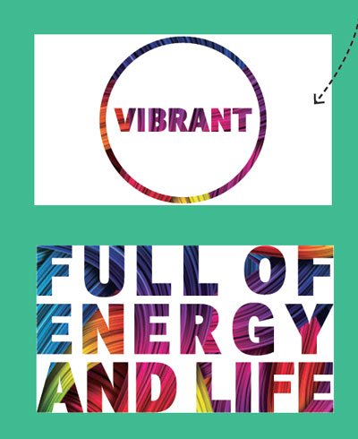
You can have fun with the typography by using patterns or images inside letters.
Above all else remember, keep it consistent – think same characters, the same movie – otherwise your audience will switch off.
For more help, check out Emma Bannister’s book Visual Thinking: How to transform the way you think, communicate and influence with presentations.
Emma Bannister
Latest posts by Emma Bannister (see all)
- How to Foster a Culture of Creativity in Your Team - 15th November 2018
- Why It’s Important to Do Your Homework Before You Present Overseas - 21st August 2018
- Hostility in the Presentation Design Industry - 10th July 2018
- What is Visual Tone in your Presentation? - 15th May 2018
- Why It Pays to Invest in a Professional Presentation - 17th April 2018


