A Simple Three-Step Guide To Creating Better Sales Presentations
Why is it so hard to sell our ideas to other people? What makes people say no to a sales pitch? Why do sales people have a reputation of being dishonest? This article will not answer any of these questions, because quite frankly I don’t know the answers. But I sure do know how to create great sales slides and that is what I am going to teach you. Right here and right now.
Actually, I have my own view to why people fail on delivering their ideas to others when using PowerPoint slides or similar visual alternatives. The simple answer is: you are using it wrong.
How often have we seen presentations where the speaker seems to have written down his whole speech in the slides? Or those that minimize the text size so that they can fit more bullet points? It’s hard to blame these people since this is how we learned to use the software. And ironically, this is the first thing we see when opening PowerPoint – “add some text here” it says with the prechosen bullet points.
This outline is quite convenient since you can jot down your points quickly and move to the next slide. However, the sad truth is that this is not how you should present your ideas – ever.
“Bullets kill people, bullet points kill ideas”
How many sales pitches have you given where the prospect at the end says “We will think it over and get back to you”. They almost never get back. If they are not excited enough right after you have given your pitch, then your presentation was probably not effective enough.
Let’s dive in to how it should be done with these three simple steps:
1) Structure your purpose
What is the purpose of your presentation? This should be the basis of how you will design your speech. In a sales presentation, we usually want to sell our ideas, products or services. We will have a very short time to grab the audience’s attention and convince them to take action.
The way to do this is to have a very clear structure which in the end leaves the potential client with no other choice than to invest in your offer – they should be feeling “if I don’t invest in this, I will be losing out on something really good.”
A good series of well-designed slides can be really helpful to bring the whole story together and bring structure to your speech. Keep it as simple as possible and you will succeed.
The first part of your speech is the most important part. This is when the audience will determine if they like you or not, or in other words, if they trust you or not. This is where you should show that you are there to bring them value, and not to sell your products.
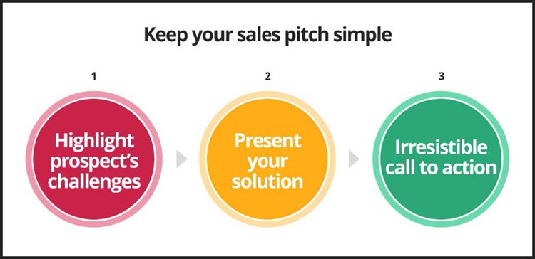
You would not be there if you didn’t believe that you could bring value to their business – make them feel this by highlighting their current situation, what challenges they are facing, and make them relate to what you are saying.
This strategy of simply highlighting the client’s challenges and showing them how inefficient their current solution is, builds up a momentum of “please show us a better solution.” The audience can’t wait for you to present your solution – and once you do it, they will love it since you just visualized what challenges they are going through.
Now when you’ve got the attention of the prospect and taken some minutes to connect with them and identify their challenges, it is time to present your solution. This should be the aha-moment where you show that there actually is a better way of doing it.
Together with the solution, you should present testimonials and real case examples that show the benefits of your solution. E.g. if you are selling a marketing software, show them an example of a client that increased their lead generation with 500% after using your software.
Finally, you should give the prospect an irresistible call-to-action while your relationship is still warm. Give them something that fits their business, their budget, their team.
The same call-to-action might not work for different businesses, so be sure to modify your offer in order to meet their needs. For example, a free trial period is probably the best way to hook the prospect and give them a reason to try your product/service.
2) Know your audience
This is actually the point that most people tend to forget – who are you going to pitch? What do they know about you and your business? What interests them? How can you bring them value? Before you even open your mouth, you need to know their business in and out, so you can clearly show how they will benefit from your services.
There are way too many sales people using the same pitch template to all their prospects which of course is bound to fail. In order to get the attention of a potential customer, you need to adapt your presentation to their needs and knowledge. Make them feel targeted. If you come to my business to pitch me I don’t want to know how good your product or service is, I want to know exactly how your offer can bring me value.
When you know your audience you can adapt your presentation to them, and move from talking about your products, to talking about how to solve their specific challenges.
Let’s say that you are selling a software that helps businesses with their social media tracking. In order to show them the benefits they will receive from your product, you need to compare it to their existing software. And since you already know what they are using (because this was the first thing you asked them in your cold call), you can simply bring up screenshots of their current software and display the process they are facing today. Ask them questions, engage them to make sure that you understand their situation.
This way they will relate and feel that you understand them before you even mention your own product. Too many sales people tend to focus on their own business, and forget that the main purpose for a sales presentation should always be to bring value to prospective clients and nothing else.
Drop the agenda and company introduction slides and start off by connecting with the prospective client. Make them like you right off the bat, because if they don’t they won’t buy what you say. And they will certainly not buy what you offer.
Back to our scenario where you were going to sell a software for social media tracking. Let’s say that the prospect is using several types of software for monitoring their different social channels, while your company has come up with a solution of one software for all social channels. Now tell me, which one of these is more engaging?
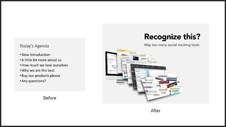
Starting with a slide like this also has an unexpected surprise effect on the audience which definitely catches their attention. The audience expect you to have a slow intro and boring presentation since most sales pitches actually do suck. Open up with an unexpected element like above and they will listen to you.
After the purpose is clearly defined and we know who our audience is, we have the basis for putting together a compelling story that will make your pitch stand out from the rest. There are tons of resources online that share the art of storytelling in presentations so I will not go deeper into this here. You can start off at the Ethos3 blog that shares some great insights on this topic.
Together with the purpose of your presentation, you should adapt your slides to your audience as well. The same set of slides will not have maximum effect if you are presenting to a group of investors, doing a TED talk, or giving a sales pitch.
By knowing your audience and their demographics, you can design your slides in a way that brings maximum value – which essentially means to transfer your main idea or point to the audience in a clear and effective way. So how do you do this?
3) Design your slides
Now we get to the design – my home turf. It is still surprising to see how many companies fail in this aspect – they put all their time, energy and money in their products, billboards, TV ads, flashy websites, and then present the results in a standard PowerPoint template. Skip the templates once and for all. Don’t ever use them again since they have never ever helped you.
Here are the basics you need to know to create beautiful presentation slides:
Keep it ridiculously simple
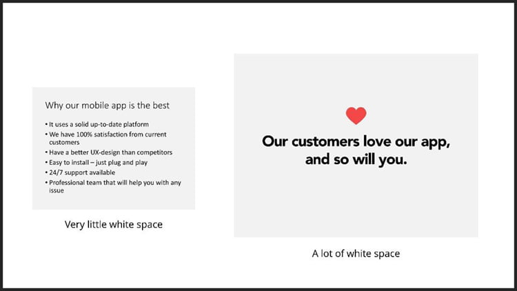
As silly as it sounds, it is very hard to keep things simple. Let your content breathe with as much white space (i.e. the empty space in your slide) as possible. Try to resist the need to fill every part of the slide with content. By keeping it simple and clean, you will draw attention to your content, and even make it more legible.
More slides, less text
A common misconception is that the more slides you have the longer your presentation will take. This is simply not true. The fact is that your content becomes much easier to grasp if you break it up in multiple slides. So, rather than putting five important key points on a slide, break it up into five slides. A rule of thumb is to keep one idea per slide so that the audience instantly gets the idea, and then turns their focus to you and what you are saying.
Remove the bullets
Sometimes it can be convenient to list up your key points, and if you insist on doing that, try removing the bullet points and just keep the text. Steve Jobs used this strategy in his presentations and Apple is pretty famous for its minimal and clean presentations.

This SlideShare shows 13 awesome alternatives to using bullet points.
Use only Sans Serif fonts

Arial, Calibri, Segoe UI, Helvetica, Verdana, and Tahoma are all sans serif fonts that work perfect in presentations. In contrast, serif fonts are those with a little decorative flourish at the end of certain typefaces – e.g. Times New Roman, Georgia, Garamond. You should not use these fonts in your presentations since they tend to be less legible (and not so modern).
Avoid the standard colors
The standard colors in PowerPoint are overused and quite boring. Go to a site like color.adobe.com and choose 2-3 colors that you like and think would fit your presentation. Copy the RGB color code and paste it under the “More colors” option in PowerPoint to add the color there. It takes less than a minute and brings a fresh touch to your deck.
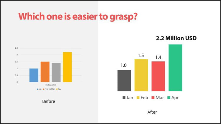
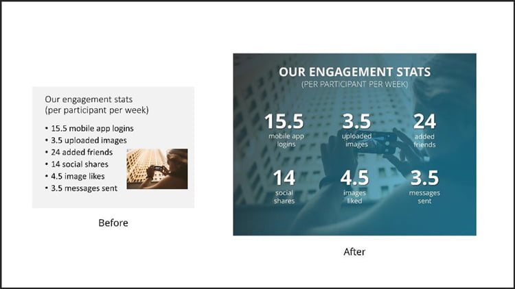
Simplify your charts
Whenever you want to present data in graphs, make sure that you only highlight the relevant numbers and delete everything else. There is no reason to present the revenue numbers for the whole year if you only want to show the increase from last year. There are also several unnecessary elements when you insert a chart in PowerPoint, so cut away the things you don’t need. Simplify simplify simplify!
Use fullscreen images
The easiest way to make your slides visual is to use fullscreen images. There are tons of sites that offer free high-resolution images (e.g. unsplash.com or stocksnap.io) – find a relevant image, place it so it covers the whole slide and place your content on top of it. You might need to make the image darker or lighter so that your content stays in focus (easiest way to do this is to add a colored transparent box over the image).
Use your slides with care
Always keep in mind that your slides should be there as a support and the main focus should be on you as the presenter.
If you don’t want people to read off your slides and instead listen to what you are saying, then try to minimize the amount of text you put there. And if you still think you need all the content and bullets you have listed up, at least break it up in multiple slides.
Your slides should not be a distraction. They should catch the audience’s attention in the few first seconds when you click them up, and then the attention should go towards you and what you are saying. Don’t let your slides bring you down!
If you want more tips and tricks on how you can spice up your own slides, feel free to connect with me.
Damon Nofar
Latest posts by Damon Nofar (see all)
- Who Needs a Presentation Designer? You and Here’s Why - 12th February 2020
- A Simple Three-Step Guide To Creating Better Sales Presentations - 6th June 2016


Abigail Lee
25th June 2019 at 12:16 pm
Hey Damon – Thanks for this informative article. It really helps to enhance my presentation skills. I would like to share some enthusiastic articles with you which I have found on https://www.slideteam.net/blog They definitely have some rare PowerPoint tricks up their sleeves which can be mastered by a beginner too.
moreslides
10th September 2019 at 10:36 am
This blog is very helpful for creating best sale presentation
Rosie Hoyland
11th September 2019 at 8:58 am
Thanks – I’m glad you find it useful
Claire Rutherford
26th November 2020 at 12:00 pm
Great article! Highly informative. If anyone is looking for some presentation tips and tricks I would highly recommend http://www.slideuplift.com
Business professionals would find their content highly useful.
Robert
22nd February 2021 at 5:07 pm
Beware of slideuplift and slideteam as they are scammers. They promote their sites under false names and then charge people for crappy templates.