From Bullet Points to Visual Presentation – and Why It Matters


If you have tried in the past to use more pictures in your presentations but you’re not quite convinced, keep reading and take a second look at what’s possible and why it matters. In this article, Robert Lane shares his helpful and relevant advice on how our brains behave when faced with text over visuals.
In a previous article, I showcased how some governmental agencies and businesses in the U.S. are beginning to look at PowerPoint differently — transforming it into a kind of content management system, where highly visual presentation topics are instantly available on demand via dashboards like the one shown here.
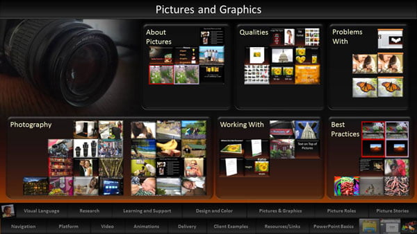
You, too, can present this way, dynamically selecting what to show at any moment — but first we need to look a little more closely at the “what you show” part. It doesn’t matter how good your organizational system is for quickly finding and displaying information on demand if that content is garbage to begin with (otherwise known as bullet points).
Bullet points are unacceptable, period, forever, always, amen. They should never appear on slides, ever.
Fortunately, numerous engaging visual alternatives exist, and they don’t have to involve special software or super-fancy technology. The best, easiest, most readily available, and arguably most effective solution has been, and always will be, the humble photograph. But I’m not talking just any photograph. Images can be good or bad. What you put on your slides really matters.
By the way, if these articles strike a chord and you need more information on how to fully implement dynamic visual presentation strategies, this book series can help. But you don’t have to know all that stuff to get started. Keeping a few key concepts in mind goes a long way. I’ll share those now.
What Text Does to the Brain
Before doing so, though, I’ll address a question that may be lingering in your mind. Why? Why do we need to replace the text with visuals? Why does it matter? How does that improve a presentation?
Some years back, researchers in Australia wanted to know what happens when we try to read text on a piece of paper or on a screen, such as a website or presentation, while someone is talking about the same subject at the same time.
They found that although we see written text with our eyes, we process that information in mostly verbal areas of the brain. This fact is intuitively obvious if you think about it. What happens when we read a book silently? We can hear those words in our head, right? It’s as though someone is sitting beside us reading aloud.
And that means bullet point presenters have a big problem. Verbal processing is serial. Our brain can only deal with one source of verbal input at a time. It physically can’t process two sources simultaneously.
You already know that. What happens when two people stand in front of us talking at the same time, both trying to get our attention? We say, “STOP! WAIT! One at a time, please.” It’s like trying to brush your teeth and comb your hair at the same time. You can’t do it.
So, here’s the rub. When we show bullet points and expect viewers to read that information while we simultaneously read or summarize those points verbally ourselves, audiences suffer. We’ve just given them two forms of verbal input at the same time and asked them to make sense of both. They can’t. It’s biologically impossible. Our entire presentation puts them in a position of trying to understand two people talking at the same time. They might try to do so for a little while, switching back and forth between reading and listening to us. Eventually they become frustrated and stop paying attention altogether. It’s one of the main reasons why people hate PowerPoint presentations so much. Text-based talks are uncomfortable and annoying.
An entirely different situation occurs when we display meaningful imagery and talk at the same time. True visual input, such as a picture, gets processed in entirely different brain regions, and that processing is parallel, meaning we can process more than one stream of visual input simultaneously. Likewise, we can easily process verbal and visual information together. Viewers have no issue scanning our slide visuals while listening to our words. It’s why we can watch an action movie, with objects exploding and flying all over the place, and yet still pay rapt attention to the ongoing dialogue.
Visual and verbal information work well together. In fact, they seem to enhance each other. Other studies suggest we see more when we hear, and hear more when we see.
Cleaning up slides and eliminating most of the text is an imperative, not only to form slides that are more visually interesting but to eliminate the conflict produced by two sources of verbal information. It’s one of the most critical changes you can make. In an upcoming article, I’ll step through the procedures for converting existing bullet points into more engaging alternatives. For now, let’s pursue the fascinating adventure of making good picture-based presentation materials. All pictures are not created equally.
Full-screen Pictures
The idea of removing text from slides entirely is a serious mental hang-up for many presenters, and we’ll talk about that in more detail later. For now, go out on a limb and move slide text to a handout, or simply deliver those details verbally. One way or another, the bullets have to go.
Once that task is complete, you’ll have a whole lot of empty and available real estate left over. Take another radical step and fill the entire slide pane with a picture. I say “radical” because so few speakers ever display full-screen pictures. I’m not sure why not. It’s as though there’s some kind of law mandating that all pictures have to be accompanied by text — if nothing else, a title. Resist that urge. Make the picture as big as possible and forego the text entirely. You can always fill in details about the image verbally.
Again, why does it matter? I discovered a couple other interesting studies while working on my master’s thesis. Researchers used eye-tracking software to see where our attention settles when we look at a webpage or article filled with a combination of text and images like the one shown here.
They found that 90% of the time our gaze gravitates first toward the largest image and then scans lesser images, eventually settling on the text – maybe – if the images first evoke enough interest.
The implication of those studies for presentation design is profound. When your slides contain text and a small image off to the side, guess where audience attention lands first. Yes, it’s irresistibly attracted to the picture. The brain wants to know what that picture represents, why it’s on the slide, and what it’s supposed to mean. If that’s true, why not give viewers the satisfaction of scanning big and bold pictures. That way, there’s nothing to distract from engaging visual stimuli. Displaying a large picture – and only that picture – tells people, “Hey, this image is important. Pay attention to it. There’s a reason why I’m showing it to you.”
Here’s how I demonstrate in workshop sessions the difference between having text and a small picture verses a single large picture.
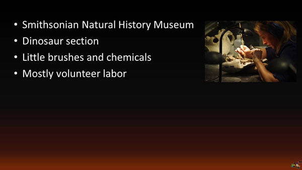
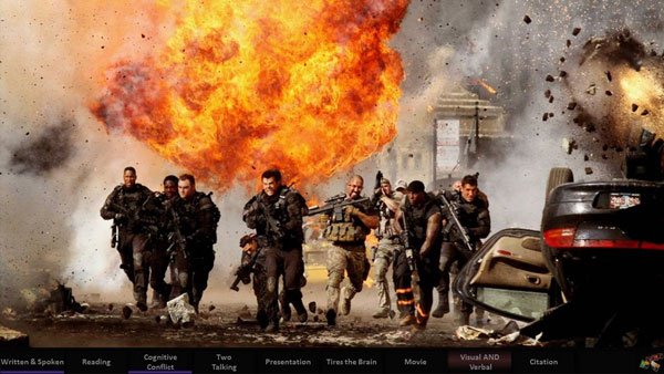
I display this slide and talk about a visit to the Smithsonian Natural History Museum in Washington, D.C. In the dinosaur area, there’s a large glassed-in section where you can watch volunteers meticulously cleaning fossils. They use chemicals and tiny paint brushes to carefully and patiently remove dirt and stone. I spoke to one of the attendants in the area and she told me that a vast majority of the fossils these volunteers finish will be categorized, and then probably go into boxes to be stored, possibly never again seeing the light of day.
That surprised me. I wondered why they would be willing to put in so many laborious hours, without pay, on pieces of bone that probably no one will ever see. The attendant replied that their motivation is simple. Maybe, just maybe, someday a particular fragment will turn out to be a missing link that changes the way scientists think about our world’s history – and perhaps even life itself.
I then ask trainees, “Did I really need those bullet points on the slide to tell you the story? What if I showed only the picture, as big as possible, while filling in the explanatory details verbally? Then you would be able to clearly see the tiny brush, the chemicals, and the concentration on her face.”

It’s funny. When I show that second slide, I can always immediately see in people’s expression that they get it. The larger picture, without distracting text, is so much more effective at helping explain the scene.
Content Versus Decoration
Returning to the eye-tracking research for a moment, did you pick up on another vital lesson it teaches? If pictures automatically and powerfully capture our attention, clearly the brain places a high value on assessing the relevance of presented visual information. When we insert a picture onto a slide, it’s like bait to viewers’ visual cortex. All attention goes toward figuring out why that picture is there and why it matters.
That fact can either help or hurt you. If the image successfully conveys meaningful information that helps a speaker explain, model, clarify, or otherwise expand upon the words being said, it’s valuable – and perhaps even essential. On the other hand, if the picture is nothing more than irrelevant fluff intended to merely fill space or add color, it more than likely distracts attention and diminishes your effectiveness. Brains are left wondering, “Why is that picture there? It doesn’t seem to be showing anything significant or useful. What does it mean? Why are you wasting my attention with this?”
A critical part of mastering visual communication is learning to differentiate between what are known as content pictures verses decorative pictures. Most PowerPoint users don’t have a clue about the distinction between the two, nor do they grasp the significance of understanding. I’ll classify the two in very stark terms. Decorative pictures are worthless. Content pictures are gems. Sadly, the vast majority of modern presentations contain nothing but decorative pictures – the worthless ones. You’ll see smiling models in suits, or any number of other staged stock images that at best only relate to the topics being discussed during the talk in a tangential, associative way.
A classic example of decoration is projecting a picture of perfectly groomed, ethnically correct, shaking hands while talking about a new partnership, teamwork, cooperation, shared goals, or something similar.

Yuck. Everybody knows what shaking hands look like. These hands don’t belong to the partners in question, nor to the team members. This image contributes absolutely nothing useful to the ideas being expressed. A person’s brain takes one look at it and says, “Why the heck are you wasting my time with this worthless, staged visual? Show me something I can analyze to better understand what you’re trying to convey.”
A content picture, conversely, does contribute something useful and meaningful. For example, a real picture of partnership representatives shaking hands in a ceremony, although not especially exciting, would be more meaningful and significant. It’s worthy of scrutiny. Or a content picture in this context might show the team in question working together on an actual project. It contributes extra detail that would be hard to express verbally.
Apply these litmus tests to further distinguish between content and decoration:
- If a picture can be removed from a slide without detrimentally affecting the overall message, it’s almost surely decorative in nature. We could remove the manicured shaking hands from the discussion of partnership or teamwork and nothing of substance would change. But if removing the picture would somehow result in less understanding, less entertainment, less persuasion, less humor, or less of anything else helpful, it is content.
- If you feel reluctant or embarrassed to display a picture full-screen, the image probably is purely decorative. Recall that a full-screen picture makes a bold statement and essentially yells out, “Look at me!” Displaying a meaningless or tangentially associative picture so prominently is kind of silly. It’s like you’re telling the audience to really focus on this picture, when in fact there’s nothing significant there to see. Replace such a visual with something more meaningful.
- If you find yourself referring to a picture with phrases like: “As you can see here … ” or “Here’s an example of what I’m talking about … ,” it’s content. Similarly, drawing attention to specific details in the scene while making points assures a content classification. There’s no reason to focus attention on a decorative picture.
- Finally, if the picture plays any of the more substantial roles found in this Picture Roles Guide, it’s automatically content and probably is an important part of your visual communication strategies.
To sum up this topic, decorative pictures in your presentation materials are harmful and should be eliminated across the board. Look through your current presentation materials and categorize all existing pictures. In some cases you’ll be able to replace the decorative ones with better options. Otherwise, delete them. Find a more complete guide to getting the most out of your pictures in book 2 of this series.
Picture Stories
One of the most versatile and professional ways of integrating images into speaking topics is by leveraging what are known as picture stories. A picture story is a short presentation, typically 3 to 10 slides long, that sequentially illustrates (makes visual) aspects of a verbal story. The presenter gradually scrolls through the images while presenting, creating an effect that draws people into the scenes as though they were a part of the story.
Most dynamic visual speakers organize such stories on a dashboard like the one shown here that give random access to any story at any time.
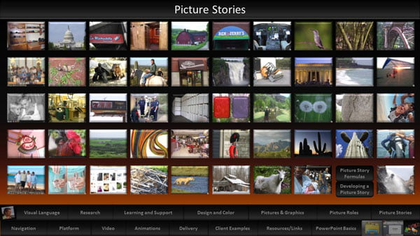
The thumbnail images representing the hyperlinks here always show a familiar and representative scene from the respective story, and that visual cue helps the speaker quickly find any desired story.
Picture stories can take on several forms, but most of the time they are narrative in nature, meaning the speaker tells the story from beginning to end and the images shown at intervals along the way help bring that story to life in ways that words can’t.
Here’s an example of that strategy—in a non-presentation context, actually. Picture stories work exceptionally well in just about any communication circumstance, whether it be in front of an audience, or in my case, an appeal to local government officials.
I am an avid gardener and recently built a structure in my garage for growing plants from seeds—up to 7,000 at a time if I want that many. It’s complete with automated grow lights, water delivery, and the works. The only problem was that it was taking up too much space in the garage and I decided to move it to an outside location. But that was problematic. As it turned out, I couldn’t do so without a permit from the county.
To make sure the permitting process went smoothly, I put together a picture story for inspectors that showed all aspects of how the electrical components would be protected from the elements and exposure to water in general. It featured 13 pictures in all, along with written descriptions of what those pictures represented.


To my surprise, the visual illustrations and descriptions were so effective that the development services people approved the project without even asking any follow-up questions and without conducting an onsite inspection. I had never seen that happen before. The images apparently so thoroughly placed them into the scene that there was no need for additional detail.
And that’s exactly what we as presenters want to create for our audiences, visually pulling them into situations as though they themselves had been present. Such experiences are practical, entertaining, and educational. I suggest having at least two short visual stories in every performance.
When Pictures Are Unavailable or Insufficient
Visual communication, of course, is about more than just pictures. Sometimes photos just don’t work, especially when dealing with abstract concepts. Or, finding the right depictions might be impossible or impractical. You’ll need other strategies in your visual vocabulary collections as well. That’s a subject for the next article, to be published next month. We’ll dive into visual expression that goes beyond explicit, direct picture use. Then, in the final article, I’ll tie all these ideas together to provide a practical guide for converting bullet points into more engaging content.
Here’s a hint about that process. You’re not going to find formulas, software, or machines that take in bullet points at one end and spit out visuals at the other. Your brain, and its creative imagination, must be involved from start to finish. Stay tuned.
Robert Lane
Latest posts by Robert Lane (see all)
- From Bullet Points to Visual Presentation – Making it Interactive - 9th February 2017
- From Bullet Points to Visual Presentation – Finding the Right Images - 17th January 2017
- From Bullet Points to Visual Presentation – and Why It Matters - 22nd December 2016
- The Secrets of Powerpoint – and How They Can Help You - 20th September 2016


Jim Harvey
22nd December 2016 at 11:00 am
Brilliant article Robert, thank you. We’re so proud to have you on board as a part of the team here at Presentation Guru. I loved the example from your home garden. Brought the whole thing to life. Regards Jim
Shane Purnell
22nd December 2016 at 12:45 pm
Finally, a cogent article on PowerPoint/Presentation visuals. You have very clearly covered what I try to teach my corporate brothers and sisters. Would love to see the research you referenced. Again, great job.
Robert Lane
22nd December 2016 at 3:44 pm
Thanks, Jim and Shane!
Shane, visit the link below to download a research summary that lists about 80 studies related to the use of hyperlinks and visuals in media. Sadly (and unbelievably), very little such research seems to exist in a direct PowerPoint context–despite hundreds of millions of people using the software–but a lot can be found in other forms of media such as websites, gaming, online learning, and so forth. I would love to hear of any newer research as well.
https://www.aspirecommunications.com/visual-language-research/
Harcharan Singh
3rd February 2020 at 6:53 am
Wonderful insights into what presentations really are rather than those using a laptop, powerpoint and a speaker. I’m impressed with your deep knowledge of the subject and look forward to the next pat of how we can use pictures and no words on powerpoint to string up a beautiful presentation Robert Lane.
Rosie Hoyland
4th February 2020 at 9:31 am
Thanks Harcharan – you will find it at https://www.presentation-guru.com/from-bullet-points-to-visual-presentation-finding-the-right-images/