From Bullet Points to Visual Presentation – Making it Interactive
In this article, Robert explains in detail how to transform your presentation into one that can be connected through hyper-links, giving you the control to navigate your audience. This freedom provides the ability to interact and engage with your audience in ways that a linear slide by slide delivery cannot facilitate.
This article is the last in a series of four looking at how to use PowerPoint in a dynamic, flexible, highly visual way. Visit the following links to see the other articles: The Secrets of PowerPoint, Why It Matters, and Finding the Right Images.
So far we’ve explored a concept called visual language, where a presenter dynamically chooses between potentially hundreds of highly visual slide shows while speaking, in effect having a tailored “visual conversation” with audiences that is full of interactivity and customized delivery. And we looked at best practices for integrating pictures, shapes, and animations into slide shows to create the necessary content.
One key subject remaining is figuring out how to transform your existing linear, bullet-point-filled presentations into this new interactive format. The process is somewhat messy, inexact, unpredictable, and – without at least a few best practices – potentially frustrating and downright daunting. Yes, this is only PowerPoint, but don’t be surprised if, when looking through your old materials, you initially draw a blank thinking, “How the heck am I going to convert all these words into little packets of visual information?”
The short answer is: you won’t. Moving from text-based presentation to hyperlink-powered visuals is rarely a one-on-one conversion from one to the other. You’ll never find convenient formulas or software that let you magically plug a bullet point into one end, with an appropriate visual popping out the other end.
Conversion doesn’t work that way. For that matter I can’t give you any fixed rules to go by, either. Don’t expect right or wrong ways of doing it. The best practices I’ll offer are subjective. You may come up with entirely different procedures and they could work as well as mine.
That said, my colleagues and I have 20 years of trial and error behind our thoughts that can guide your decisions and save a lot of wasted time. See what you think, at least.
Modularity
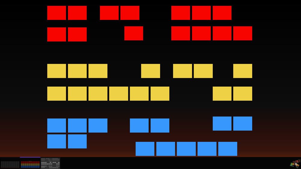
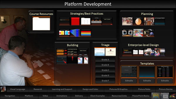
To take full advantage of a visual language presentation style – meaning using dashboards in PowerPoint to access individual topics in any order, on-the-fly – your speaking subjects should be as modular as possible. Said another way, you must break down existing long, linear presentations into many separate pieces – that is, separate slide shows. A show currently containing 60 text-based slides might morph into 20, 50, or 100 individual slide shows instead, each holding a handful of slides at best.
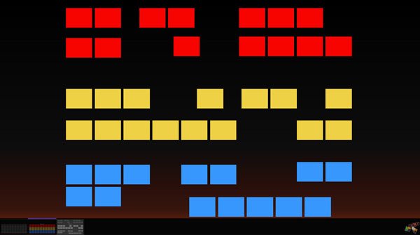
Yeah, I know. How ridiculous, right? Why strive for so many separate little shows when, at present, you can easily scroll through the entire collection of ideas during a talk and be done with it? The reason is because some of those ideas might be needed again in a future talk, but probably not all of them, and not necessarily in the same order. When core, reusable ideas exist in their own shows, you’ll have freedom to create any needed sequence of topics in the moment, with mere hyperlink clicks. Anything can be included or left out, or moved around in the timeline, without PowerPoint force-feeding you a strict diet. You’re setting aside the notion that slide shows are disposable and meant only for a single performance. Now presentation is a series of choices, kind of like the way we humans string together verbal words into a practically infinite number of possible sentences.
When thinking about an upcoming talk, you’re not thinking ONLY about that event. Ponder everything upcoming, and all conceivable audiences you might face. Consider all situations where your presentation materials might be useful for spontaneously displaying something – whether it be over a cup of coffee, while collaborating with a team, in training situations, or during formal presentation activities. Then, build high-quality, valuable, reusable, engaging content that exists as individual topics ready for quick display in any context, as needed. That construction doesn’t have to occur all at once, of course. You’ll prioritize the most valuable, frequently needed elements and build those first.
Think about a grocery story.
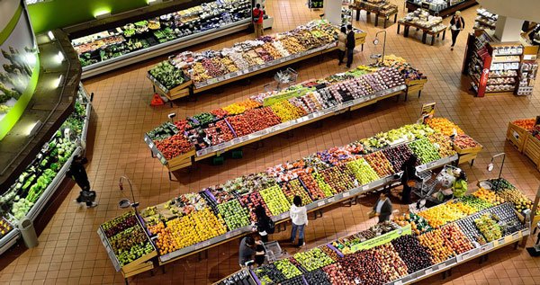
How outrageous would it be if they simply handed you a box of preplanned items they think you should buy? That’s equivalent to giving a talk with a standard linear presentation. You don’t have a choice about what’s in the box—whether it’s wanted or not, and when it might be wanted.
On the contrary, a grocery store is a reusable resource, an organized repository of all items desired on any given day. You get to pick and choose which items go in the cart, and those choices usually vary with each visit. The store doesn’t change much from week-to-week. Its thousands of products are there waiting, and are sufficient for just about any dinner anyone might want to cook. Only a tiny fraction of those options will be chosen.
Dashboards displaying content choices are much the same.
They hold all your key topics—perhaps hundreds. Today, tomorrow, and next week you’ll display a few of the choices to support a keynote speech, give a talk to the board, deliver a conference presentation, or discuss a proposed project with concerned neighbors. The dashboards – other than being occasionally updated or expanded a little – don’t change much along the way. Everything waits for your choices about what’s relevant right now.
Without such modularity, you sometimes would have to scroll through perhaps 30 or 40 irrelevant slides just to reach two or three with information pertinent to a question just asked or necessary for making a spontaneous point. That would be silly, not to mention unprofessional.
Content Grading
Hold on, though. Before tearing apart old slide shows and transforming the resulting scraps into visual gems, first complete another vital step. Look through existing bullet point groups and give them grades. Doing so will save your sanity.
All bullet points are not created equally. Some, as we’ll see, are garbage and should be ignored altogether. Others, although perhaps worth a mention, are not worthy of the time and resources required for visual conversion. Only the most critical subjects deserve the creativity, time, resources, and energy you’ll devote to making high-quality visual vocabulary.
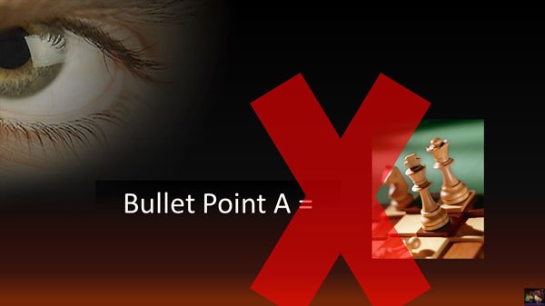
Start with a ground rule commitment. You will never again, under any circumstances, place a bullet list on a slide in your new presentation materials. No excuses. No justifications.
With that baseline in mind, gather together all old presentations. Look through each slide/bullet list and ask, “How much is this information worth?” Give each one of the following grades and take suggested actions accordingly.
Grade F
If the worth is “not much” or “nothing,” maybe trashing the slide altogether is best. You’ll likely find a lot of garbage when looking back through old shows. Almost certainly you occasionally copied slides from one show and pasted them into another being made for a new talk. In that case, analyze only the most recent version and trash all duplications. Likewise, throw away any material that is out of date or no longer needed.
Grade D
When the information has some value but never was worth spending much time on, consider moving such details to a handout and referencing it there. Create a simple slide that summarizes the points as a whole and mention them quickly in passing.
That slide might hold nothing more than summary text in big, bold letters.
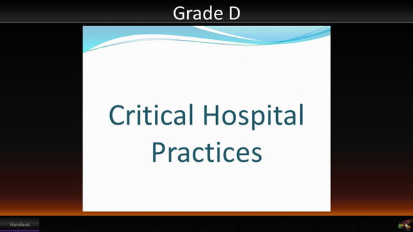
Or it might feature a generic image that provides context.
For example, let’s say you are a medical professional. A small part of your current talk addresses the symptoms of vitamin D deficiency in infants, but you don’t have time to go through these symptoms in detail. Besides, people can read more about the subject on their own. Displaying a slide like the one shown here is good enough, while mentioning that further information is available in the handout, on a webpage, in a downloadable white paper, or whatever. Such details DO NOT have to be shown on the slide.

Grade C
Bullet points in the next level up are important enough to talk about one-by-one, but they still are not worth a lot of time or resources. Probably in the past you faded in each of these points sequentially while adding more information verbally.
I’ll give you a recommended design that, although better than a standard bullet list, honestly is not dramatically better. Keep in mind this kind of content still is not your really good stuff. You want people to hear and know it, but realistically you’re aware they probably won’t remember the specifics a week from now.
What you’ll do is separate each of the points onto its own slide, simplify the text as much as possible so that the phrase contains a minimal number of words – ideally five or less – and then give that text a large font size. Most people go a step further and then place a context picture in the background that relates to the points being made.
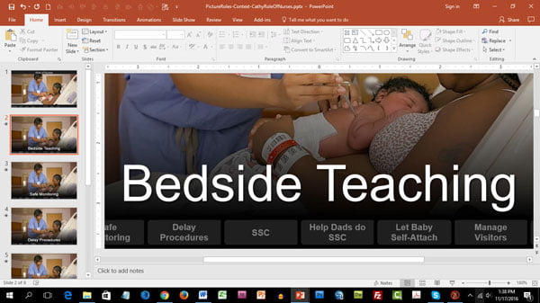
The slide show shown here in edit mode is a good example.
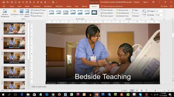
It highlights the roles nurses play when working with a mother and new-born baby. Each role sits on its own slide and the same generic context picture of a nurse with patient appears across all backgrounds. The presenter walks through each point, one at a time, in a way similar to moving through a bullet list. So, in that since, this form of content is not the greatest in terms of visual quality. Even so, at least the points stand alone with very simple text. The viewer can quickly absorb that phrase and then return focus to the speaker, without any other text visible to distract or annoy. As such, there is no conflict between the slide words and the speaker’s verbal words, as would normally be the case, because the written text can be read and processed so quickly, before the presenter even begins elaborating.
Notice, also, that this show, although linear, does have a navigation strip at bottom. A presenter doesn’t necessarily have to go through all the available points, and can take them out of order if desired. It’s one more superiority over a traditional bullet list.
Grade B
The last two grades apply to points representing vital concepts – and by vital I mean you want viewers remembering as much about them as possible. These messaging components do deserve special attention. Grade B points, for example, not only get their own dedicated slides, they also should be represented by meaningful visuals, if possible – such as a relevant picture, a shape graphic, a video, an animation, a drawing, or some other powerful form of expression the brain can analyze as a way of enhancing understanding.
I use the show displayed here during workshop sessions to discuss what you should know when using your presentation platform in an online environment. I outline the pros and cons of various online presentation services such as Webex and Adobe Connect. I caution them that sending video through one of these services may not look as good on the other end as expected.
I warn them that viewers in a faraway country (such as someone in Australia watching a presentation originating in the U.S.) might experience several seconds of delay in what they hear compared to what they see on their screen. All the points in this show are important and every slide contains some form of meaningful visual that contributes to my words.
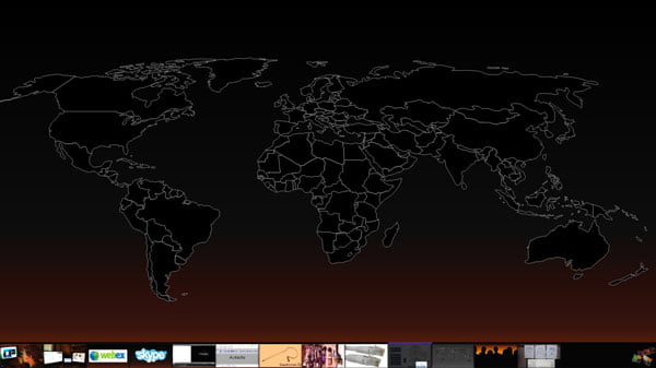
For example, on the last slide I highlight the fact that online presentation has a very different feel compared to an onsite talk. You know the audience is out there somewhere, but normally you can’t see their faces or even hear their voices. While presenting, it seems like you’re talking to the wall, as though no one is there. Some say it feels awkward and kind of scary at first.
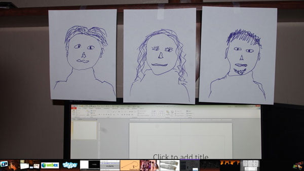
I point out one strategy that can help. Wherever you are, tape drawings or pictures of faces around the room, as though people really are physically in front of you. Look into their eyes while talking. I know. The concept sounds really weird but it works. Delivery doesn’t feel quite as strange when you can “see people” (albeit imaginary) in your virtual audience.
Grade B content still exists as multiple topics inside a single linear presentation. Each slide is a new and separate topic. The speaker normally scrolls through the 5 to 10 slides available to cover all topics related to the theme at hand. The primary differences with Grade B content over Grade C content is that the visuals in the background are more than mere decoration or context and the slides normally don’t contain, or need, accompanying text.
Grade A
Your core, most essential topics receive Grade A attention. These points are so vital they deserve more than just their own slide. They warrant their own separate slide show. In other words, to explain these points, you’ll open a small slide show that typically holds somewhere between 1 to 4 slides. Scrolling through the show visually depicts different aspects of that single topic.
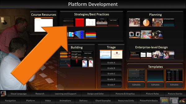
My dashboards, quite honestly, feature probably 90% Grade A content. Over the past 15 years or so I’ve had time to focus in on the ideas in my profession that really matter. I’ve devoted the necessary resources to make these topics the best they can be visually. I teach these subjects frequently in workshops, after all. They are my bread-and-butter knowledge, the concepts I really want you to remember and implement. They are worth that kind of attention.
Each dashboard link opens one of these little shows. For example, the thumbnail indicated here with a green arrow displays a show with three slides.
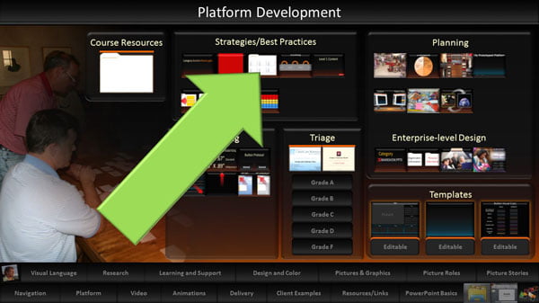
That show’s overall purpose is to explain an essential strategy called a “platform folder.” Slide 1 highlights the fact that you should place all the individual shows discussed so far in this article inside a single folder on your computer.
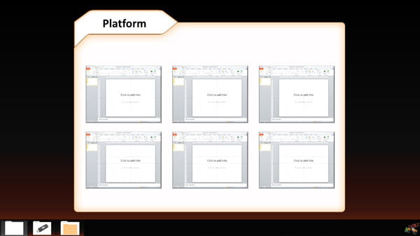
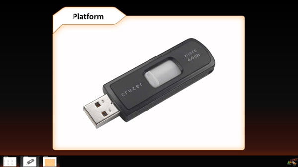
The second slide explains why. Having all your presentation platform components (dashboards and individual slide shows) inside a single folder guarantees complete portability across all devices, without links breaking or anything else going wrong. You can store your materials on a thumb drive, on an external hard drive, on another computer, or even in the Cloud. The location doesn’t matter. All is good, and will be good, if you locate everything inside a single folder.
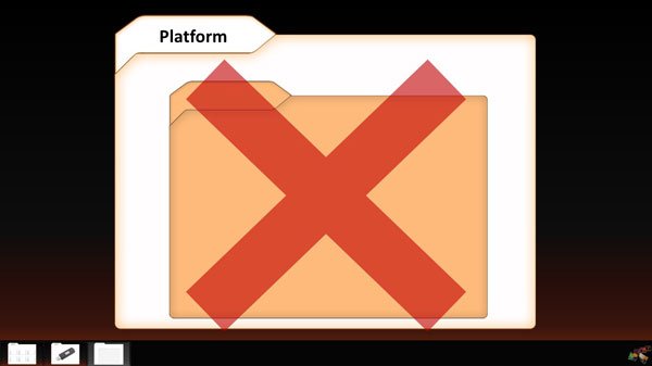
The third slide goes on to recommend not placing any subfolders inside this one main folder. You’ll organize its slide shows in a different way, using what are known as “naming conventions.”
At that point I then click the link here indicated by the orange arrow, to walk through that show’s four slides to discuss naming conventions. Then I go from there to another topic, and from there to another topic, and so forth. Grade A slides always contain high-quality and meaningful visuals that tangibly contribute in some way to understanding.
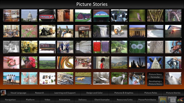
Sometimes Grade A content is a picture story. I have a dashboard for those shows as well, all filled with carefully selected images.
The point is that these best-of-the-best content shows, regardless of the number of slides they contain, concentrate on a single topic only. The presenter scrolls through one of these topic shows after another to complete the talk’s overall agenda.
Persistence
Here’s one more tip about the conversion process to preserve your sanity. IT DOESN’T HAPPEN OVERNIGHT. Getting a presentation platform in place, with all its separate slide shows, takes time and persistence. The effort is worth it, but don’t get discouraged by what at first might seem like an impossible project. Concentrate initially on only the highest priority materials that will be useful in the immediate future. Then gradually build out the rest of the platform. That “gradual process” might takes months, or more likely years. In fact, a presentation platform is never actually finished. You’ll always be adding to it, updating components, and perhaps occasionally rearranging its organizational structure to simplify finding content.
It’s similar to designing and maintaining a large website. Creating the initial structure takes a fair amount of effort and time, but once that content is there, maintenance and expansion is straightforward and easy. And prepping to use this material is a breeze as well. Most, if not all, of what you’ll present already exists as quality, reusable shows waiting to be selected on demand. Usually when I give a talk or conduct training, the preparation time is minimal. I already know the content well. Planning an agenda comes down to deciding which links to click, and when.
Of course, sometimes you’ll need a new show or two for a particular event. That content receives a generic design as well and gets integrated with the rest, ready for reuse in the future with another audience.
The bottom line is this. Planning talks and building content takes time and effort no matter what. Why not put in a little extra thought and energy to contemplate the big picture now and then build a high-quality, well-organized, flexible, reusable library of topics that serves presentation needs for years to come? The strategy is efficient and the outcome valuable. It just makes sense.
Robert Lane
Latest posts by Robert Lane (see all)
- From Bullet Points to Visual Presentation – Making it Interactive - 9th February 2017
- From Bullet Points to Visual Presentation – Finding the Right Images - 17th January 2017
- From Bullet Points to Visual Presentation – and Why It Matters - 22nd December 2016
- The Secrets of Powerpoint – and How They Can Help You - 20th September 2016


