What Are the Simple Rules that Help Us Design Better Visual Aids?


You don’t need to be a PowerPoint expert to create effective visual aids
The rules I outline here are based on scientific research and human experience. I recommend that you watch this TED talk from David J Phillips. I have built on the ideas that David explains in his video and added my own beliefs. You don’t have to watch it but it illustrates some of the reasoning behind the rules that I’ll share with you in this article.
You don’t need to be a PowerPoint expert to create great slides, but even if you are an expert these rules will help you to unleash your brilliance in the real world. They are a simple set of rules for you to follow in every presentation that you make, and I’ll illustrate them with examples as I go.
The rules
- Remove clutter
- Replace bullet points wherever you can
- Present only one idea per slide and one idea at a time
- Use animations for more complex ideas and visuals
- Make images and charts full size on the screen
- Highlight and emphasise key data and points
- Put the detail in the notes section
1) Remove clutter
Clutter is anything that gets in the way of the main point being made. Clutter in a visual aid is anything that adds to the ‘cognitive load’ of the audience or the presenter, that stops the visual and verbal’ working together. This is a typically ‘cluttered’ visual aid.
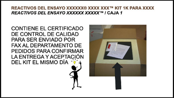
It’s an important part of the presentation and the presenter has tried to make the slide more effective by adding animation, clipart and an arrow to highlight what is being said in the text.
The clutter here includes the small image, the arrow, the clipart, the block capital text and the overlong headline. A ‘decluttered’ version of the same slide would look like this:
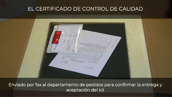
What we did
- We made the photograph much bigger so it can be seen.
- We removed the clipart and the arrows as they are not needed.
- We have reduced the amount of text in the title and in the instruction.
- We have added an animation to make the instruction appear after the photograph.
2) Remove Bullet Points
Bullet points work well in a written document. They don’t work well in a visual presentation because they force the listener to read the bullet points and that stops them listening to the speaker. They also look boring. Bullet points are difficult for the speaker too. Why? Because the more words there are on the screen, the more likely it is that the speaker will just read them word for word and turn the presentation into a ‘supervised reading’ session… and absolutely nobody wants that.
So wherever you can, replace bullet points with something different. And why not start with PowerPoint’s own anti-bullet point tool, SmartArt? Let’s look at a case study.
This slide has a few problems
- There is too much text.
- The image bears little relevance to the words.
- The text and the image appear all at once.
- The title adds nothing but confusion.
- The alignment and layout looks wrong
Here’s the simple fix
What we did
- We used a standard layout from the powerpoint template to make sure that everything lined up.
- We used a relevant photograph of an iconic part of the business as a background.
- We made the point of the slide in the headline.
- We reduced the amount of text in the bullets by removing unnecessary words.
- We changed the bullets to SmartArt in 2 clicks.
- We added animation to make the elements appear one by one.
Here’s a good article from Ned Potter on 6 things you use in the place of bullet points for further inspiration.
3) One idea per slide
Here’s a pretty typical slide from a sales presentation. There’s a lot of information crammed on one slide and it all appears at once, making it hard for the audience not to read ahead, and very hard for the presenter to keep their attention.
This is a clear example of 3 or 4 messages on one page. And it looks terrible too.
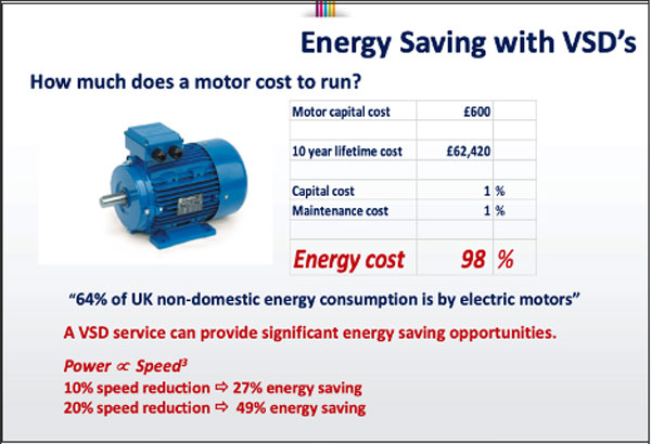
Here’s the simple fix
- Realise that the slide is trying to make 3 different points as an important part of the presentation.
- The concept of energy saving
- The potential value of it to this audience
- How VSD (the service) will help the audience make these savings.
- Split the slide into those 3 parts. And follow the rules.
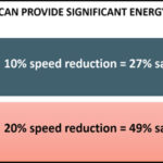
In the first slide
- Maximise the image of the motor, remove clutter (the logo, the background image, the unhelpful formatting).
- Add animation to the data to add impact to this important message.

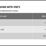
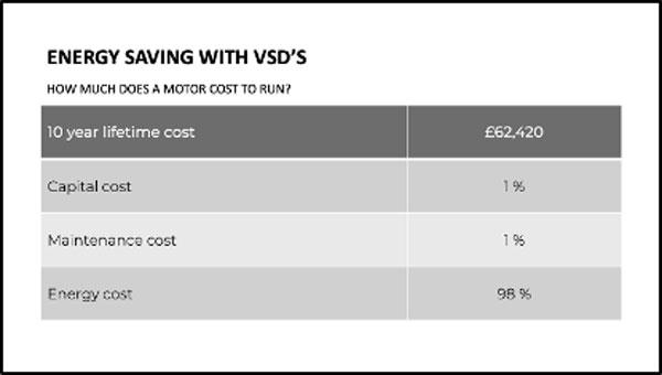
In the second slide
- Let the table speak for itself as background to the next slide.
- Add a headline if you need it, but you probably don’t.
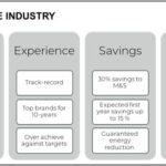
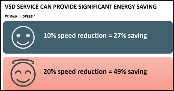
In the third slide
- Use SmartArt to make the point stand out.
- Add animation to the SmartArt graphic and an image if required.
4) Use animations for complex ideas/visuals
There’s nothing wrong with a complex visual aid. But the way that you use it, and how well you guide your audience through the complexity is the only true measure of your skill. It takes no skill to leave an audience confused, but using your visuals effectively will help you bring understanding and clarity, even with the most challenging subjects.
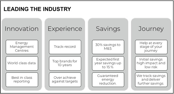
This visual is pretty typical of the kind we see every day in our work with clients. It’s an important part of the presentation, where you want the audience to understand how great your business is, and why they should choose you over all the other businesses pitching for the same piece of work.
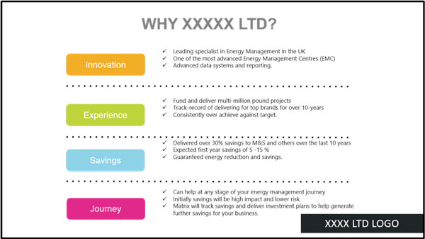
There’s a lot of information on it, and as we have seen, you can’t just click and show all of that to the audience at the same time, because the impact of the information, and the presenter will be lost, just when you want it the most. There are so many things that we can do to help the audience and the presenter to make their point more clearly.
Version 1: Use PowerPoint to help
In the original image the designer didn’t use a powerpoint slide layout to arrange the text, images and titles on the slide, instead they created individual text boxes and then tried to arrange them on the ‘page’ in a way that made sense. This is a time-consuming way to go about slide design and can often, as in this case, leave the finished slide looking ‘home-made’ because none of the elements align in a way that follows standard slide design practices. It also makes animating the slide more difficult and time consuming too, because each element has to be animated individually.
The first example of fixing such a slide uses PowerPoint’s amazing SmartArt feature to resolve a lot of the issues. Smart Art, as Microsoft says, ‘…combined with other features such as themes, will help you create designer-quality illustrations with only a few clicks of your mouse.’
It’s true. If you get into the habit of using PowerPoint’s inbuilt features of slide layouts, themes and SmartArt you will save hundreds of hours of editing time over a year, and it will leave you with better looking and easier to use slides.
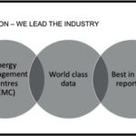
Here we have just taken all of the text from the original image and pasted it into a new slide using the ‘Grouped List’ layout in SmartArt and we already have a slide that looks much better than the original.
We can then go on and animate the SmartArt graphic so that each column and subsequent point in it, appears one ‘click’ at a time; just as Steve Jobs and the BBC have shown us is the very best way of presenting complex graphics.
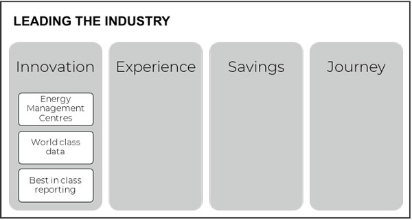
Doing that allows each point to appear separate from the previous point, with more impact, which is what you want at this important stage of the sales presentation.
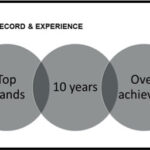
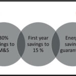
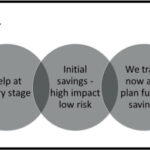
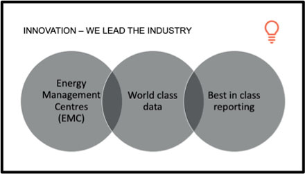
Version 2: Use icons to help and separate the ideas on individual slides
We could make even more of the information in this part of our presentation if we wanted to. We could separate the ideas even further, like this:
Starting with a simple text and image slide:
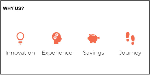
We could use this slide as the introduction and then illustrate each of the ideas with a further SmartArt slide for each of the areas. Like this:
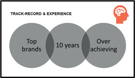
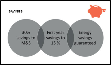
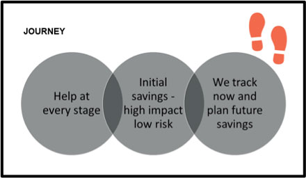
And we could animate each of the slides to appear one by one if we wanted to.
Already you can see the simple yet vast improvements to these slides. In the next post, I will be looking at the final three rules:
- Making images and charts full size on the screen
- Highlighting and emphasising key data and points
- Putting the detail in the notes section
Jim Harvey
Latest posts by Jim Harvey (see all)
- Influencing Strategy – The Overton Window - 21st November 2024
- Make Your Sales Presentations Land and Stick: Using Ancient Stories to Sell Modern Technology - 18th November 2024
- how to cook up the perfect ChatGPT prompt - 11th November 2024
- The Ultimate Guide to AI Tools: Part 3 - 10th November 2024
- The Ultimate Guide to AI Tools: Part 2 - 10th November 2024


Richard I. Garber
30th June 2020 at 12:43 am
Jim: an excellent article. I blogged about further refining your motor example in a post today at my Joyful Public Speaking blog titled Removing clutter from PowerPoint slides.