What Are the Simple Rules that Help Us Design Better Visual Aids? – Part Two

You don’t need to be a PowerPoint expert to create great slides
They are a simple set of rules for you to follow in every presentation that you make, and the rules are:
- Remove clutter
- Replace bullet points wherever you can
- Present only one idea per slide and one idea at a time
- Use animations for more complex ideas and visuals
- Make images and charts full size on the screen
- Highlight and emphasise key data and points
- Put the written detail in the notes section
In our previous post we covered the first 4 rules, and now I’d like to look in more detail – and with examples – at the last three.
5) Make images full size
Often, in an attempt to reduce the number of slides in a presentation, we put too many images on one slide. If we do this, we lose in three ways:
- The power of the image to illustrate and emphasise our points is lost, because the audience can’t see the pictures, particularly if they all appear at the same time.
- Our impact is reduced because we lose the audience’s attention as they get confused and try to figure out what we’re trying to say.
- Our confidence is reduced because we realise that we have lost the audience, even if only for a moment.
So if we’re going to use images at all, and we should, then we need to use the images in such a way that the audience can see them.
Example 1: Set the power of the image free

This simple text and image slide is OK, but simply by making the image ‘full bleed’ as printers say, i.e. making it as large as the slide, add even more impact to a slide that is about the beauty of simplicity. And here’s the result. Simple isn’t it?

Example 2: Make them full size, don’t try to cram too many images on to one slide

Here’s a pretty typical slide with too many images. It works OK on the page if the document is printed out to be read, but not so well on a small TV or even a large screen, in a room where people may be sat tens of metres from the image. Just a few changes can make a big difference.


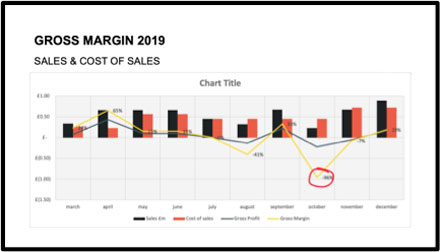
6) Highlight and emphasise data and key points
The temptation with data slides is to put too many graphs/charts on any one slide, with more concern about the handout that the audience in the room. This kind of slide is pretty typical:
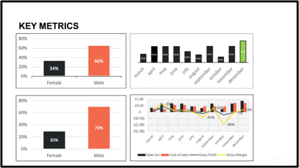
Imagine that you’re in a meeting, and the CFO is taking you through the key metrics for the business. It’s an important message, and you want to understand it. If the CFO then puts up these data, all at the same time, to emphasise and illustrate her key messages, you are presented with a real cognitive problem, the link between the presenter, the visuals and the audience is lost.
One idea at a time, one idea per slide
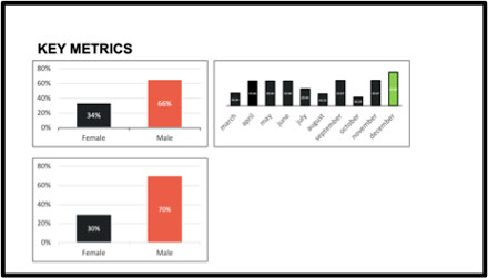
It’s a really simple rule that every presenter can remember and follow to help their audiences to understand. The simplest thing that the presenter can do if they have to have 4 charts per slide is to animate each chart individually, and the presenter can then use the images to emphasise the message. Like this:


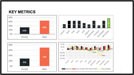
But still, for the more complex slides that might need a little more explaining (slides 3 and 4 here) there is a better way. And that is to use the ‘one idea per slide’ rule more effectively. Here’s an example for Slide 4:
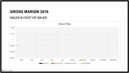
We can animate Excel (and PowerPoint created charts) charts easily in PowerPoint. And it’s essential for complex data. In this chart we simply animate the whole chart to appear one ‘series’ at a time. Once we have done this, the chart appears like this:
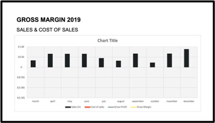
Clicks 1 & 2
The ‘frame’ of the chart appears and allows the speakers to explain the point and the axes. Then the first data series appears and can be explained…
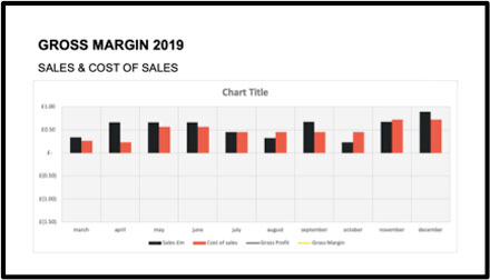
CLICKS 3 & 4
Then the second data series appears and can be explained… with as trend line if necessary…
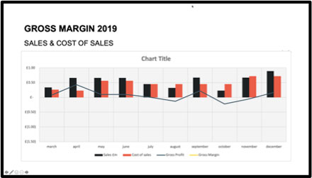
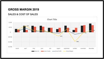
CLICKS 5 & 6
Now the last data series appears (The Gross Margin series, which is the point of the chart) and can be explained… And the last click can emphasise the point that you want the audience to remember over everything else in this chart.
For really complex slides
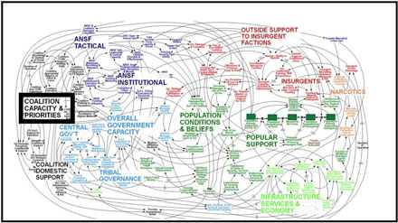
Sometimes you do have to show an audience a complex slide with no animation. There might be many reasons for this, and the reason might be to show how complex something is. This slide ( unfairly) is often cited as the world’s worst PowerPoint slide ever.
The slide was part of an arrival briefing for a General Mc Chrystal’s (Commander of US and NATO forces in Afghanistan in 2010), to him to explain the US military strategy in Afghanistan.
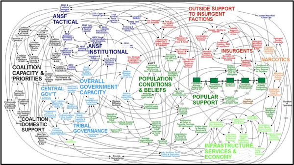
As the UK’s Guardian newspaper said in 2010,
‘…This is the Microsoft PowerPoint slide which drove US military General Stanley McChrystal to declare that “When we understand that slide, we’ll have won the war” at a briefing in Kabul last summer has led to big questions about the world’s reliance on the presentation software…’
But to be fair, as Julian Borger (Middle East Correspondent) wrote the day before:
‘The diagram has an undeniable beauty. Done the right way (embroidered perhaps) it would make a lovely wallhanging and an ideal gift for the foreign policy-maker in your life. But it is a bit of a red herring … It was designed to convey the complexity of the Afghan conflict…’
He then goes on to state,
‘…But the big problem with PowerPoint is that it makes everything seem simple.It does not link ideas or facts in any kind of human narrative. It just lists them as bullet-points, a shopping list of things to do or jobs already done…’
He makes a fair point about the bad use of PowerPoint, but it isn’t true if PowerPoint is used well, as we are describing here.
If you’re going to use such a complex diagram as this, you need to know a few things
- First you need to be aware that this slide actually is a confusing blur of lines and relationships and text that will make no sense at first glance to any audience (including an expert audience as General McChrystal’s comments prove). Many experts are so used to the complexity of what they deal with every day that they become blind to how ‘normal’ people will respond.
- If you have that level of self- and audience awareness, then you will understand that your job is to make the reason for showing the visual to the audience very clear…
- If you understand that, then you won’t just throw the slide up and let the audience suffer before you try to explain it, you will take time to introduce it before it appears, and then you will ‘talk them through it’ step by step so that they understand everything you want them to know before you move on to the next slide.
Here are some general rules for us to follow when we are going to use complex visuals to explain complex ideas.
Manage the audience’s experience
We have to manage the audience’s experience, to keep them with us, as we show them the visuals:
- Introduce it with the ‘why’.
- Explain it in as little detail as the audience needs.
- Summarise it and move on.
Click 1
Brings the title slide and the opportunity to say, ‘I’m going to show you the whole US military strategy for Afghanistan on one page. I warn you that when I show you the image, your first reaction will be one of confusion. Are you ready to see it? I’ll show it to you and just spend a few seconds looking at it and then I will explain…’
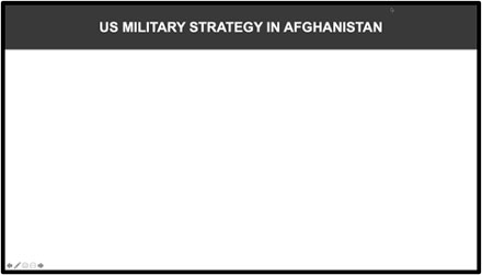
Click 2
Takes the title away and…

Click 3
Brings the image up for the audience to see…
At this point the audience will probably gasp out loud and start muttering to themselves, and the experienced presenter should let them, because that’s the reason for showing them the image.
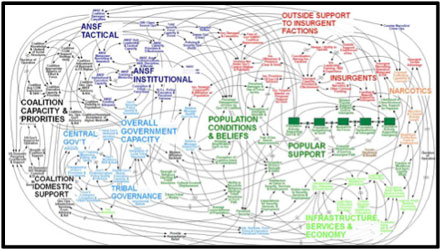
Click 4
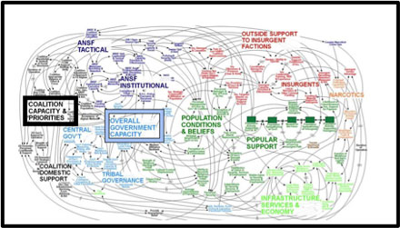
You could say something like, ‘Yes, it’s really complicated, isn’t it? That’s our job here. If we can make sense of all of these things then we can win here…(Stealing the General’s line…)’. and then direct the audience’s attention to where you want to start with a visual highlighting.
See how your eye is drawn, immediately to the black box and you could start to work through the elements that make up the whole to bring a little clarity to the detail of the message – just as much detail as the audience wants or needs.
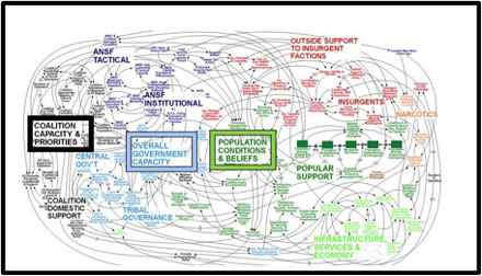
Click 5
The next area of focus, click 6 – etc… giving a summary of the key point of the slide (‘It’s complicated, but it’s our job to work it out…’), before moving on.
7) Put the written detail in the notes section
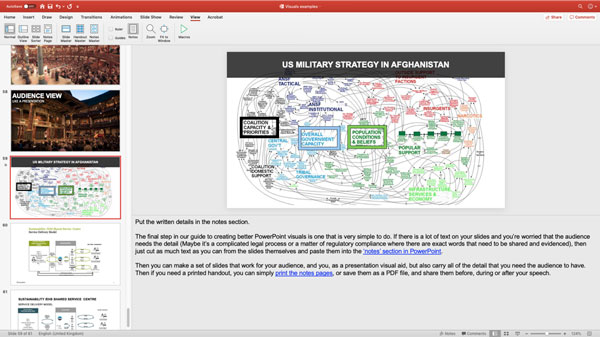
The final step in our guide to creating better PowerPoint visuals is one that is very simple to do. If there is a lot of text on your slides and you’re worried that the audience needs the detail (Maybe it’s a complicated legal process or a matter of regulatory compliance where there are exact words that need to be shared and evidenced), then just cut as much text as you can from the slides themselves and paste them into the ‘Notes’ section in PowerPoint.
Then you can make a set of slides that work for your audience, and you, as a presentation visual aid, but also carry all of the detail that you need the audience to have. If you need a printed handout, you can simply print the notes pages, or save them as a PDF file, and share them before, during or after your speech.
Here is the ‘Notes’ view and remember that you can’t add images or formatting to the notes in PowerPoint, but you can add hyperlinks.
Jim Harvey
Latest posts by Jim Harvey (see all)
- Influencing Strategy – The Overton Window - 21st November 2024
- Make Your Sales Presentations Land and Stick: Using Ancient Stories to Sell Modern Technology - 18th November 2024
- how to cook up the perfect ChatGPT prompt - 11th November 2024
- The Ultimate Guide to AI Tools: Part 3 - 10th November 2024
- The Ultimate Guide to AI Tools: Part 2 - 10th November 2024


