The Best Way to Use Visual Elements in Your Slides


As I work with many professional graphic designers, I’ve witnessed firsthand how important it is to synergize great messaging with strong visuals. I’ve also witnessed this pairing go very, very wrong.
I’ve watched presenters read from a PowerPoint deck as though it were a script, nodded off while speakers rattled off pages of statistics with nary a pie chart or graphic to support their data. I’ve seen stock images that had nothing to do with the presenter’s main message bounce in and out of the frame like a bad Benny Hill episode.
The point? If your graphics don’t support your narrative or align with your brand, it may be time to reconsider your visual storytelling technique.
Using visuals to support your slides is one of the most fundamental ways you can engage your viewer. The notion of “visuals” encompasses a whole litany of items, from photos and vectors to graphs, icons and Smart Art. Fortunately, there are a number of techniques and resources you can employ to add dynamic, engaging visuals to your content. We’ve curated our top tips for using visuals in your slides.
1) Psych 101
There has been an extensive study on the psychology of visual content; how it’s used, where to put it, and how it can engage (or alienate) your audience. The statistics surrounding how people process visual messaging is staggering:
- 90% of the information transmitted to our brain is visual.
- 80% of people are more likely to read content that has coloured visuals.
- View rates (online) increase by 94% when content is accompanied by images.
- Presentations with visual elements are 43% more persuasive than those without.
The takeaway? Visuals are important.
If people are hardwired to process images faster than text, it behoves you to create a visually appealing presentation that emphasizes your message. Remember, your audience will be processing what you say in addition to what you display. Well-designed slides will not only tell your story, but they will also tell your viewers how to engage with your content.
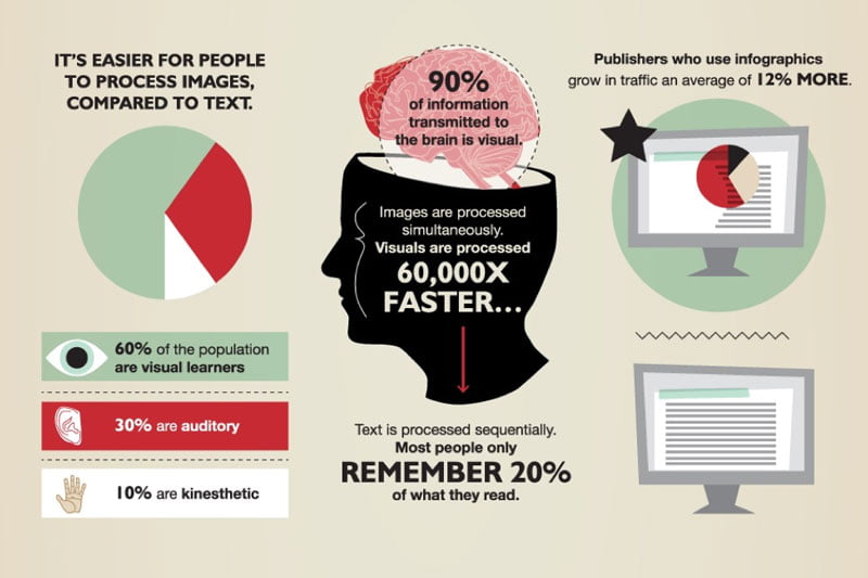
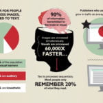
Infographic courtesy of https://visual.ly/community/infographic/business/picture-infographic
2) Know Your Message
Good graphics support your messaging, they don’t lead it. It has always been my experience that if people notice your graphics and effects, your messaging has taken a backseat. What is the purpose of your presentation? What are you asking your audience to do? Whether the purpose is to educate, inform, entertain or promote, be clear with your intentions and deliberate with your choice of visuals. Your graphics are there to strengthen and support your messaging, not replace it.
3) Leverage Your Tools
A picture is worth a thousand words, and nowhere is this more apparent than in the design process. Thankfully, PowerPoint has a number of features that can help you add visual appeal to your slides, even if you’re a design novice.
Graphs & Charts
Converting flat data into dynamic, appealing charts and graphs using Smart Art can show your viewer the relationship between data sets far easier than gratuitous exposition. Here are some graph and charts templates to help you get started.
Photos
For more polish and professional appeal, use high-resolution images and graphics wherever possible, and avoid degrading the quality by skewing proportions; nothing says “hack” like a photo that has been forced into a slide. Determine too whether your image should be the primary focus (as with a product description, for example) or if it’s better served in the background as a supportive element.


Images courtesy of http://www.garrreynolds.com/preso-tips/design/
The image on the left identifies a photo as the primary focus, whereas the image on the right has been used as a secondary, or background image.
There are some great sites that offer free images, icons and infographics for download, such as:
Video
If appropriate, video is a great visual asset that engages your audience. Using video selectively to illustrate your presentation has been shown to promote active cognitive processing, a natural, intuitive learning method. There are some great tutorials to help you embed video into your slides here and here and great advice on using video effectively here.
Templates
Finally, don’t be afraid to think outside the template. PowerPoint themes have been greatly overused. You’re better off starting with a clean slide and building from there than to use something that everyone has seen before.
24Slides has a selection of PowerPoint templates available for free download.
4) Be Consistent
When it comes to visual data, we are hardwired to look for patterns. Each slide in a presentation should have the same look and feel l the one preceding it. Using Slide Masters is a great way to template your design; just add your logo and any relevant icons to each slide to maintain consistency and add brand recognition.
As one of the four main principles of design, the use of repetition will sway rather than distract your audience if used selectively and with intention. Similarly, your visual elements – be they photos, vectors or icons – should all tell the same story. It’s perfectly fine to mix these components together, so long as it makes sense to do so. Think of the graphic elements in your slides as a family, all sharing the same visual DNA while having their own distinct role to play.
5) Use White Space
Have you ever been confronted with a slide that was so jam-packed with content, you found yourself reading the slide rather than paying attention to the presentation? Too much content is visually overwhelming and pulls focus from your intended messaging. As business guru Patrick Lencioni famously said: If everything is important, then nothing is. If used well, white space balances the visual elements on a slide and navigates your audience’s focus.
6) Avoid Information overload
Similarly, avoid overloading your slides with cumbersome paragraphs of text. The whole purpose of your presentation is to add visual support to your key messaging. Our brains are programmed to respond visually, and we tend to process images faster than text.
According to Venngage, visual aids drive engagement because less effort is required of your audience when pictures support your messaging. Your slides will have far more impact if you break up large chunks of cumbersome verbiage with graphics that make sense and have visual balance.
Understanding how people observe and interpret visual content creates a compelling argument for agile, intuitive design that strikes a balance between imagery and messaging. It’s important to keep in mind that your visual presentation is an extension of your content, not a teleprompter to read from. By enhancing visual appeal that complements rather than overwhelms, you can engage your viewers and keep the focus where it belongs.
Jonathan Jeffery
Latest posts by Jonathan Jeffery (see all)
- The Best Way to Use Visual Elements in Your Slides - 6th November 2019


PowerPoint presentation writing services
17th February 2021 at 4:39 am
I have gone through the post, and I must admit. PowerPoint presentation writing services are not easy to find. I will be coming back to check this out.
Thank you