The Best Way to Protect Yourself from Misleading Graphs
A person trying to persuade you toward their point of view may well use a graph to present information. After all, “a graph isn’t an opinion – it represents cold hard numbers and who can argue with those?”
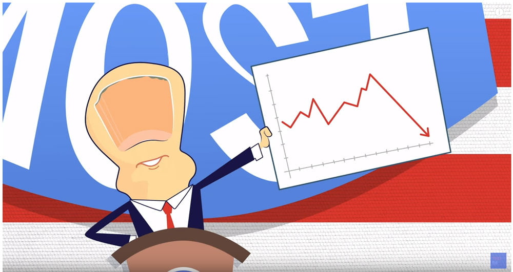
Well, guess what? There are plenty of ways that graphs can give a misleading impression. Yes, graphs do help us grasp complex data but equally data can be manipulated to help the speaker make their point. Even careless handling of the data can send a distorted message.
What is the best way to protect yourself against misleading graphs?
Read the labels, the scale, the numbers and the context-and ask what story the picture is trying to tell you.
This very short TED-Ed video explains it perfectly and is well worth 4 minutes of your time.
And here is some more useful advice for using charts and graphs well.
Rosie Hoyland
Latest posts by Rosie Hoyland (see all)
- Now Is the Time to Look at Webinars - 13th March 2020
- The Only PowerPoint Templates You’ll Ever Need - 26th March 2019
- 12 Tips for the Technologically Challenged Speaker - 25th March 2019
- The Best Way to Protect Yourself from Misleading Graphs - 17th January 2019
- 3 Tips to Boost Your Confidence - 13th September 2018


