Better Presentations – A Guide For Scholars, Researchers and Wonks


Jon Schwabish is a Government Economist turned presentation guru. He works for the Urban Institute – a non-profit organization, where he specialises in data visualisation. He’s a straight-talking, smart, presentation expert with a book to sell. I like the book very much which makes it easy to review it for its many virtues, and for balance, if need be, to criticize a few of the gaps. But to be honest, I struggled to find any. It’s really good, I learned loads and you should buy it!
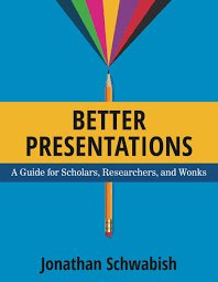

There is an old adage that,
A great idea presented badly has no future; a bad idea presented brilliantly has a chance to succeed.
Jon Schwabish will show you how to present ANY idea brilliantly, or certainly better than you ever could without his advice.
Jon has realised that, in real life, busy presenters looking for help want you to cut to the chase pretty quickly – they’re probably thinking ‘Just tell me, what do I need to do and how do I do it and then let me get back to work because every second I’m doing this my inbox is filling up like a water barrel in a storm…’
And here it becomes clear pretty early on that this is going to be a book worth reading. It’s not aimed at Graphic Designers and so, unlike some books on the subject, does not intimidate or overwhelm with design jargon or concepts. The endless amount of theory out there is distilled into the essentials. Simple, practical pointers and lists of useful resources, tools and further reading are peppered throughout the book. If you need to know the essentials, they’re there; if you want to know more, he’ll show you where to find it. There’s enough theory to appeal to the scholar, researcher or wonk in you, but not so much as to distract from his core message.
His main point is that when you design your presentation you are trying to lead your audience logically through your argument, making it as easy as possible for your audience to process, order and understand the message, and staying focused on the path as they get there. Equally his book is written just so.
The book has 3 sections. The first, an introduction to Jon’s approach to presentations generally; secondly his principles of data visualization with lots and lots and lots of examples of how to apply those principles to some pretty demanding data. Last, but not least, he gives some really sound advice on the pure practicalities of delivering your presentation. Each chapter has a beginning, middle and end, finishing with a link back to the book’s rules: Visualise, Unify, Focus.
Jon’s years of experience creating data visualisations for government, business and non-profit organisations has led him to build a series of rules that define his approach, and they can by summarized, simply as follows:
- Visualise – make the point easy to see, not read
- Unify – bring it together for your audience and make it consistent
- Focus – on the most important things for your audience
His principles for visualizing data are equally simple (and it’s worth buying the book for the section on data visualization alone):
- Show the data with as few distractions as possible
- Remove clutter – lines, grids, words, everything that stops the data singing out
- Integrate graphics and text – for the reader’s benefit
Jon also talks about ‘Layering’ your content to show your message. This is a powerful method that ensures that your audience is looking at exactly what you want them to focus on as you’re speaking; and helps you ‘integrate’ the visuals and the voice for their benefit. i.e. to help them understand the point being made. He recommends:
- Using Twitter-style headlines – brief but captivating
- Ensuring all elements are unified (font, colour etc) to create a consistency that prevents any confusion
- Revealing data point-by-point to help your audience better remember your message
In my first draft of this review I wrote that my only gripe was that Jon often refers you back to the book’s website and once you get there it’s not that obvious where things are. However, I’ve got to scrub that now as he’s only gone and redesigned the website and it looks great! Pretty much everything you would need to order your mind and create a persuasive presentation is handed to you on a plate – checklists, worksheets, colour palettes, icons, PowerPoint template slides, the lot!
I saw Jon most recently at the Presentation Summit in Las Vegas where he was giving a highlight overview for his book. We don’t have footage of that but here he is speaking at VISUALIZED in New York last year.
He’s a great speaker and an engagingly opinionated personality, and as I listened to him explain his approach, with his examples, I realised that he’s a great teacher too. The book is a teaching tool for anyone who wants to learn how to use data for their own work or teach others how to do it. Buy the book here – it’d be a great use of $19.00!






Dylan L Omran
27th October 2020 at 11:41 am
I read Jon’s book after Slideology and Presentation Zen. Those two were good, especially Zen. Better Presentations was the stand out though. Simple and effective advice for everything from pace to visuals and even what to have in your bag to make sure you’re never caught out at the last minute. I met Jon last year at a data visualisation meet up and he’s as engaging in person.
Your site looks amazing too. I look forward to learning lots here!
Rosie Hoyland
27th October 2020 at 7:04 pm
Well welcome to our site! We hope you find lots of great info here – we do try to cover all aspects of presenting and public speaking. And thanks for that ringing endorsement of Jon’s book. We agree – well worth the read.