There Are Only 6 Types of Slides You Should Be Using – and This Isn’t One of Them!


Simple visuals that emphasise the spoken message help the speaker and the audience in every way. Slides should only be used to add impact and emphasis to your spoken words but please don’t make the mistake of confusing your story (script) with your visuals. Powerpoint is a great presentation tool, but a poor word processor. Used well, though, it will help you to achieve all of the above, and help to make your presentation truly memorable. With that in mind, let’s look at how you can make the most of this insight in your day-to-day work. Here’s the latest Presentation Guru podcast on creating and using simple visuals that supports this post.
What kinds of visuals should we be using?
There are only a few types of visual aids that we should use when we’re presenting. Here’s a list of the major types of visual and their purpose and usefulness for the presenter and the audience:
- Headlines – Impact
- Still Images – Impact and illustration
- Text and Images – Impact and emphasis
- Diagrams – Illustration
- Data – Illustration, impact and emphasis
- Graphs, charts, numbers – Impact, illustration and emphasis
1) Headlines
A headline stands out. It summarises something or expresses an opinion. It is emphatic. It isn’t a title, it’s job is to help the audience identify what is important out of all of the words that are said. The dictionary definition:
A heading at the top of an article or page in a newspaper or magazine, as in “a front-page headline”
- the most important items of news in a newspaper or a broadcast news bulletin.
plural noun: the headlines - denoting a particularly notable or important piece of news.
- denoting or relating to the star performer or group at a concert…
So a headline slide can be used in the same way. Here are a few examples from the real world of business and TV news.
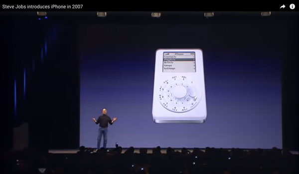
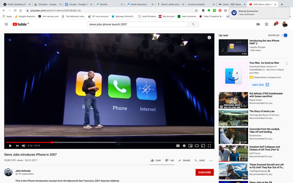
First, here’s the iconic presentation by Steve Jobs from the 2007 iPhone launch.
One of Apple’s great skills as a communicator is that it follows the rules of effective communication laid down over thousands of years. We’ll use real examples from its decades of presentations, to illustrate the best practices in creating and using visual aids for us mere mortals.
This example shows us how Apple’s presentation designers use headlines. In fact we’re looking at the first headline of that very special presentation. This is the first time the word ‘iPhone’ had been heard in the open world outside of Apple. And they used a headline slide to add even more impact to that moment.
Steve Jobs had spent the first 2 minutes and 57 seconds of his pitch building up to this point. He’d reminded the world how (in his words) Apple had changed the world of computing with the Macintosh, and music with the iPod and promised that today they would do the same thing with the mobile phone. He promised repeatedly that he would be showing us a product that was actually ‘three products in one’ and then he said ‘…and we are calling it (Click) ‘iPhone’…’ The weird word appeared just as he spoke the strange word and the audience cheered.
He waited a little while and then (click) the strapline appeared. He waited a little longer, by which time the audience had all read the strapline and he summarised it, ‘Today, today, Apple is going to reinvent the phone…’ , to tumultuous applause. The spoken word had been made even more powerful by the use of images and visual headlines.
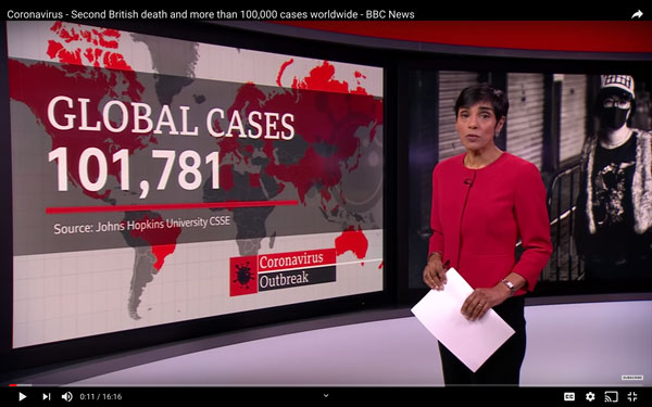
Another example of the excellent use of visual aids in support of the spoken word comes from the BBC. It’s a news bulletin from March 2020 that introduces an item on the growing Coronavirus threat across the world.
2) Images
An image is a powerful thing. Most presentations that we see have lots of images in them, but with one major difference to the examples that we show here. In most business presentations the images are just too small to be seen. If you’re going to use an image of a product, a person or a thing, make sure that the image can be seen clearly by everybody in the room, whatever the size of screen that you’re using. That usually means that you have to have one image per slide, with the image as large as you can get it.
Here Steve Jobs uses a large image, appearing on cue with a ‘click’ as a laugh-out-loud funny joke to illustrate what this amazing new product looks like. It’s funny because everyone in the crowd was keen to see the iPhone for the first time, and when this image appeared they knew they’d been tricked, and it was funny because this obviously, and instantaneously, wasn’t it.
It also worked on a different level because it helped make the point that Steve Jobs had just made, that most ‘smart phones’ in the market at the time were ‘…not that smart and not that easy to use’.
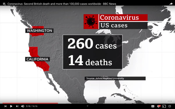
In the BBC news article, this image is used, briefly, to illustrate the extent of the virus’ spread across the world. In under 3 seconds, the audience could see the ‘danger red’ colours on a map of the world…
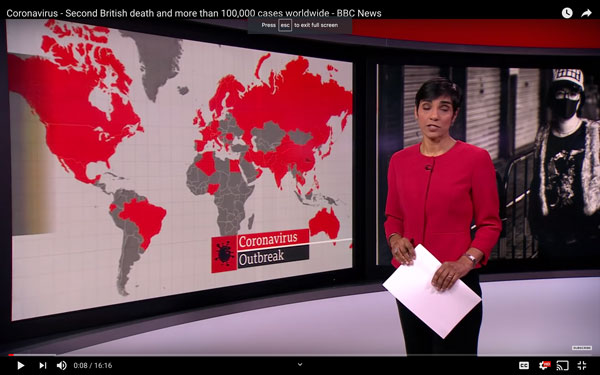
…and that instantaneous understanding in the audience was then reinforced by a ‘shocking statistic’ appearing on top of the image to illustrate the extent of the virus outbreak. All in perfect synchronisation with the spoken word.
3) Text and images
Text and image slides are probably the most frequently used (and misused) type of slide we find in presentations. Lots of the worst examples that we see happen when the presenter tries to combine too much on one slide, and then has all of that information appearing on screen at the same time. But it’s easy to do much better if we follow a few simple rules. You can make this type of slide work for you if you:
- Maximise the image size.
- Minimise the number of words.
- Use simple animation to make sure that only one idea appears at a time.
In the Apple presentation, they use this type of slide over 40 times, and it works every time. They use it to give a visual structure to the whole presentation as here, where they start with a Headline Slide to frame the structure of the whole presentation, repeating (over 20 times throughout) that the iPhone is ‘3 products in one’.
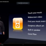
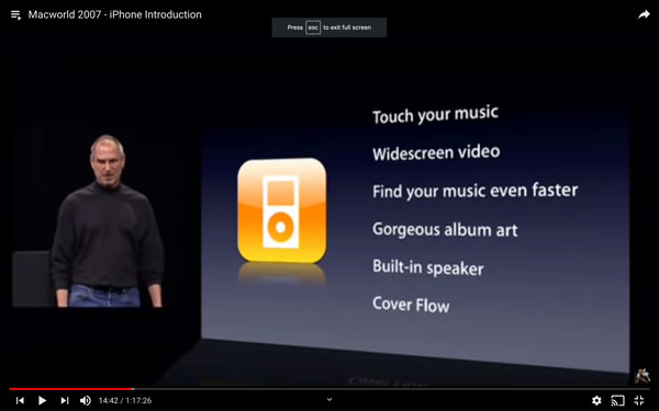
Then, slightly later in the presentation, at the start of the heart of the message about the product and all that it can do, they use the same, colour-coded icons to introduce the audience to each section of the product.
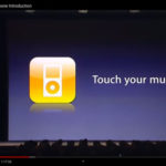
The icon for the ‘iPod’ appears and Steve Jobs uses simple text animations to introduce the 6 elements that he’ll cover in this section and talks about each element before moving on to the next. Click, ‘Touch your music’. Click, ‘Widescreen video’. Click and so on.
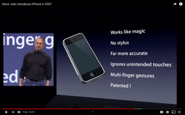
Then as he moves through the detail of this chapter, using a mixture of product demonstrations, short ‘video demos’ and his explanations, he uses Image and Text Slides to illustrate, and emphasise his key points…
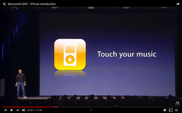
…before coming back to the same image as above to look back before moving on. Then he uses this image and text slide as a headline to summarise the whole ‘chapter’:
In the BBC news extract we see them using simple image and text slides to illustrate and emphasise their key messages. Notice how simple all of these image and text slides are. And in this one, even though there’s the image, the text and the data to understand, it can still be processed by the viewer in under 3 seconds, allowing them to get the impact of the visual supported by the extra information delivered by the speaker.
4) Text only
This type of slide is a really useful one to have if there’s a quotation, or piece of text that you want your audience to read, understand and digest. It’s an emphatic kind of slide when used properly, and can add impact to an important moment that you want the audience to remember.
In the iPhone launch, Steve Jobs uses another person’s words to help him make an argument supporting Apple’s software/hardware strategy. A classic rhetorical technique, and he makes the point clear and obvious using this slide.
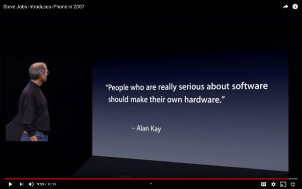
Notice how he uses the quote and the slide (at 9 minutes and 49 seconds in the video). He introduces it and the man who said it (Alan Kay) at the end of his previous slides and positions the person as one of his own heroes, and the quote as the reasoning behind Apple’s obsessive focus on software and hardware as the foundation of their product strategy. Then he clicks to the quote. That’s not the only way to do it, but it’s a great example of synchronising the verbal and visual channels.
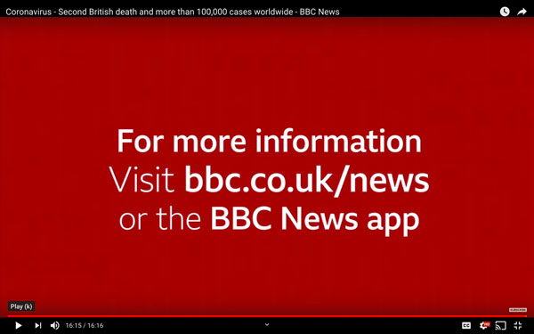
In the BBC News clip there’s one and it follows the same principles as in the iPhone presentation. There’s a simple statement that appears and then the presenter simply says ‘For more information…’ and restates the written word.
5) Diagrams
What is the point of a diagram? It’s simply to help the reader (or listener in the case of a presentation) to understand a more complex idea than words could simply explain. Here’s a definition from The Douglas County School website.
A diagram is a graphic aid that shows information visually so that the reader can better understand and remember the ideas. A diagram gives the reader a picture of how a process or relationship works. Some diagrams illustrate information in the text. Others add important new information.
And then goes on to describe how a ‘reader’ uses a diagram,
‘…A reader will
- Read the title to find out the topic of the diagram.
- Read the deck to learn the main idea and other information about the topic.
- Read the steps in the correct order.
- Read the label and explanation or caption.
- Study the illustration.
- Go on to the next number and continue reading.
- Retell the information in your own words…’
It’s a good explanation and it also gives us a step-by-step approach to introducing a diagram (and all kinds of charts and data visualisations) effectively to our audiences.
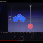
Here Steve Jobs introduces a diagram to illustrate his central argument for the whole sales pitch. Here’s the process he uses and see how it matches the list above:
- First he introduces the concept of ‘smart phones’ and ‘not so smart phones’; and then the concept of ‘ease of use’, before he shows the diagram.
- He then (click) reveals the 2-axis framework and describes each axis.
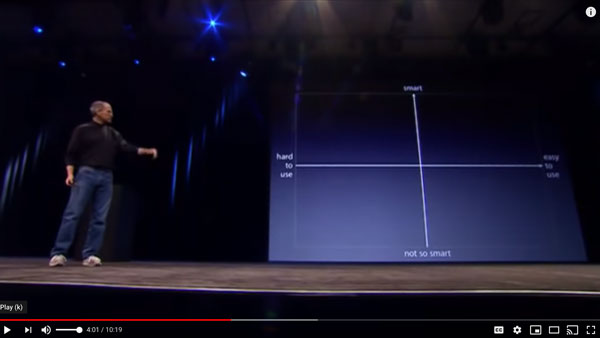
- Then he clicks a number of times to plot competitor products (Cell phones and three specific ‘‘smartphone’’ products) on the diagram, one click at a time.
- Finally he describes the purpose of the iPhone, and plots it on the diagram and says ‘We’ll show you how the iPhone is the smartest smartphone on the market and the easiest to use…’
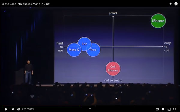
It’s a brilliant demonstration of how we can all use a diagram to add impact and emphasis, and in a way that works perfectly with the spoken word.
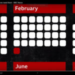
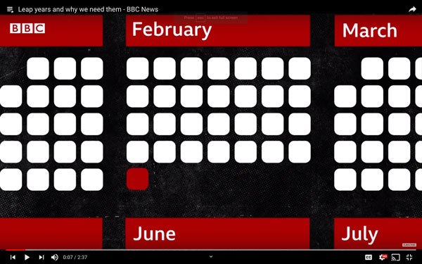
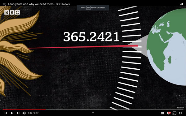
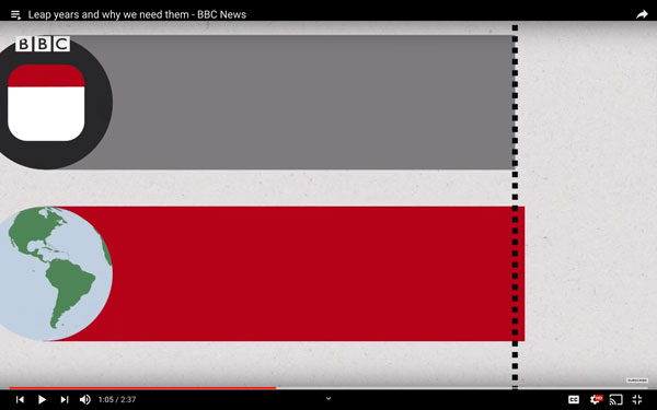
In this BBC short video explaining how a leap year works there are many really good examples of how we can use a diagram to explain complex complex concepts in a simple way.
First a really simple graphic to show what a leap year is in one glance:
Next the video explains the reasons for Leap Years (it’s fascinating, watch the video to see the maths) and that the reasons for the Leap Years is to balance the actual time that it takes for the earth to orbit the sun (365.24219 days), with our calendar so that the calendar works over centuries.
The video then goes on to explain that if we just added one day to our calendar year, every 4 years then we would still ‘lose 24 hours over about 370 years’ (which would mean that day would be night and night would be day, which would be ridiculous) and so there is a further calculation and balancing that needs to be made because of this tiny kink in time.
They then go on to explain how that calculation is made.
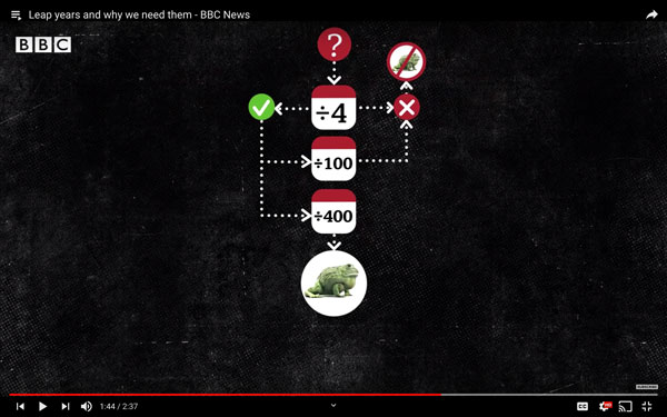
Simple visuals in support of the spoken explanation. Illustrating, emphasising and making the whole thing easier to remember.
6) Data, Graphs, Charts, Numbers
In business we use data to help us tell better stories. We use data to prove things. To add weight to our argument, whatever it is. Without data we have no argument it is just an opinion. With data we can:
- Illustrate trends
- Identify gaps, opportunities and threats
- Demonstrate achievements
- Quantify failures
- Emphasise differences
- Highlight similarities
- Clarify goals
The data that we use is important, and the way that we use it is as important. Jon Schwabish offers three simple pieces of advice for people using data in this simple video. Jon’s years of experience creating data visualisations for government, business and non-profit organisations has led him to build a series of rules that define his approach, and they can by summarised, simply as follows:
- Visualise – make the point easy to see, not read.
- Unify – bring it together for your audience and make it consistent.
- Focus – on the most important things for your audience.
His principles for showing data in presentations are equally simple (and it’s worth buying his book for the section on data visualization alone):
- Show the data with as few distractions as possible.
- Remove clutter – lines, grids, words, everything that stops the data singing out.
- Integrate graphics and text – for the reader’s benefit.
Jon also talks about ‘Layering’ your content to show your message. This technique ensures that your audience is looking at exactly what you want them to focus on as you’re speaking; and helps you ‘integrate’ the visuals and the voice for their benefit. i.e. to help them understand the point being made.
He recommends:
- Using Twitter-style headlines – brief but captivating.
- Ensuring all elements are unified – (font, colour etc) to create a consistency that prevents any confusion.
- Revealing data point-by-point – to help your audience better remember your message.
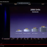
We can see a perfect demonstration of all of these points in the Apple presentation. As Steve Jobs moves towards the end of his presentation, he is setting a context for the sales targets for the next year, and he uses global sales of all kinds of IT products as the context for his sales prediction for this new product.
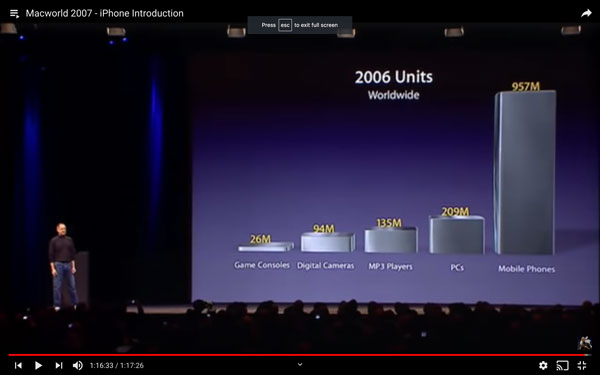
He explains the blank chart and title and then clicks to allow each category of products to appear with a very clear number of units sold for each. When he clicks for the ‘Mobile Phones’ category to appear he explains that this is the category that iPhone will be competing in.
Then, with a showman’s timing he clicks again to make all of the other categories disappear, and asks the rhetorical question ‘What does this tell you?’ Click to make the sentence ‘1% market share = 10 m units’ appear. We read it and then he answers his own question with a word for word reiteration of the phrase that we have already seen, ‘1% of the market equals 10m units. This is a giant market…’ His point is made clearly, memorably and emphatically.
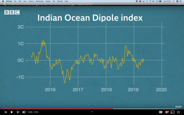
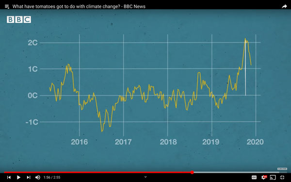
In the BBC report on Tomatoes they use data to show the upward trend in Indian Ocean temperatures in a similarly confident and clear way. First by introducing the Indian Ocean Diopole Index and explaining what it is.
Then the presenter clicks on to the 2019/2020 data point and helps us to focus on the right area of the chart by circling the data point in red. The viewer’s eye transfers all of its focus to that specific point.
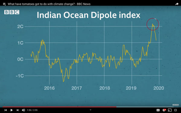
They then focus even more on the specific point that they want to make. It is not just the (visible) rise in temperatures that is important here, but the increase in the range between hottest and coldest temperatures… which they illustrate with a white ‘trend line’.
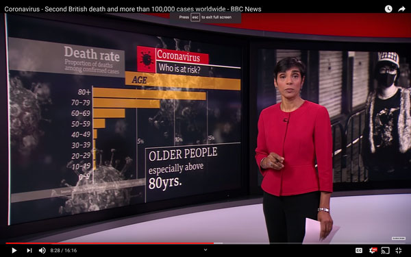
Another example from the BBC from to the Coronavirus story from March 2020. In this part of the story the data is the story. The incidence, spread and severity of the virus is what the audience is most interested in, and the BBC wants to illustrate and evidence all of this in this report.
They cut back to the presenter in the studio standing in front of a headline slide with the title ‘Coronavirus, who is at risk?’ The title morphs smoothly into a data slide once we have read it (3 seconds) and the presenter allows it to happen without referring to it directly.
As an audience we listen to her introductory sentence in which she says the words, ‘Some people are far more at risk than others…’ and as she finishes these words another headline appears on the slide that says ‘Death Rate’, and gives the source of the data in writing as the presenter says, ‘A recent study from the Centre for Disease Control in China…’ and then explains that the elderly are much more likely to die, which the ever present data bars show very clearly. Notice that the presenter never refers to the specific numbers in her presentation. She doesn’t need to. Why? Because we have seen them already and can look at the data, understand them and then focus back on the speaker without any confusion.
In summary
Simple, effective storytelling is enhanced by using simple, clear slides. We have seen some first-class examples of how to do it from masters at visual communication from Apple and the BBC. The ‘rules’ for creating better visuals are easy to understand and easy to follow whatever slide software we use.
Jim Harvey
Latest posts by Jim Harvey (see all)
- Influencing Strategy – The Overton Window - 21st November 2024
- Make Your Sales Presentations Land and Stick: Using Ancient Stories to Sell Modern Technology - 18th November 2024
- how to cook up the perfect ChatGPT prompt - 11th November 2024
- The Ultimate Guide to AI Tools: Part 3 - 10th November 2024
- The Ultimate Guide to AI Tools: Part 2 - 10th November 2024


Bill Cunningham
1st May 2020 at 12:25 pm
I occasionally use a slide like this to say
“This is a really complicated process — let me give you the simplified version. I either leave the slide up — or use the “B” key to then explain what all that means in simple language. Everyone gets a kick of making fun of such a bad slide and then they focus on the speaker.
In the right situations, it can be effective.
Not to be used more than once in a presentation or to the same group (unless it’s your staff and you like to have a “running joke” every week.
Oliver Hauss
3rd May 2020 at 2:21 pm
Bill, that requires knowing the audience very well, though. At a larger conference or so, you risk that they actually do try to dig through the information on their own and don’t even hear “let me give you the simplified version” anymore…
Microsoft Nederland Contact
30th June 2020 at 12:05 pm
Hi….
Using visuals to support your slides is one of the most fundamental ways you can engage your viewer. The notion of “visuals” encompasses a whole litany of items, from photos and vectors to graphs, icons and Smart Art. Fortunately, there are a number of techniques and resources you can employ to add dynamic, engaging visuals to your content. We’ve curated our top tips for using visuals in your slides.
Kristian Olson
24th March 2021 at 6:38 am
Haha! I love it that you show that crazy graphic at the top. I’ve had to shoot down many clients in their eagerness to include what they think are “cool” graphics in their presentation design. I feel like half of my job is to remove unnecessary visual information. Agree with the first comment though. It can be useful to cause information overload on one slide so you can cure it on the next. Great article.
Jim Harvey
24th March 2021 at 11:24 am
Hi Kristian, thanks for the post and kind words! I think that you’re right. It’s the taking away that often reveals the quality beneath – or lack of it! good luck in all your efforts! Rgds Jim