How to Engage the Audience When Your Data is the Story


How can presenters keep an audience engaged when going over large sets of data? It can be challenging keeping an audience focused during a normal presentation, but graphs and pie charts can make it even more difficult to keep their attention. Here, Jude’s written these tips to make sure your next presentation establishes the story first, and then uses data for context.
Every good story needs a hero or heroine, a series of challenges the main character is required to overcome and, of course, a good ending.
No matter whether the challenges are internal or external, real or imaginary, if you get the audience to sympathise with the main character you have a good story. A good story also needs supporting characters and events that surprise, engage or have a punch.
A story with a happy ending will make the audience feel good, while an ending that is sad or bad will leave them feeling bleak. In either case, both the main character and the audience go through a process.
Today, lecturers and speakers are taught how to tell a good story and how to fascinate their audiences. Every TED Talk and every successful campaign includes, or ought to include, a good story.
The Challenge is to Write a Good Story When the Main Component is Data
How does one fascinate and engage an audience that is not comfortable with “rough data”? How do we get the audience to buy into a message conveyed using data?
The key is in the last question above: the story needs to revolve around a message which the data supports. Therefore, in the stories I write for my clients, data serves as the supporting character and empowers the message.
People often raise an eyebrow when I tell them: “Lose the data!” For example, let’s say that just as you’re about to begin your presentation, your laptop breaks. What then? People have come to listen to you speak. What will you tell them? Do you excuse yourself politely and ask them to return another time? Or can you tell them a story, one that will engage them, even if you don’t show them a single slide?
How do we do this?
- Remember the first rule: every datum or detail should be in context.
- The next step is answering two questions: Where is the hero at the beginning of the story? What needs to happen to the hero in order for there to be a good ending?
- Even if the data is interesting, you have to present it in a way that makes the audience pay attention and helps them to understand it.
- Present clear data that makes sense.
- Simplify the data and make sure the context is straightforward.
- Don’t visually overload the presentation.
- Get the audience engaged with the message and try to make them feel as much as they think. The audience needs to sympathise with the story and connect to it.
- Walk your listeners through the challenges related to the data that you are going to cover without overwhelming them with too much information
Imagine you are giving a presentation to a group of potential clients. They have come to listen to you talk about your new enterprise. You, in turn, have prepared data and information showing how successful your enterprise is. That’s it! That’s your message: I have a successful enterprise.
The data should be described and presented as challenges faced by the hero (your successful enterprise). Thinking about data in this way will attract, fascinate and engage your listeners.
When talking to potential clients, your story consists of what the market looks like today and how it will look after your enterprise reaches it. Also, tell them what’s in it for them and how they will benefit from the happy ending.
Another example, the end-of-year board meeting
The general manager reports (supported by a presentation of course):
“This past year had been quite challenging. Nonetheless, it will close with $1.5 million in revenue. True, it is lower than in previous years, but as you know, two major clients did not to renew their contracts with us, we replaced 10% of our employees, and we also invested in infrastructure and new systems. And, we have gained three new middle-sized clients and our revenue forecast for the coming year is $4 million.”
The message: the revenue this year was relatively low and can be explained; next year, higher revenue is expected.
That is one way to report. Frankly, such a message can be sent via email and save precious time.
Another way to present the same data
We can present the data in another way, this time conveying a message of improvement:
“This past year was dedicated to an improvement process that will strengthen the firm and produce excellent outcomes in the future. True, two major clients have left us claiming our products no longer comply with their innovative systems. Investigating this issue we discovered our means of production are no longer the spearhead of technology, and that we currently lack the talent required to make the necessary changes.
“During the first and second quarter we introduced new systems, replaced 10% of our staff and recruited new employees in key positions. Senior employees were offered generous retirement benefits which, of course, took a toll on our cash flow, provisions and payments throughout the year.
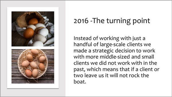
“Additionally, instead of working with just a handful of large-scale clients we made a strategic decision to work with more middle-sized and small clients with whom we have not previously worked, which means that if a couple of clients leave us, it will not rock the boat.
“During the end of the second quarter and most of the third quarter, our new key employees were busy training their teams. As you can see, this process has proved to be a great success and is already paying off.
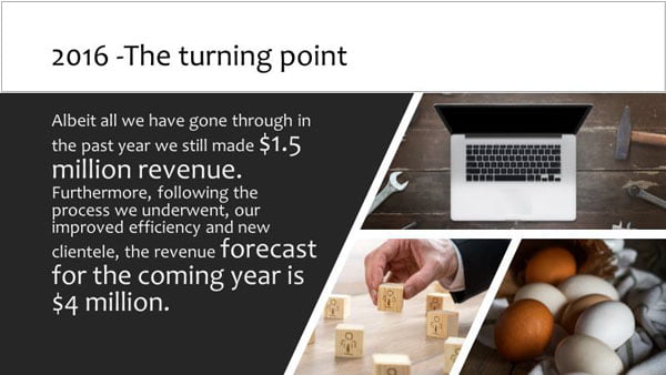
“And yet the data shows that notwithstanding everything we have gone through in the past year, we still made $1.5 million in revenue. Furthermore, following the process we underwent, our improved efficiency and new clientele, the revenue forecast for next year is $4 million.
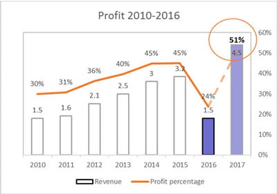
“This challenging process did indeed lower our revenue this year, but has contributed greatly to our development, resilience and efficiency. In the years to come we expect greater profit than in the past.”
Alternatively…


The message here is: improvement, growth and the process, not the revenue or figures. The board knows immediately that there is no need to worry about the past year’s revenue, as the results of last year have paved the road to the future.
Revenue in this case served as the supporting character while the company was the the hero, since it managed to overcome the challenges and emerge successfully.
If you were on the Board of Directors, which of these presentations would you rather hear?
Jude Barak
Latest posts by Jude Barak (see all)
- Data Visualisation Advice to Stop You Drowning in the Numbers - 11th July 2017
- Data Needs Context - 14th March 2017
- How to Engage the Audience When Your Data is the Story - 19th January 2017


ido
20th January 2017 at 9:14 am
WOW!!!!!!
A complete set to tell a great story – from the most boaring Data!!!
Thank you for sharing and teaching, for great ideas and wonderful schema
Oliver
20th January 2017 at 11:28 am
Visually, the last set looks nice, but in my eyes it contains a lot of text while being light in the data department. I personally feel that combining the second approach with the third would make the presentation more solid and credible. Though the third set might work if it’s all the audience gets – i.e. no spoken presentation the text might distract from. Though even there, the fact that it’s low on actual data might lead to some dismissing the conclusion as wishful thinking. It’s something that needs to be carefully tailored to the specific audience.
Jude Barak
21st January 2017 at 7:24 am
Hi Oliver,
Thank you for your comment. I agree that there is too much text for a pitch, but I wanted the readers to read what the CEO would otherwise tell.
The data should be available to all the attendees in a separate document.
Jim Harvey
20th January 2017 at 12:22 pm
Lovely article Jude, thank you so much. It’s a great, concrete example of how to do what you say, and in narrative form.
Eran B.
20th January 2017 at 2:42 pm
Great tips Jude, I will definitely will use them on my next presentation