3 New Design Trends to Use in Your Presentations

Let’s be honest, not everyone is a designer or has a professional designer on staff. A lot of business owners and marketers are creating their own graphics from scratch. At Venngage we have a ton of designers on staff but I still create a lot of my visuals!
That’s why I thought I would outline some of the best new graphic design trends that anyone can use in their presentations this year.
It really doesn’t matter if you are a newbie or a design pro, these 3 graphic design trends will help you create better presentations in 2020.
So let’s get into it!
1) Muted Color Palettes
Over the past few years, designers and creators have been using extremely bright and vivid colors. These colors helped them stand out in the real world and on the many devices that we carry each day.
But once every brand started using these vivid colors, the uniqueness wore off pretty quickly. Instead of being innovative, it just becomes another design tactic that someone can use.
That’s why muted colors, which are basically the opposite of vivid colors, are becoming so popular in 2020. Brands like Apple, LinkedIn, Classpass, and more are already using these color palettes in their marketing.
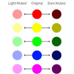
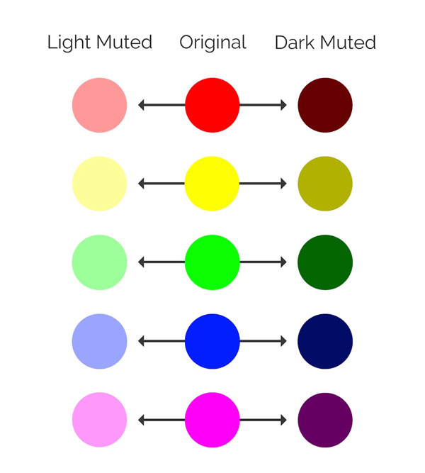
These muted colors are usually created by adding black, white or a complementary color to the original.
This addition helps desaturate the original color and make it feel a lot less powerful. I like to think that muted colors have had their “edge” taken off by adding those other colors.
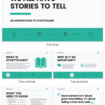
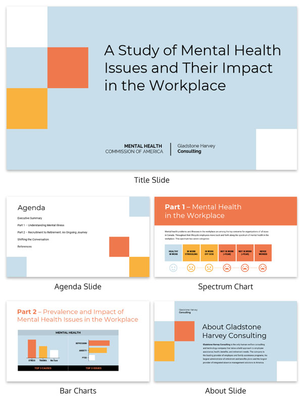
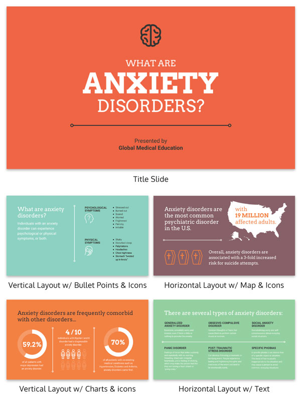
You can use muted colors to not only signal a move towards the future but also make your presentations feel a lot more genuine and natural. Below you can see a great example of muted colors in action:
In this presentation, you can see how light and dark muted colors can actually be used together. Even though there are many colors used, each slide doesn’t feel overwhelming or obtuse. Instead, you can easily focus on the graphs or information on each slide.
I can guarantee that you wouldn’t be able to achieve this much visual harmony if you would have used strictly vivid colors. Or only used your brand colors!
What I might like best about this design trend is that anyone can use it in their presentations. You don’t need to be a professional designer to add some muted colors to your slides!
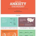
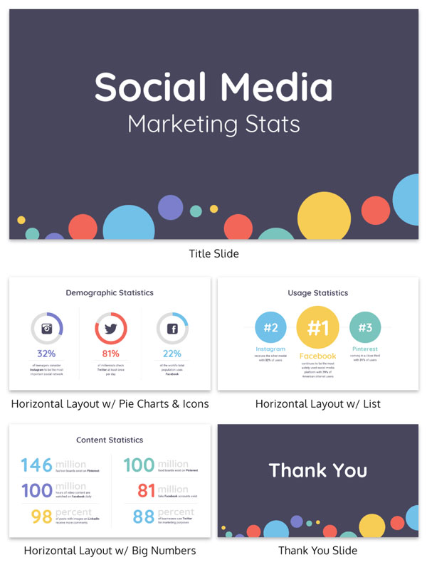
Additionally, muted colors pair nicely with most neutral color palettes. In the presentation below, each color, including black and white, blend together extremely well.
That said, your presentations should be any less colorful than in previous years. Actually, muted palettes will allow you to sometimes use a lot more colors!
For example, take a look at all the colors that are used in this example:
So if you want to update your presentations this year, I would start with my favorite graphic design trend: muted color palettes.
The best part about using muted colors is that you can use your current brand colors as a starting point. Then create a secondary color palette just by adding black, white or a complementary color to those original colors! You can even add them to your style guide for future use!
2) Bold & Heavy Fonts
In the previous section, the rise of muted colors was driven by a rejection of vivid and bright colors. But here is another trend that has been gaining steam for the past few years. You probably have already noticed that bold fonts are pretty popular in the design world. But in 2020, things are going to get a lot bolder.
Heavy or extra bold fonts are going to be used a lot more, especially in presentations.
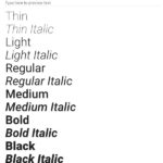
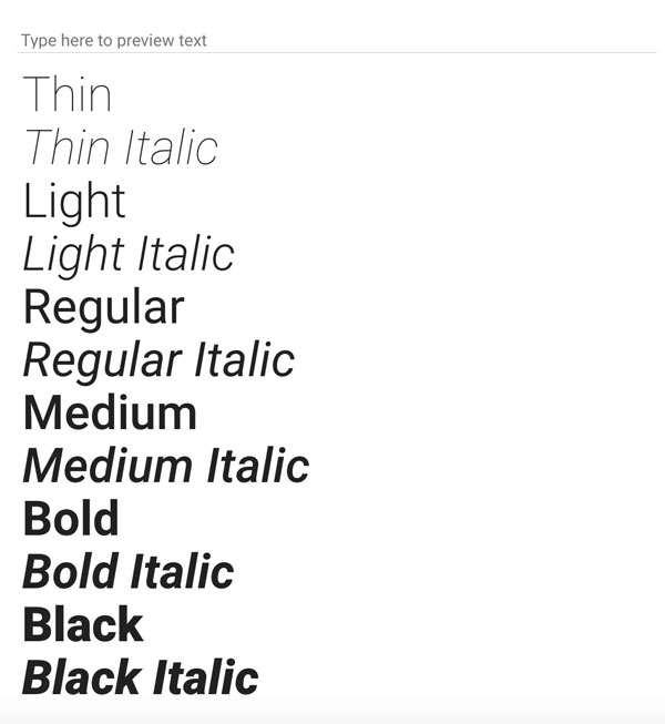
As you can see in the chart below there are a lot of different weights for each font:
Heavy fonts are at the bottom of this list and there’s a ton of them out there that you can use. In fact, almost every popular font out there has a heavy version that you can download.
These thick fonts will give your slides a modern, strong and contemporary feel from the instant someone sees them.
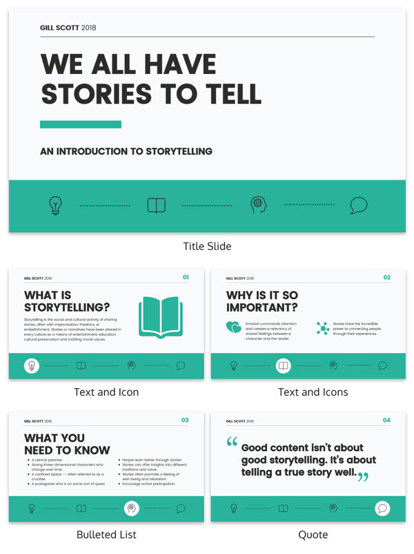
If you want someone to be drawn to a piece of information or a phrase, use a heavy font like in the example below:
When using a heavy font in your presentation I would recommend only using it as a title or header font, like above. Otherwise, it will be almost impossible to read the content on your slides. And the heavy fonts won’t be eye-catching at all!
Now if you really want to highlight a phrase or idea pair your heavy font with a minimalist font, like below:
The contrast between these two types of fonts makes the heavy font almost jump off the page. It also will help direct your audience or readers to the most important part of each slide.
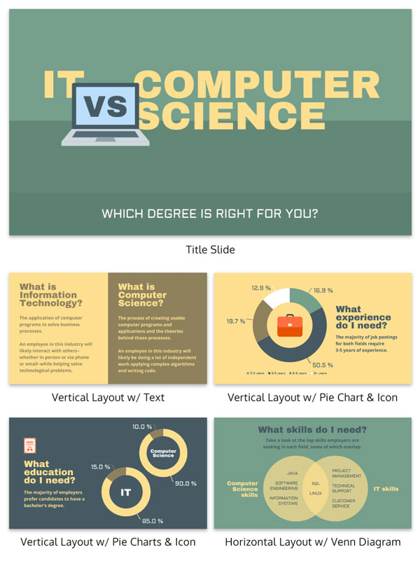
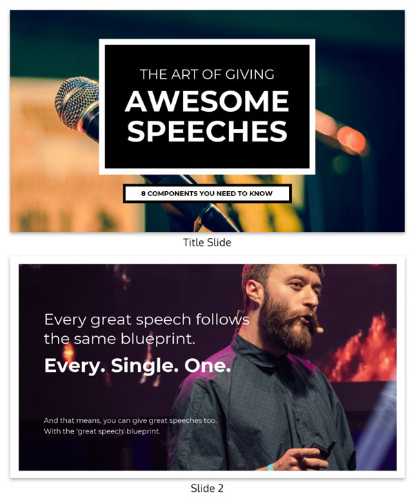
The same thing can be said about the title slide of the example below. By only using a heavy or bold font on one part of the title, they made it the focal point of the whole slide.
If the designer had used a minimalist font instead, the slide wouldn’t have had the same impact at all.
Additionally, as you can see above, muted color palettes pair very well with heavy fonts too. I think that this is because one is so subdued and the other is so loud.
Just remember, don’t overuse a heavy font in your presentation. By using it sparingly throughout, you actually make it a lot more eye-catching and unique to your viewers.
3) Authentic Stock Photos
I will admit that I used to hate stock photos…with a passion. Actually, I have written a few articles about how you can avoid using them in your projects or presentations.
This was mostly because, like many other creators, I had only been exposed to bad and cheesy stock photos. I really thought that those stock photos were the only ones you could use.
However, with the rise of Unsplash and Pexels there’s now a whole new type of stock photos that feel a lot more genuine and authentic.
Additionally, because almost everyone has a high powered camera on them at all times, there has been a slight renaissance of stock photos.
Not sure what I am talking about? Check out some of the examples below:
In my opinion, these photos look like you could have snapped them from your phone while exploring the city or countryside. They aren’t overly edited or composed, unlike some stock photos of the past. Plus, they feature a very muted color palette, which makes them feel even more genuine.
Now I know “genuine stock photos” might feel a little backwards to some people. Especially because the whole point of stock photos is that they can be used in a ton of different situations.
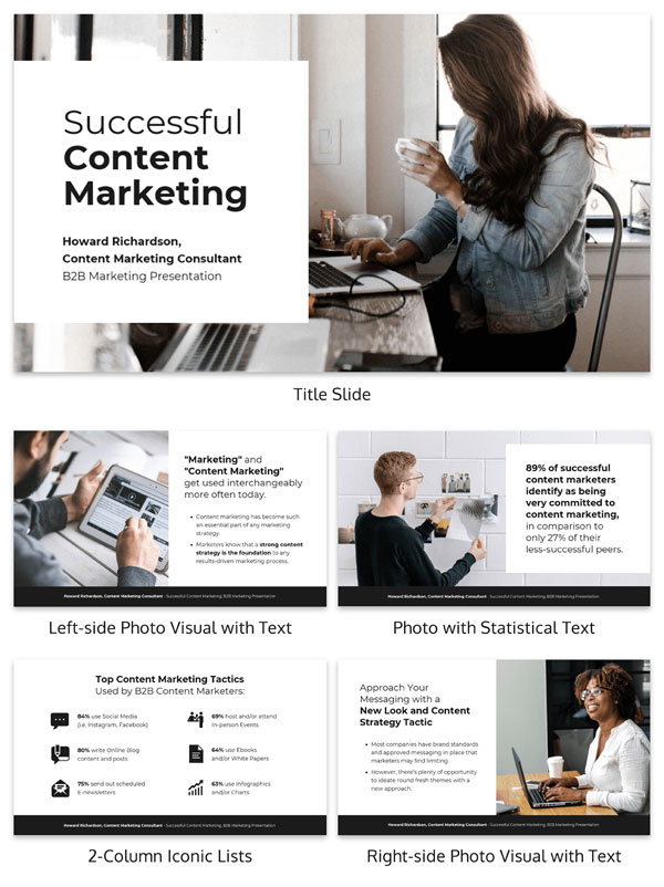
But they are out there! Just check out the examples used in the presentation below:
Each of the stock photos that they selected are very genuine and fit the theme of the slides pretty well!
Plus because they each feature a rather muted color palette, the photos don’t distract from the rest of the presentation.
Like I said above, you should strive to pick stock photos that look like you took them! With that simple rule of thumb, you should be able to find some great examples in no time.
This real estate presentation features some more genuine stock photos:
Honestly, if I didn’t tell you that they used stock photos on each slide I’m guessing you probably wouldn’t have known! And that’s what you should strive to achieve each time you pick a stock photo for your presentation.
A bad stock photo can break the concentration of your audience in seconds while they focus on that instead of your content. The sad thing is that you might not get their attention back! So take more than a few seconds to find the perfect stock photo for your presentation.
I know that sounds a little overwhelming at first but if you follow the advice above, you can find a super authentic photo in no time. Especially because you can find great stock photos in basically every graphic design tool!
—
Hopefully you can start using some of these simple design trends in your presentations straight away. I’m guessing you can add some muted colors or bold fonts to your slides rather easily.
If you want to see the rest of the more complex design trends, check out this article.
Also check out this course from Hubspot if you want to become a better designer in 2020!













Chris Robinson
3rd February 2020 at 3:27 pm
Great article! I think I should point out, though… I spend a lot of my time teaching people how to design in ways that don’t cause problems for people with low vision or color vision deficiency. I ran color contrast analysis on many of these samples and unfortunately there were a lot that failed the test. Slides and other visuals need to be as easily-readable as possible, to avoid other people’s frustration when color contrast is too low for how they see color.
Rosie Hoyland
4th February 2020 at 9:33 am
An interesting point Chris and one that’s well worth bearing in mind. Thank you.