The Wondrous World of Colour in Presentations

We regularly detail the importance of conveying a message in presentations using different techniques for visuals, but what exactly is it about visuals that audiences find so appealing? Here, Emma explains a few simple principles to keep in mind when choosing the right colours for your next presentation.
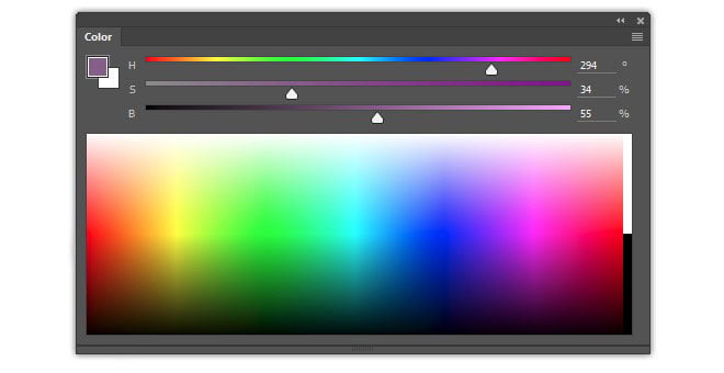
Visualise:
- Hue = all colours like a rainbow
- Saturation = dull to rich
- Brightness = light to dark
A great presentation isn’t based on hot fonts and cool colours; your audience won’t appreciate it if they can’t read it. A great set of slides is there to support the speaker and clarify the message – that’s the gist of visual design. Aesthetics, layout and being ‘on-brand’ are important but not necessarily about personal preference (your favourite colours).
Here are the basics of using colour to clarify your presentation’s message and influence your audience.
The History of Colour
Ok, there’s always colour – unlike televisions, we didn’t upgrade from a black and white world. But our modern understanding of colour originates from Isaac Newton’s famous colour wheel, which demonstrates how the primary colours, red, blue and yellow combine to create secondary shades.
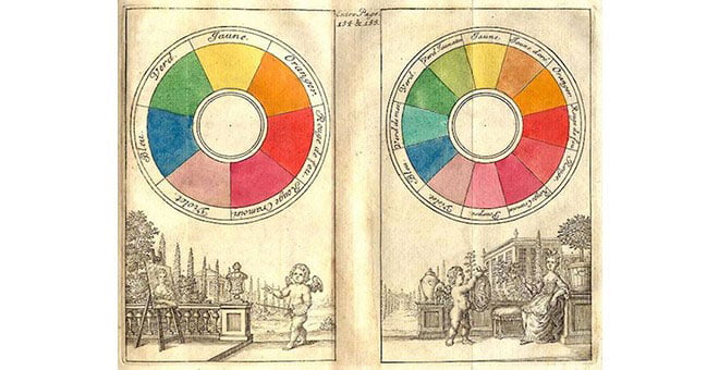
Newton was the first person to “discover” the spectrum of light by directing a single ray through a Prism.

A phenomena we see regularly in a rainbow.

How do we apply this understanding of the colour spectrum to presentations?
A fantastic tool is Adobe’s Kuler colour wheel. Choose your feature colour and the wheel will match according to your rule: a triad, complimentary colours, compounding, monochromatic, etc.
Contrast
Contrasting colours, or vivid accents draw attention and focus to important information. Use two – no more than three, for headings and accents.

High contrast colours taken from an image, then reversed for text, have intense impact.
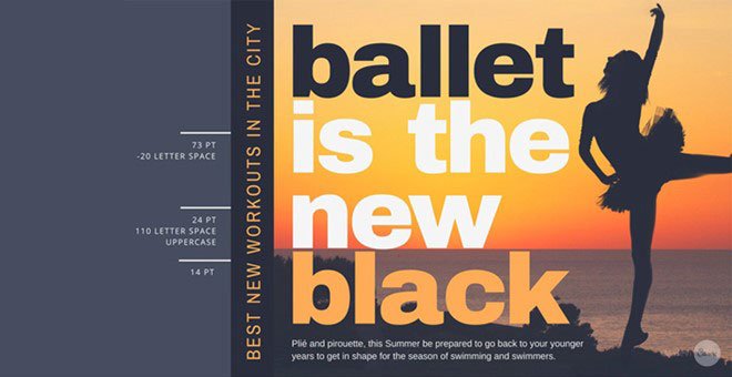
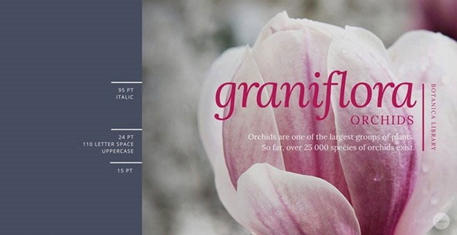
Another method is to take a strong colour from an image and use that to create focus, such as the pink from the flower in the following example.
Company Brand Guidelines
Use them wisely. If the brand uses grey, black, white and a feature colour of orange, use the orange sparingly – only as an accent to draw the eye to an area of focus.
Technical considerations
Not all projectors display like your laptop or monitor, so test whenever possible in the environment you will be presenting.
Beware of older projectors: avoid light colours and greys when projecting on a big screen.
Even colours that are ‘on trend’ like the “Pantone Colours of the Year” look great on your monitor – but translate very differently on a big screen.

The safest bet is high contrasting colours whenever possible.
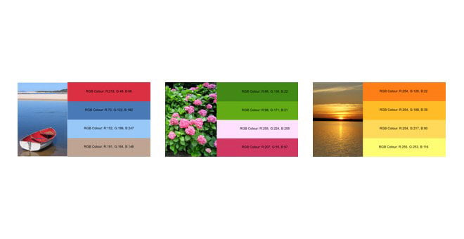
Visual colour matches
Take colour cues from the images you are using in your presentation. PowerPoint now has a colour picker built into the program to make it easier to choose colours directly from your images.
These examples demonstrate the colour combinations that work as background colour boxes or fonts. Gradients
If you’re adding text on top of an image, a simple technique is to add a subtle gradient over the picture to clarify your text.
Whilst colour theory was established in previous centuries, our dynamic environment warrants the meanings we associate with images continually evolve. We are constantly gaining new insights into what works and what doesn’t, especially as we learn more about differing cultural interpretations of colour.
Yet simple principles, such as colour matching, contrasting and the use of gradients will guarantee your presentation’s message is always clear, powerful and influential.
Emma Bannister
Latest posts by Emma Bannister (see all)
- How to Foster a Culture of Creativity in Your Team - 15th November 2018
- Why It’s Important to Do Your Homework Before You Present Overseas - 21st August 2018
- Hostility in the Presentation Design Industry - 10th July 2018
- What is Visual Tone in your Presentation? - 15th May 2018
- Why It Pays to Invest in a Professional Presentation - 17th April 2018