The Problem for Prezi – Most Prezis look rubbish and don’t work


In this article, Jim Harvey looks at Prezi as an innovation, and tries to see a bright future for this once shining, now slightly faded star.
Most Prezis look rubbish and don’t work. That’s a bit harsh isn’t it? Particularly from someone who’s been supporting Prezi and advocating its use for years. And from the guy who wrote the first ‘how to manual’ now in it’s 7th edition and dowloaded 50,000 times.
Why would I say this? Well I guess because the honeymoon is over. 5 years ago, Prezi was still new. Just using Prezi, even in its earliest, most limited form, could help you stand out from the PowerPoint crowd. Not anymore. Most people in advertising, marketing and media circles in Europe, US, Asia, and all around the world have heard of Prezi, and many have already formed an opinion about it. For many it’s become a zooming, spinning, sick-making cliché; something that works against the presenter before they’ve even started speaking. How has this happened? What can we do about it?
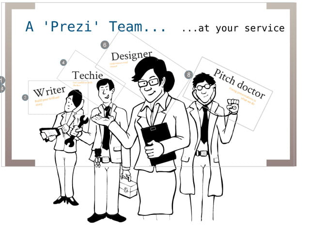
My team at The Message Business were probably some of the first people to use it as a pitching tool for ourselves and then for our clients. We even wrote the first book about it and how to use it to best effect. We loved Prezi, but not unconditionally. We recommend Prezi still, but only sometimes, and we use Prezi, but less and less now as we, and our clients see other tools like PowerPoint. Keynote, SlideBean, Zeetings and many others close the gap.
The Diffusion of Innovation- innovators and early adopters
Using Everett Rogers’ ‘Diffusion of Innovation’ theory we can see why we are where we are with Prezi today.
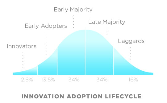
Prezi was a new product back in 2009, breaking into a static market dominated by one product, PowerPoint. The innovative tool gained traction with a few ‘innovators’ and ‘early adopters’, and a cult was formed. We loved the possibilities of the tool, if not the tool itself, and we felt like we were part of a team. The geeks at Prezi and ‘us’, the users, bonding together to find a voice, a space and a use for Prezi in this slide-dominated, Microsoft world.
And we did succeed, didn’t we? We experimented, made mistakes, had great triumphs and made Prezis, sometimes creaky, and limited presentation toy, a real option for business presenters. But our enthusiasm made us blind, sometimes, to the weaknesses in Prezi.
Prezi vs PowerPoint
Prezi had no built-in visual structure – templates, slides, layouts, paths, fonts, font regulation and sizing. That came as a standard part of PowerPoint. There was almost no such structure provided in Prezi. You got the canvas, and that was that. Everything else you had to create; frame by frustrating frame; path-point by agonizing path-point. Prezi was also (in my view) less intuitive than PowerPoint and harder to learn to use well.
But Prezi caught something in the imagination of students, academics, creative types, innovators and people who were looking for an alternative. It was an instant hit with a very small slice of the population.
I first blogged about it in 2009, and used it for my first pitch in the real world in October of that year.
My thoughts then, can be summarised as follows:
Obviously, Prezi is not as broad, flexible, integrated or widely used as Bill’s much derided PowerPoint tool, so it’s nowhere near PowerPoint as the default option for corporates, but as an expert user of PowerPoint, I could do some things much more easily and powerfully with this little gem, and there are times that I’d choose to use it, without question, simply because Prezi’s starting position is so different.
But I was not uncritical. I thought the tool was unsophisticated, glitchy and full of challenges for the would-be advocate. By 2010 I was saying this,
‘’…It is good and offers a new way of thinking about presenting ideas in work and life.
It’s not Microsoft – and as we know that’s enough for some people to go crazy about something that is not yet proven technology. But it does have promise.
People confuse the medium with the message- i.e. most presentations at work are crap, most presenters use PowerPoint, therefore PowerPoint is crap and anything new must be better… Logic flawed all through. Though it’s logic that Prezi is still using today. Their latest campaign is as follows:
Will Prezi help you make a better presentation next time I get up to speak?
Answer: No. Crap presenters will still present badly with Prezi, maybe even worse because there’s less structure to follow than in a PPT template. But if you’re good at building and telling stories, if you have a clear point to make, if you loathe bullet slides, then maybe it will help a little. For you creative types, thought leaders, designers, poets, CEOs who want to woo investors, show-offs, me, and people with a little bit of flair for the new and dangerous you will want to have a go anyway. So enjoy the experience…’’
Over the next three and a half years Prezi has worked incredibly hard to stay ahead of the chasing critics and behind the existing users and fans. They’ve listened to all kinds of people, even me, and they’ve created a much more rounded, usable and commercial presentation application. So well done to them and in trying to make a sustainable business from a brilliant idea, they’ve added all of this functionality and continue to do so.
Where does Prezi stand today? At a crossing in the road
Today, Prezi is better, stronger, more user-friendly than we could ever have imagined that it could have been. It has apps for mobile presenters on Apple and android products. It’s used much more widely than most of use expected, 75 million users, apparently and rising, But where are we really? Is Prezi a ground-breaking new product or a quirky craze that only students really love?
Hundreds of thousands of young, intelligent, enthusiastic people (your typical early adopters), all over the world, are using Prezi. There are literally tens of millions of Prezis out there for people to see and use. And most of them are rubbish. They aren’t visual aids: they’re tools for supervised reading. Little different to the vast majority of PowerPoint slides that we’ve all panned for years.
That rapid proliferation has been part of the problem. In the ‘early days of Prezi’ we were all trying to find a way to use the tool, I made mistakes with it; we all did. But in the innovation and adoption stage, that’s what happens. Prezi still might fail to take hold, and with all of that inexpert experimentation we were helping to brand an innocent piece of software as a geek’s presentation trick.
You only have to take a look at Prezi’s website to see that many of the ‘highly recommended’ Prezis, the ones with lots of views and hundreds of ‘likes’ often look good at a glance, but fail when looked at more closely. The same is true, even for the ‘staff picks’. Prezi’s site is clogged up with lots of sincerely meant, fundamentally flawed examples of what Prezi can do.
The good news
The idea of Prezi is still alive, and clinging on with a chance of reaching the mainstream.
The second wave – Convincing the early majority
In Europe, at least, we’re entering the second wave for Prezi. Opinion Leaders have adopted it and/or rejected it vociferously. We’ve seen it used at conferences, at TED and in business presentations, and some senior people in some pretty big corporations are starting to demand it in their lives.
If Prezi is going to be around in 5 years, we have to make sure that we use it, show it and talk about it in a way that makes sense to the (rightly) sceptical ‘next generation’ of users who will try it once, and discard it if it doesn’t do what it promised. What are the challenges that must be faced if we’re to make a success of this product? To convince the ‘early majority’ of business users, 2 things have to happen:
- We have to move away from describing Prezi as a presenting tool and understand that we can use it more much more broadly in business, because it may just be that Prezi’s success will lie in the fact that it has many potential uses, not just one use as a rather limited presenting package.
- We have to make sure that we use Prezi to it’s best advantage, for its few real strengths, and minimise its many potential weaknesses, or the impatient, change-averse corporate crowd will reject Prezi out of hand, and Prezi will probably fail to recover.
Establishing the wider business case for Prezi
Prezi is a good tool for presenting, but it may have even better, unimagined uses for many businesses – though the principles of creating a good Prezi presentation remains the same. Have you thought about using Prezi in the following ways?
- As self-running presentations on a stand-alone monitor as a part of your next conference stand or marketing event.
- As a touch-screen presentation for customers to learn about your products and services in your public areas at your business premises.
- As an easy way to create and share online learning modules hosted on your intranet as a part of your knowledge sharing offering for employees and clients.
- As embedded content on your website for your users to see your ideas, products and services in more detail. With or without narration.
- As a remote meeting and brainstorming tool to bring teams together all over the world and build ideas collaboratively.
- As a tablet/iPad tool for ‘sit-down’ discussions in business, where Prezi’s ‘off-path’ ability would allow us to use it as a discussion aid.
Here’s a really interesting Prezi from Jacco vanderKooij that shares his ideas, and expands on mine, or how you can use Prezi more widely in your business life.
Use Prezi with Skill
So if you want to make the most of your hard-won experience in using this, potentially, brilliant tool, you have to be better than the Prezi norm. You have to bring a structured, rational and business-like approach to your design of Prezis and use of the tool.
Let’s look at the fundamentals of creating and using Prezi in the best, most professional way, to help you stand out from your competitive crowd. And for each element we’ll show you best and worst practice examples from the ever-expanding Prezi world.
The opinions expressed here are all ours. You don’t have to agree with our opinions, but we believe that an opinion helps others to form theirs, and so it is with this in mind that we’ll cover the following.
- Using the big picture possibilities of Prezi to make a great impression.
- Remove sickness from the Prezi ‘vocabulary’ by reducing spinning, zooming and panning.
- Understand visual structure and layout- staking & layering
- Use templates to help you hit the ground running.
Use Prezi’s ‘big picture’ possibilities to make a great impression
The thing I love most about Prezi is the big, blank canvas: a place where you can create simple, visual aids to help you tell your story. The problem with a big, blank canvas is hinted at in the name. It’s big and it’s blank. So there’s a great challenge for non-designers. Two questions they need answering:
- What do I fill it with?
- How do I use it?
The answers :
- What do I fill it with? A big picture that frames or outlines your subject and acts as a ‘reinforcer’ of your presentation’s ‘big idea’. See our “Six presentation structures” download for examples.
- How do I use it? As an emphatic tool to help you see the big picture and how it all fits together, and then to zoom in and pan for detail, before zooming out again to allow the audience to ‘see’ how it all fits together.
Remove sickness from the Prezi vocabulary by reducing spinning, zooming and panning
There are a few things to understand about using Prezi’s ‘tricks’ well. Essentially Prezi only allows you to do 3 things with content:
- Use Layering to create interesting ‘unveiling’ effects.
- Zoom in and out for emphasis and expansion of an idea.
- Make things appear to help build an argument, progression or an idea.
In order to get the best from the tool when presenting we need to be careful when we’re putting things onto the canvas. There are 3 concepts that we need to understand in order to do a great job. We need to pay attention to:
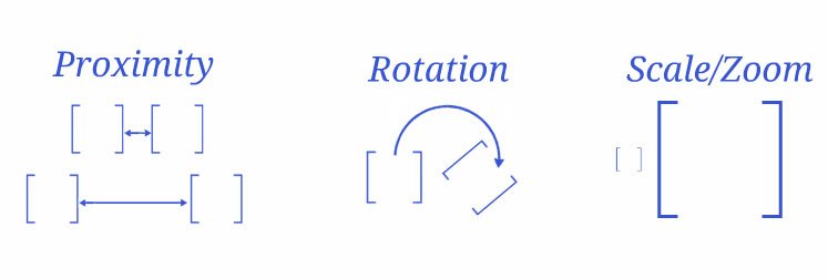
Working with Proximity, Rotation & Zooming
The amount of spinning and zooming in your Prezi depends on how you arrange and align your path elements on the canvas, because Prezi looks at your path and decides for itself, the best way to move (‘transition’) from path-point to path point.
So if your next path point is a long way from the previous one, Prezi has to zoom quickly and directly between the 2 points, which can mean a very distracting and disorienting journey for the viewer. So pay attention to the following three issues when arranging assets on your canvas and joining them with the path tool. Be aware of:
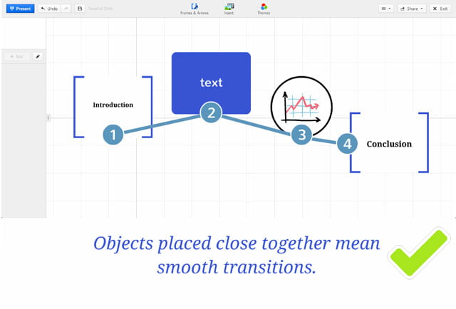
- Proximity – the closer things are to the previous path point, the smoother the transition will be.
- Rotation – Be aware of greater than 60 degree rotations from path-point to path-point and use 180-360 rotations very carefully, for deliberate reasons; for example, to zoom out to your ‘big picture’ in order to move to the next act or major part of your story.
- Scale and zoom – Zooming in deeply and zooming out strongly can be very effective ways of emphasising a key point (zooming in), and giving context, but don’t combine a big zoom with a long, lateral transition, or a greater than 60 degree rotation, or the audience will be at best confused, or at worst, sick.
Here’s a really good example of how to use Prezi’s panning and zooming to best effect – from Prezi’s excellent collection of ‘how-to’ videos, available free from Prezi.com.
Understand visual structure and layout
One of the next hardest things to do as we build real, high-end Prezi skills, is to understand how we can best arrange all of our assets on the canvas and then build the path through our Prezi to make the most of the strengths (layering, zooming, the large canvas etc.) and minimise the weaknesses (excessive zooming, spinning and lateral motion). There are a few simple rules that we can follow, as a start and these include –
- Understanding basic ‘framing and layout principles’.
- Remembering to zoom in and out vertically before panning across.
- Using the screen ratio tool to make sure that what you see in a frame is what you see on the screen when presenting.
- Using simple layout ‘grid thinking’ for every frame you show, so that there’s a professional and coherent visual structure to every path point view in your presentation.
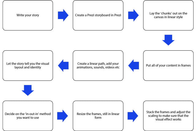
- Linking your visual structure to your story structure and have ‘chunks’ of your Prezi for each part – Prologue, Act 1, Act 2, Act 3, Epilogue – and consider the layering of the ‘chunks’ to allow you to develop an ‘In-Out’ or an ‘Out-In’ structure to help you tell that story.
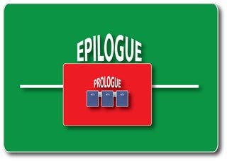
Using that same Prezi again, that shows how you can use simple visual structure to help you tell your story. Notice how we use the ‘chunks’ of the story as stages of our Prezi path. Starting off with the Prologue ‘chunk’ zoomed into grab the audience’s attention…
Then zooming out to tell the main ‘3 Acts of the story’…
And moving between the 3 Acts with short, lateral transitions, after showing the audience the ‘Big Picture’ to make sure they see the point…
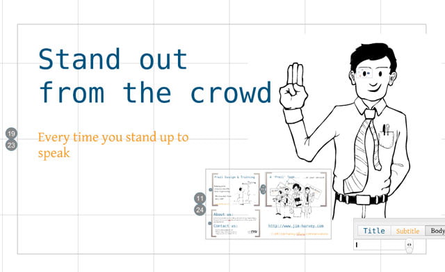
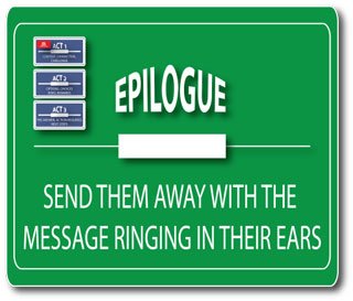
Then zooming out for the last time to emphasis the real value of Prezi (and our services) which is to help the viewer stand out every time they stand up to speak.
This ‘stacking and layering’ of content chunks is one of Prezi’s most important, and little known strengths. Most important because it allows you to move away from the ‘linear’ nature of PowerPoint when using Prezi. Little known, only because Prezi has been around for such a short time, and we’re still creating the ‘rules’, aren’t we?
Use a stacking strategy – ‘In-Out’ or an ‘Out-In’
In my publication ‘6 Speech Structures’ we show you how to use classic story structure to write your speech. In short there should be the 3 ‘Acts’ that audiences expect in any well written story. Three acts, and an attention grabbing first 30 seconds, then a confident, concise closing 30 seconds. Represented graphically as follows:
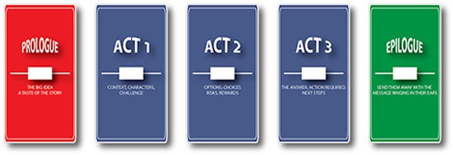
If you follow a similar structure in creating your presentations, you’ll find that you have 5 ‘chunks’ of content that you can create as 5, distinct parts of your Prezi visuals. Each chunk will have a path of its own (though, obviously, the path is continuous from section to section). To make the most of Prezi’s abilities, you can then arrange your content using scaling, layering and animation, to help you tell the story in a visually interesting way, while avoiding excessive zooming, panning and all those lateral transitions.
NB. In each of the examples below, the red element is where you would start the presentation; blue is the 3-act story structure; green is the rousing end of the presentation.
An ‘in-out-out’ approach –
Start zoomed in for the prologue
Zoom out for the 3 Acts of the story
Zoom out again showing the whole story in the context of what you want them to do
An ‘out-in-out’ approach –
Start zoomed half-way in for the prologue
Zoom in for the 3 Acts of the story
Zoom out all the way for the epilogue, showing the whole story in the context of what you want them to do
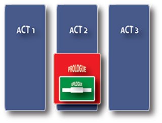
An ‘out-out-in’ approach –
Start zoomed half-out for the prologue
Zoom out again for the 3 acts of the story
Zoom in all the way for the hard-hitting epilogue
Step-by-step to stacking and layering
Use templates to help you hit the ground running.
Many of the challenges we face in creating Prezis that work well, can be solved by developing your own, trusted templates with the right fonts, colours, frames, layouts and paths already made, so all you need to do is fill the empty spaces with your content and ‘tweak’ the formatting, alignment and sizing before you present.
You can use Prezis bank of templates and ‘tweak’ them with different fonts, colour schemes, backgrounds and lines, and then save them as your own template for use again and again.
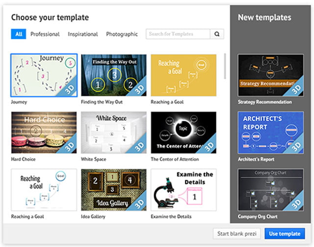
This is probably a good place for you to start if you don’t have the budget to go further. But the Prezi templates don’t really use stacking and layering as we’ve discussed here. They go for the easy method of an eye-catching background and a linear progression. Pretty basic, but pretty good too.
Prezi has made a lot of movement in the right direction over the last 2 years, adding tens of new templates to the choices on offer to the new user, they’ve even used some of our thinking on 6 common story structures for business presentations.
But Prezi’s templates are still:
- Visually clichéd already and well on the way to becoming like Microsoft clipart in the 1990s.
- More ‘arty’ than practical for serious business users.
- Reliant on circular frames – which is simply mad because it wastes 50% of the screen on a 16×6 or 4×3 monitor when presented.
And they’ll become even more clichéd as this year progresses and Prezi moves towards 20 million users.
3 reasons why you should buy or make your own Prezi templates
- They’ll help you stand out – they’ll be uniquely suited to you, your organisation and your brand. They won’t be the ones that everyone is using.
- They’ll save you time – because all of the time-consuming ‘background work’: like creating layouts, paths, transitions, and scaling and zooming will be done for you, so all you have to do is add your content to the empty frames.
- They’ll save you money – because if you’re a professional, your hourly rate is probably well above $100 an hour. It’ll take you at least 3 hours to do all of that thinking and planning to layout your Prezi. And if a template costs you $15.00…
Get started on shaping the second wave of Prezi
Our job is to help you make the most of your next presentation opportunity. To help you stand out from the crowd, for all the right reasons. Prezi is outstanding, if used well. And if you want to learn to be the best in the business here are 3 things you could do right now to help:
- Download our free Prezi for Professionals eBook
- Download hundreds of our free Prezi templates here
- Look at some great Prezis done by the guys at Presentation Studio, who are setting a pretty high bar when using Prezi with their clients.
Jim Harvey
Latest posts by Jim Harvey (see all)
- How to get over ‘Impostor Syndrome’ when you’re presenting - 6th January 2024
- Powerpoint Zoom Summary for interactive presentations – everything you need to know - 19th November 2023
- Sharpen your presentation skills while you work – 3 great audiobooks for FREE - 29th October 2023
- Death by PowerPoint? Why not try The Better Deck Deck? - 31st October 2021
- The Presentation Guru Presentation Skills Questionnaire – How Do YOU Rate? - 13th October 2021


Hannah
1st December 2020 at 5:12 am
This article is amazing in every aspect. Thank you.
Ruby
5th June 2021 at 7:43 am
This article is missing a key component, and that is privacy. Prezi shares your presentations by default on a free account, and this is a huge risk for any sensitive data.
While Prezi engage in this enforced sharing policy, Prezi should never be recommended, inface it should be advocated against. Your article is disingenuous in that you don’t cover this glaring issue, or you choose to ignore it to sound like an early adopter. Either way, weak journalism.
Jim Harvey
5th June 2021 at 9:41 am
Hi there, thanks for your post. I didn’t choose to mention the privacy issue because that’s down to the individual user and I trust them to make the right decision for themselves. Don’t share things that will be shared without your consent would be my advice.