Stock Photography is Killing Your Presentation

At Presentation Guru we always stress the importance of good visuals to support your message. Here Nolan Haims discusses the difference between using metaphorical and literal images and how the choices you make can have a direct impact on how your message resonates with the audience.
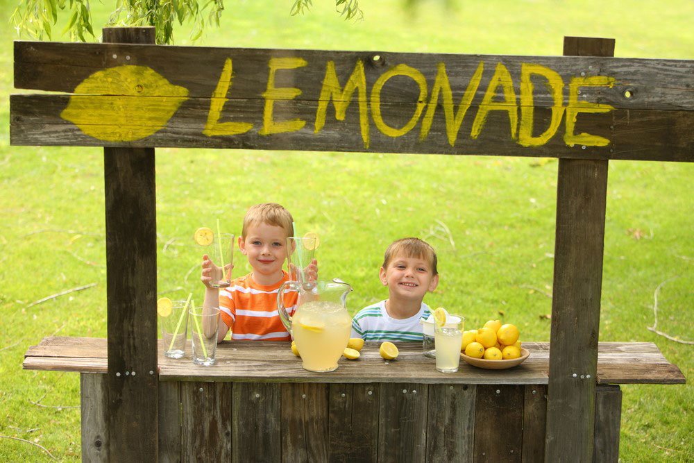
You know how you thought that really cute picture of kids at a lemonade stand would be a great image to use to introduce your new widget sales strategy? Yeah, well if you’re using imagery because you understand its value in visual storytelling and audience retention, guess what? Tomorrow your audience will be struggling to remember what lemonade had to do with your sales strategy for widgets…
There’s a continuing trend in presentation design of using highly metaphoric stock images for slides. And we’ve all done it at one point: an Olympic relay race to show “teamwork,” or a mountain climber to talk about challenges ahead. Images like these from stock sites such as Shutterstock or iStock are tempting because they are hi-res, well-shot and because they give our slides the air of a professionally designed presentation. Furthermore, when a slide’s message involves an abstract or less tangible idea – such as “strategy” or “impact” or “competency” – we may feel as though we have no other choice but go for that picture of a chessboard.
But while metaphoric stock imagery may make for an aesthetically pleasing slide, it’s not doing much for making that slide clear and memorable, which after all, are the two things we should be striving for in designing our slides. Remember, we’re communicators, not decorators.
Studies have shown that slides containing both text and image have far higher retention rates than slides that have only one or the other. But in order to get the most out of this combination, both text and image should communicate essentially the same thing in and of themselves. So, while your text may say “widgets,” your image doesn’t help when it says, “lemonade.”
Try to use imagery that is literal to your message rather than metaphoric
Let’s take a look at a couple of slides from a conference presentation advising an audience of Grantmakers on how to best communicate with their grantees. Many of the slides were metaphors like these:

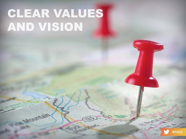
Admittedly, “trust” and “vision” are difficult concepts to design slides for. These examples above are well-designed aesthetically, but the messages of the images the audience are left with are not ideal. Is the presenter really suggesting organizations toss their grantees up in the air to build trust?
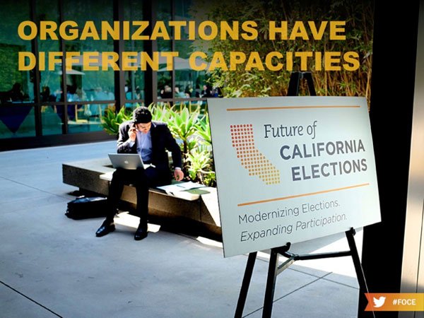
But now take a look at two other slides from the same presentation:

Literal images for slides are difficult to find, and in this case these photos probably need some explanation. The image for the first slide is from the prior year’s conference, and the man speaking served as a moderator for many of the sessions. Apparently – and this is a case of knowing your audience – that man was an amazing facilitator that everyone raved about. So…when trying to make the point that Grantmakers should have a strong facilitator when meeting with grantees, what better image to show than a literal strong facilitator instantly recognizable by the audience?
The bottom image was also from the prior year’s conference, and it shows an attendee from a presumably smaller organization that seems to be demonstrating “limited resources.” Now isn’t that a better visual message than a picture of three differently sized Starbucks cups?
At the end of the day, stock imagery should still play an important part of presentation design. And a bad or clichéd image may still be better than a page of only bullets. But whenever possible, try to use a literal image to support your text and message. If you’re talking about the strength of your new sales team, don’t use that photo of a bunch of people in suits all clasping hands or a little league baseball team. Show your audience a photo of your actual sales team that you took with your iPhone. For my money, even a slightly pixelated image of that sales team is a better choice than anything you’re going to find on Thinkstock.
Nolan Haims
Latest posts by Nolan Haims (see all)
- The 3 Legs of the Better Presentation Stool - 28th March 2017
- Why My Clients Will Pay $2000/hour for PowerPoint - 10th October 2016
- Stock Photography is Killing Your Presentation - 11th July 2016
- The Guru’s Big Five Questions – Nolan Haims - 30th June 2016


Riima
26th July 2016 at 10:45 pm
Great thoughts Nolan. A lot of times these “perfect” images do not exist. But Certainly going to an event with this idea in mind a person could possibly take a few quick photos before things gear up. Or planning ahead for the next big meeting while at the current one would be one way to plan for the future. Thanks for your insights!
Nolan Haims
27th July 2016 at 9:59 pm
Thanks, Riima! I always tell my regular clients that they have to start creating a library of owned imagery from events, partners, products, etc. After all these years, a few are starting to understand why…
emma
5th August 2016 at 5:55 am
Thank you for sharing your thoughts Nolan. I’ll be a happy designer if I never see another chess piece in a presentation!!
sridhar
2nd September 2016 at 9:32 am
Brilliant article, thanks for sharing