Make Your Point With Simple, Clear Charts


Here’s an article by Kartik Sundar, co-founder of Aploris, on creating charts that the audience will understand. Aploris enables PowerPoint users to quickly create clear and insightful charts to help better communicate information and in this article Kartik builds on our previous post on the most effective strategies for presenting data and graphs. Aploris is also the creator of a slide management software solution called TeamSlide.
Data-driven analysis has permeated a variety of roles across most industries, and as result, clear data visualization is becoming increasingly critical. The importance of strong data visualization principals is amplified for presenters who share content and influence a variety of audiences. At Aploris, we’ve developed a data visualization tool for PowerPoint that is now used at companies across the globe. As we’ve worked with different customers, we’ve learned some helpful tips that could help presenters build simple, clear charts that effectively convey their insights.
Keep your charts simple
Presenters will often try and spruce up their charts with unnecessary colors, data-less 3rd dimensions, and other effects that do not add information and instead distract the viewer. Every element on a chart should serve a purpose or otherwise be removed.
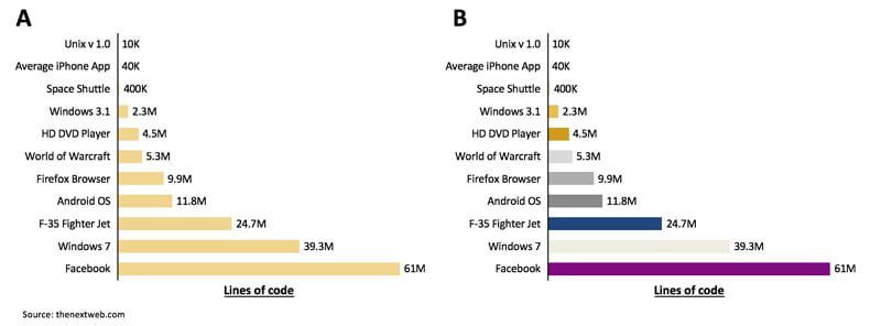
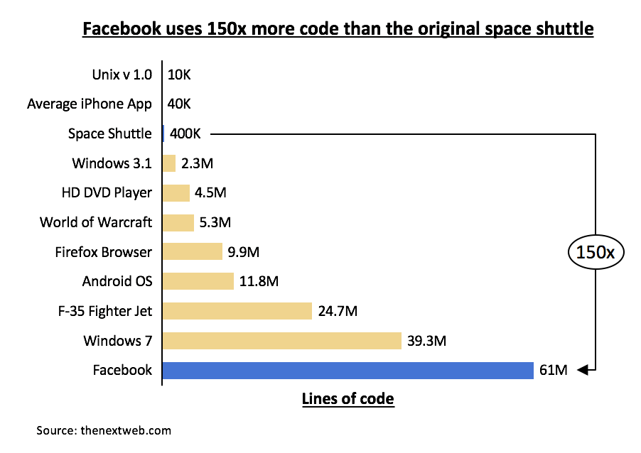
For example, the charts below examine the number of lines of code required to build a variety of popular technologies. In A, a single color is used for all the technologies, but in B a different color is used for each technology. In this case, adding extra colors provides no additional information and makes the chart harder to consume.
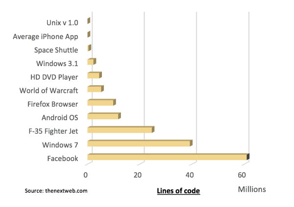
Similarly, in the 3D chart below, reading the heights of the segments is difficult due to the unnecessary shading.
Highlight the key message
The text in or around charts is often just descriptive and does not impart a clear message. Doing this repeatedly can impact the audiences’ engagement and quickly have them reaching for their mobile devices. For example, a number of insights can be gleaned from the chart above, yet it’s not clear which specific point the presenter wants to get across. Adding a few cues, however, can significantly help highlight the intended message.

Above, a contrast blue color is used to identify the data pieces of interest, while a graphical element called a delta bridge is used to highlight the difference in number of lines of code. Further, the added title explicitly states the key message.
Another option is to overlay callout boxes to draw the audience’s attention. The callout box is a standard PowerPoint element and can be an especially useful tool for summarizing key points in a complex chart.
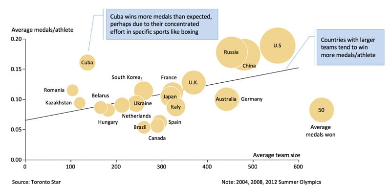
Above, two callouts quickly tell the audience what they should first extract from the chart. The audience is then free to look more closely and gather other pieces of information.
Discover new charts
Presenters often get stuck using bar and line charts repeatedly regardless of the type of information they are trying to get across. As a result, the underlying message is not effectively conveyed, or extra charts are unnecessarily required. Presenters should ideally devote time to learning new chart types that might best communicate the insights from their data.
For example, a little-known but effective chart is the marimekko or mekko chart, a two-dimensional bar chart where both width and height of each segment carries information. Below, the differences between a bar (A) and mekko (B) chart of Nintendo’s sales volumes are examined.
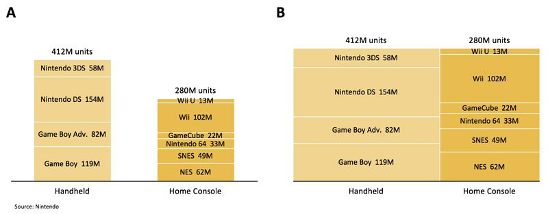
The bar (A) chart uses two columns of different heights to show handheld and home console category volumes. The height of each segment is proportional to the sales volume. While the chart is relatively easy to read, it is a difficult to compare across specific handheld and home console sales. The mekko (B) also uses two columns, but here they are the same height. The area (not height) of each segment is proportional to the sales volume. In addition, the width of each column is proportional to the total sales volume of that category. Viewers can quickly discern that Nintendo DS has the greatest volume and that both DS and Wii sales make up ~30% of the volumes sales in their respective categories.
While Mekko or marimekko charts are very useful, especially when showing market overviews, they are unfortunately not a part PowerPoint’s standard charting features. Specialized add-ins for PowerPoint or a separate application may be required to build them. However, if the chart is simple enough, it can be assembled just using PowerPoint’s basic rectangle shapes.
Building effective charts takes some practice, but by continually testing them for simplicity and clarity, presenters can make rapid improvements. While data collection and analysis are typically given the majority of attention, visualization should play an equal role. For presenters, data visualization is an opportunity to influence the audience, and therefore a capability worth sharpening.
Kartik Sundar
Latest posts by Kartik Sundar (see all)
- Make Your Point With Simple, Clear Charts - 17th October 2016
- TeamSlide Review – How A Few Simple Tools Can Boost Productivity - 22nd August 2016


