How to Spot Data Lies
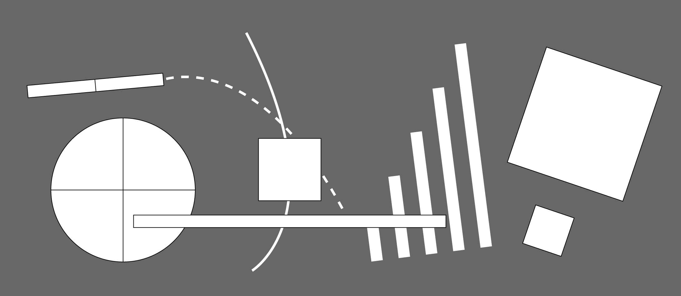
Many charts don’t tell the truth (or, at least, are quite misleading). Here’s a simple guide to spotting them, but it comes with a warning: you will never look at any statistic without a little smidgen of cynicism again.
However we shouldn’t be too cynical. As Darrell Huff puts it in How to Lie with Statistics:
“The title of this book and some of the things in it might seem to imply that all such operations are the product of intent to deceive. The president of a chapter of the American Statistical Association once called me down for that. Not chicanery much of the time, said he, but incompetence.”
Which is a shame really since bad visualisation has distorted the perception of what data visualisation is and what it can be used for. With the increasing amount of data out there, people want to try and understand it (without needing a maths degree). That’s where data visualisation plays an important role.
You can read Nathan Yau’s article in full and see all the great examples here: How to Spot Visualization Lies
For more guidance on Data Visualisation, check out these articles here.
Rosie Hoyland
Latest posts by Rosie Hoyland (see all)
- Now Is the Time to Look at Webinars - 13th March 2020
- The Only PowerPoint Templates You’ll Ever Need - 26th March 2019
- 12 Tips for the Technologically Challenged Speaker - 25th March 2019
- The Best Way to Protect Yourself from Misleading Graphs - 17th January 2019
- 3 Tips to Boost Your Confidence - 13th September 2018