From Bullet Points to Visual Presentation – Finding the Right Images


There is an art to finding visuals that support your message. Hours can be wasted searching online image libraries and copying images from Google is a big no. In this article, Robert shares his ideas on how to represent messages visually and how indirect representation can sometimes work instead.
This article is the third in a series of four discussing how to move away from bullet points and escape rigidly linear presentations in favor of a more dynamic, flexible, and highly visual approach – all the while staying with standard PowerPoint presentation software. You can read The Secrets of PowerPoint – and How They Can Help You and From Bullet Points to Visual Presentation – and Why it Matters here.
Previously, I highlighted the use of pictures (the right kinds of pictures) as a preferred tool for visual expression. Amassing photos is easy, especially if your own camera is always close at hand, and getting them onto slides is quick and easy as well.
I would rely on them exclusively if such were possible. Unfortunately, pictures are not a cure-all. Some subjects are impossible to photograph directly, or obtaining the right kinds of pictures might not be feasible. Are you forced back into bullet points in that case?
No. Bullet points are never acceptable. We need other options.
Indirect Picture Strategies
In a moment, I’ll highlight visual presentation strategies that don’t necessarily require pictures at all, or that enhance images in some way to improve their impact. I encourage you, however, not to automatically give up on pictures just because you can’t think of a way of directly showing a concept. Several indirect picture methods offer other possibilities. The three I fall back on most often are analogy, modeling, and storytelling. We’ll look at an example of each.
Analogy
Although I don’t have any children of my own, ironically I work with and train thousands of people in child-related professions, all the way from pregnancy and breast feeding up through childcare and education. Not surprisingly, I have access to much of their content and permission to show it. Here’s a practical analogy application from one of my co-trainers, Cathy Carothers, who also happens to be a lactation consultant.
She sometimes discusses colostrum with people in her audiences. Maybe you’ve never heard that word before? Neither had I until meeting Cathy.
Colostrum is the milk a new mother produces right after a baby’s birth. It’s very different from milk that appears later when the baby is, say, three months old. Cathy in the past used bullet points like everyone else in her profession to explain the difference between colostrum and regular milk. Now, as a visual communication expert, she takes a different angle.
She shows this picture…
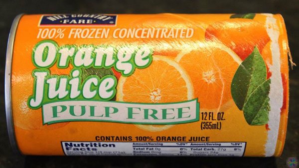
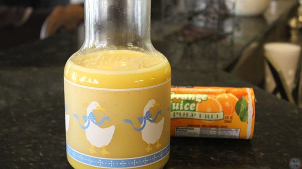
…and says, “Let’s talk about colostrum. You know what it’s like when you’re making orange juice from frozen concentrate, right? That concentrate is very sweet, dense, and packed with nutrients. A spoonful of it goes a long way.
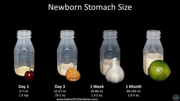
“Well, that’s exactly what colostrum is like. It’s sweet, dense, and packed with nutrients. It has very low water content because the baby’s stomach right after birth is about the size of a cherry. It can’t handle much volume. Even so, baby still needs a lot of nutrients, proteins, sugars, and antibodies right from the start. This condensed form of milk is perfectly tailored to a newborn’s dietary requirements.
“As baby grows and his or her stomach volume increases, a mother’s milk gradually changes to be more like concentrate with the water added. The same great nutrients and other components are still there but now are diluted due to the milk’s much higher water content. That’s good because baby needs the extra water to stay hydrated. The proportion of water verses nutrients changes over time, in synch with baby’s development.”
Cathy cleverly uses familiar objects (a can of concentrate, a cherry, a pitcher of orange juice) to help explain an unfamiliar subject (colostrum). In this case, she doesn’t have to directly show what she’s talking about. The non-related pictures communicate the concept just fine, albeit indirectly.
Modeling
When getting a picture of the real thing is not practical or possible, consider staging photos that instead model the desired concept. Tricia Cassie is another breastfeeding colleague working at the Vermont Department of Health. She regularly teaches classes to parents, community groups, and healthcare providers. In the past three years, Tricia assembled a massive collection of high-quality visual content, organized into several presentation platforms like the one shown here.
One of her many tasks is teaching new mothers various recommended positions for breastfeeding. She certainly could round up several volunteer moms and photograph them action, but doing so would come with drawbacks. The logistics could be messy. In today’s politically correct climate, she’d probably have to find mom’s representing all the major ethnicities, a difficult prospect considering Vermont’s population is about 95% white. Plus, mothers willing to be photographed bare-chested and viewed by potentially thousands of others are, suffice it to say, a bit rare. Plus, such photos invariably would make some people in her classes and community events uncomfortable.
She gets around all those complexities by modeling the various positions herself with the help of a stuffed Dr. Seuss character.

In a few minutes, she collected all the pictures needed, free of hassle and without the obligatory photo-release forms and diversity searches. The modeled visuals are a great substitute for the real thing, and are perhaps even better in some respects.
Storytelling
You’ve been asked to present on self-efficacy. How does one photograph that? You can’t, obviously.
Self-efficacy is a person’s belief in himself/herself to accomplish tasks or goals. Although taking a picture of such an abstract concept is not an option, showing an appropriate visual story might be a great way of introducing the subject.
Tricia has such a story. One day during a vacation to Vancouver Island, she gave in to a moment of insanity. Against her better judgement, she agreed to jump off a bridge—bungee jump off the bridge, that is.
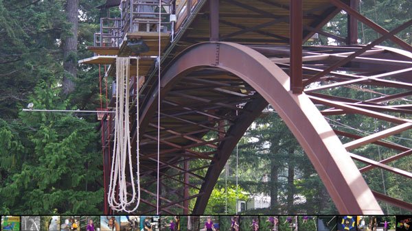
The black water 140 feet below beckoned ominously. Maybe the cord would stop her just before hitting it, or maybe not.
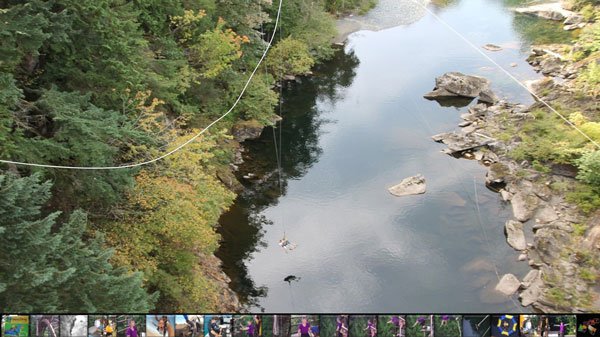
Something to know about Tricia is that she is terrified of heights. Until now, she had never jumped off anything higher than a diving board 3 feet above the water. What had she gotten herself into by agreeing to do this? Based on 57 years of life experiences, she didn’t believe there was enough courage in the universe to push her willingly off that ledge.
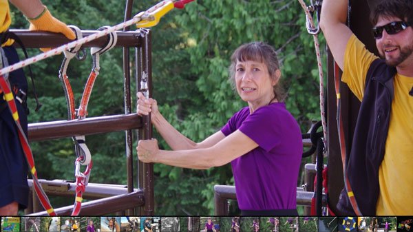
Indeed, moving from this position ….

… to this position, took no less than 15 agonizing minutes. Other people were waiting to jump. People down below were clapping and cheering her on. Jump! Jump! You can do it! But there she stood, frozen in terror.

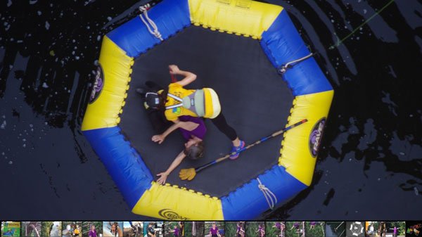
Just about when everyone had given up, expecting her to turn around and admit defeat, she somehow dug deep within and harnessed the energy to dive—screaming like a wounded hyena all the way down.

They collected her at the bottom in an exhausted heap.
This wasn’t just a jump. It was a life-changing moment. Tricia never would have believed that overcoming her life-long, debilitating fear of heights was possible.
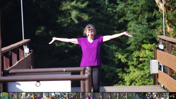
Actually, Tricia had a choice that day. The adventure company’s policy was very forgiving. She could have taken the easy way out, given in to her fear, and turned around. They would have refunded her 99 dollars with no questions asked. But she didn’t. Her belief in herself took a huge leap that day, and since then has given her confidence to push the boundaries of other self-imposed limits. She would tell you herself that we all can do a lot more than we ever think possible.
Shape Graphics
Turning away from pictures, another visual strategy you’ll probably appreciate assembles PowerPoint shapes into some kind of symbolic or representative graphic. I call these devices shape graphics.
During visual language workshop sessions I talk a lot about hyperlinks that enable on-demand selection of content. Hyperlinks are the backbone of complex presentation platforms. They sometimes tie together hundreds of individual slide shows. Most folks in my audiences have a general sense of what a hyperlink is, and what it does, but have never seen navigation strategies in a PowerPoint presentation context.
I start off displaying the following slide and say that a PowerPoint hyperlink always has what’s known as a source and a destination.
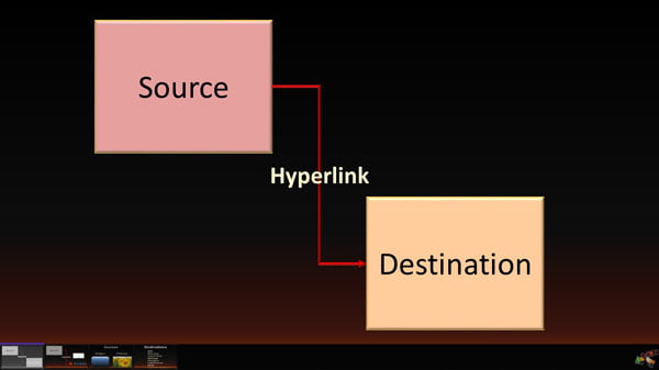
A speaker clicks the source object, usually a shape or picture thumbnail, to reveal the destination content – which can be any number of things, perhaps a different slide in the same show, another slide show entirely, a document such as a PDF file, and so forth.
With a scroll that makes the destination shape disappear, I then go on to explain that if a destination is removed – deleting the target slide show, for example …
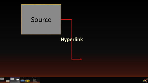
(another scroll)
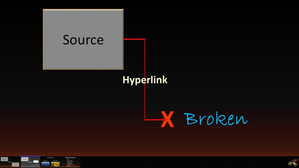
… the link is said to be broken. I scroll again to reveal a small screenshot and say that a broken link displays a dialog box like the one shown here.
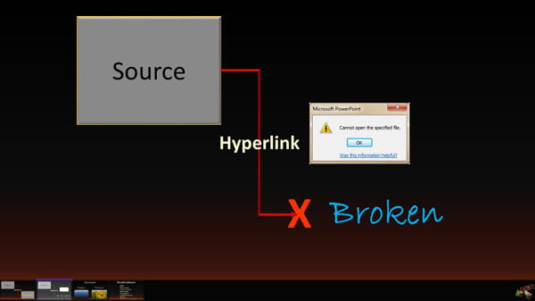
During this lesson I use multiple PowerPoint shapes to represent objects and actions. The rectangular shape labeled source symbolically stands in for the hyperlink’s starting point. Likewise the rectangular shape labeled destination is a symbolic stand-in for what the hyperlink displays. The thin red arrow shape pointing from source to destination signifies the action of clicking the hyperlink. The red X is actually a multiplication shape available in PowerPoint’s insert shape area. It denotes an event that stops the hyperlink’s intended purpose. The words Hyperlink and Broken are shapes, too, that have no outline and transparent fill.
Clearly it’s impossible to photograph something intangible like a hyperlink. The shapes in this case, provide a viewable substitute. They become, with a little viewer imagination, the unseen objects and actions.
Shape Graphics and Pictures
Shape graphics don’t always stand alone on a slide. I frequently combine them with a picture or screenshot to expand expressive potential. In these cases, the picture itself generally is not the primary content. It merely adds context or depth to the shape graphic’s symbolism.

The slide shown here comes from Ryan Comfort’s Coffective platform. His trainers display it as a way of drawing attention to a mother’s situation while in a hospital, waiting for her baby to be born. A mom-to-be typically has an average of around 24 alone periods during the day where she can collect her thoughts and relax. That might sound like plenty of personal space …
(scroll)
… until you realize that those alone times tend to last only 9 minutes or less before the next interruption come barging though the door. The Coffective trainer then goes on to work with hospital staff on finding ways to minimize these interruptions and give their patients additional downtime for a more pleasant stay.
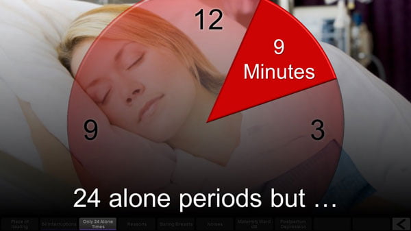
Note that the picture in the background here is nothing more than a stock photo and plays the role of context, giving the slide a mother-in-hospital-bed feel. The circular shape on top, with semitransparency and effects applied, adds the perception of a “clock” or “time.” The wedge shape that appears at just the right time in the message, representing a 9-minute time period, adds an element of surprise. Most trainees seeing this slide have never thought about the fact that their poor patients, who are already stressed, tired, nervous, and perhaps scared, barely have time to catch their breath before some other distraction or annoyance delivers more chaos.
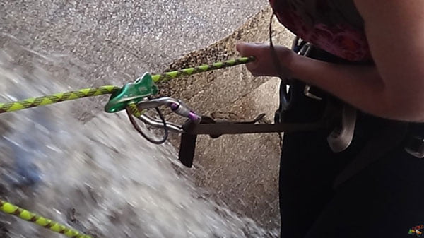
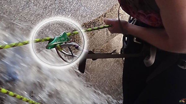
With some topics, the picture behind shapes must play a stronger role than context. I use this slide to talk about the experience of rappelling off a mountainside cliff. I show the picture …
… and then run an animation that encircles and emphasizes the little piece of metal shown, using an oval shape with only an outline and glow effects applied. I say that when you’re backing off a cliff, that insignificant-appearing piece of metal is the only thing between you and death.
Next, I run another animation that gradually reveals a yellow custom line shape and say that the rope keeping you from falling isn’t even attached to the metal, or even your safety harness. It simply winds its way through in a U-shaped pattern. And that means the only thing keeping you alive while descending is the friction of the rope rubbing against the metal. Comforting, huh?
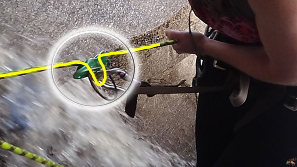
Here these shapes have a somewhat different purpose compared to the previous example. The picture in the background really is the primary content in this case. The shapes serve to help me explain the picture’s meaning by first focusing attention on a small region and then simulating the rope’s path though the metal object. In this hybrid approach, the shapes and picture complement each other. Either alone would be less effective at best, or even meaningless.
Shape Graphics and Animations
Some shape graphic content is static, with all the shapes visible at the same time. The message they represent doesn’t require reveals or other animations. A majority of the time, however, meaningful animations improve representations even more.
Returning to the new mom in the hospital bed, a follow-up slide reveals why her alone times are so short. The screenshot here is what the slide looks like in edit mode. Numerous shapes appear stacked on top of each other. They all have the following animations: an entrance fade, followed by a motion path moving the shape sideways in some direction, and then finally an exit fade.
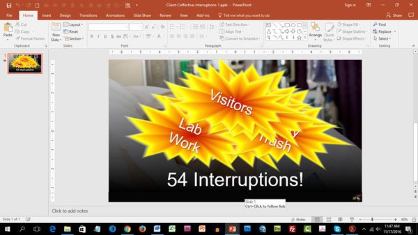
The timing is set so that each shape fades in one at a time, in a staggered, rapid succession pattern. The motion paths point in various directions, creating the impression that each shape bursts into view and moves a little before it disappears—kind of like a fireworks display exploding in the sky.
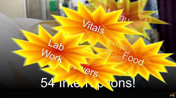
The shapes are brightly colored and contain text phases such as “vitals,” “visitors,” “lab work,” “empty trash,” and so forth to represent the various kinds of interruptions that happen throughout the day, adding up to an average of 54 such intrusions. No wonder she doesn’t have peace for very long!
In this example, the shapes are the main content but the animations add a critical additional effect. They add a sense of pounding the patient with one interruption after another, all day long. Employing a combination of shapes, pictures, and animations is usually the best way to go.
The bottom line is, sometimes pictures alone are insufficient to directly show concepts. By further expanding your shape and animation skills, you’ll add a whole new critical dimension to creative design options.
Robert Lane
Latest posts by Robert Lane (see all)
- From Bullet Points to Visual Presentation – Making it Interactive - 9th February 2017
- From Bullet Points to Visual Presentation – Finding the Right Images - 17th January 2017
- From Bullet Points to Visual Presentation – and Why It Matters - 22nd December 2016
- The Secrets of Powerpoint – and How They Can Help You - 20th September 2016